Around the world
AROUND THE WORLD
An interactive checklist that helps kids develop and follow bedtime routines
/PrototypING + Usability Testing
/PrototypING + Usability Testing


TIMELINE
10 weeks
ROLES
Product Designer
User Researcher
Prototyper
ADVISORS
Scott Ichikawa
Jon Froehlich
TEAM
3 Designers
1 Engineer
OVERVIEW
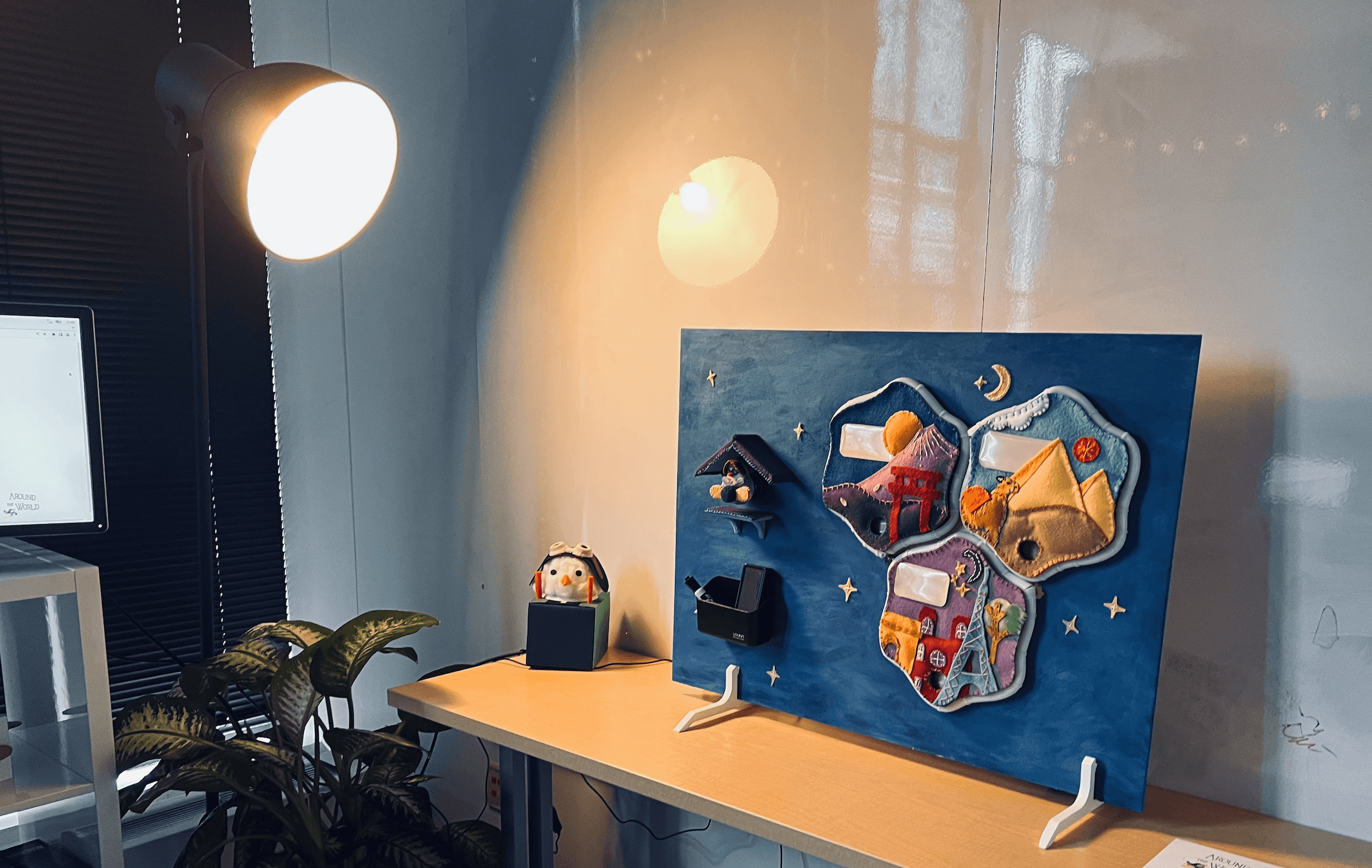
Over the course of ten weeks, the team discovered that some children struggle with bedtime routines, resulting in issues such as bedwetting. To address this, we developed Around the World, a checklist that assists parents in developing and maintaining a structured bedtime routine for their children.
MY ROLE
As the team's UX designer, I conducted desk research, analyzed data, brainstormed, wireframed, and prototyped. I also moderated three parent interviews to gather feedback on the design and co-moderated three usability testing sessions to test our final prototype.
DESIGN
Features
User Flow
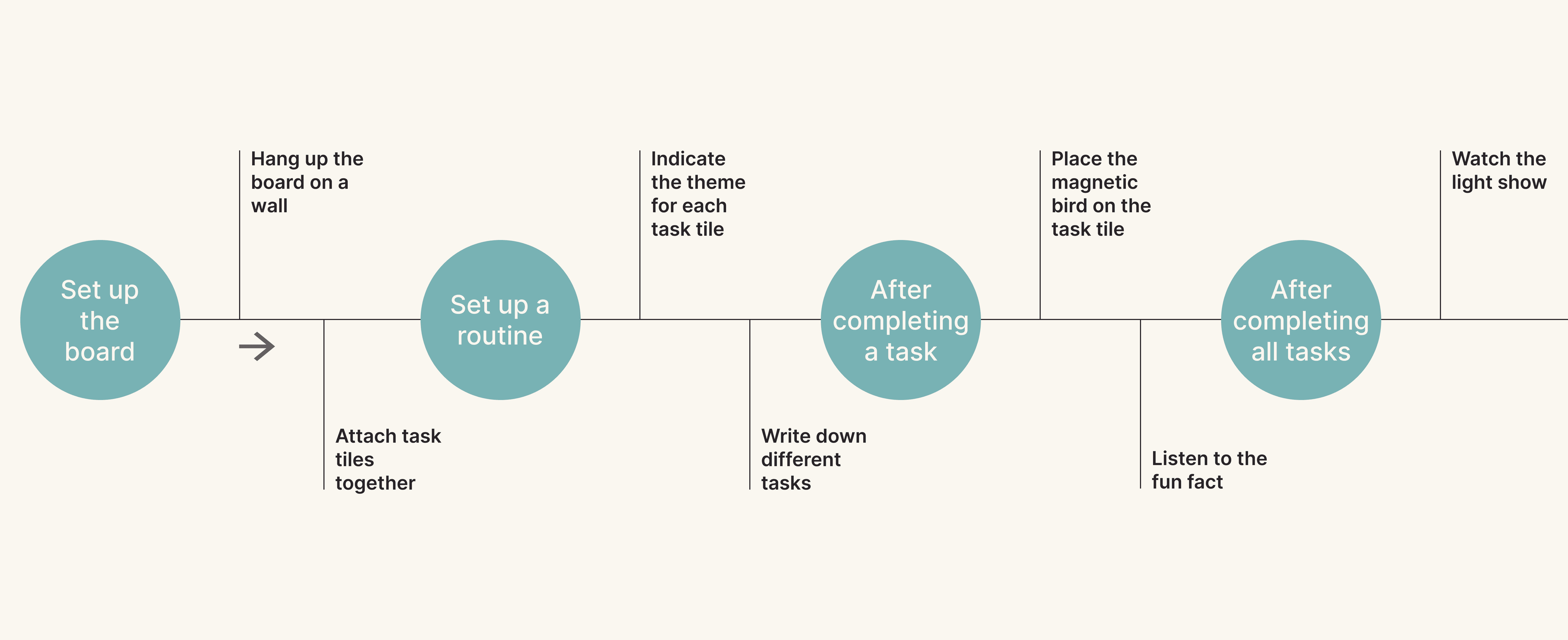
Overall, our design touches on 4 different touch-points.

Customizable Tasks for greater flexibility
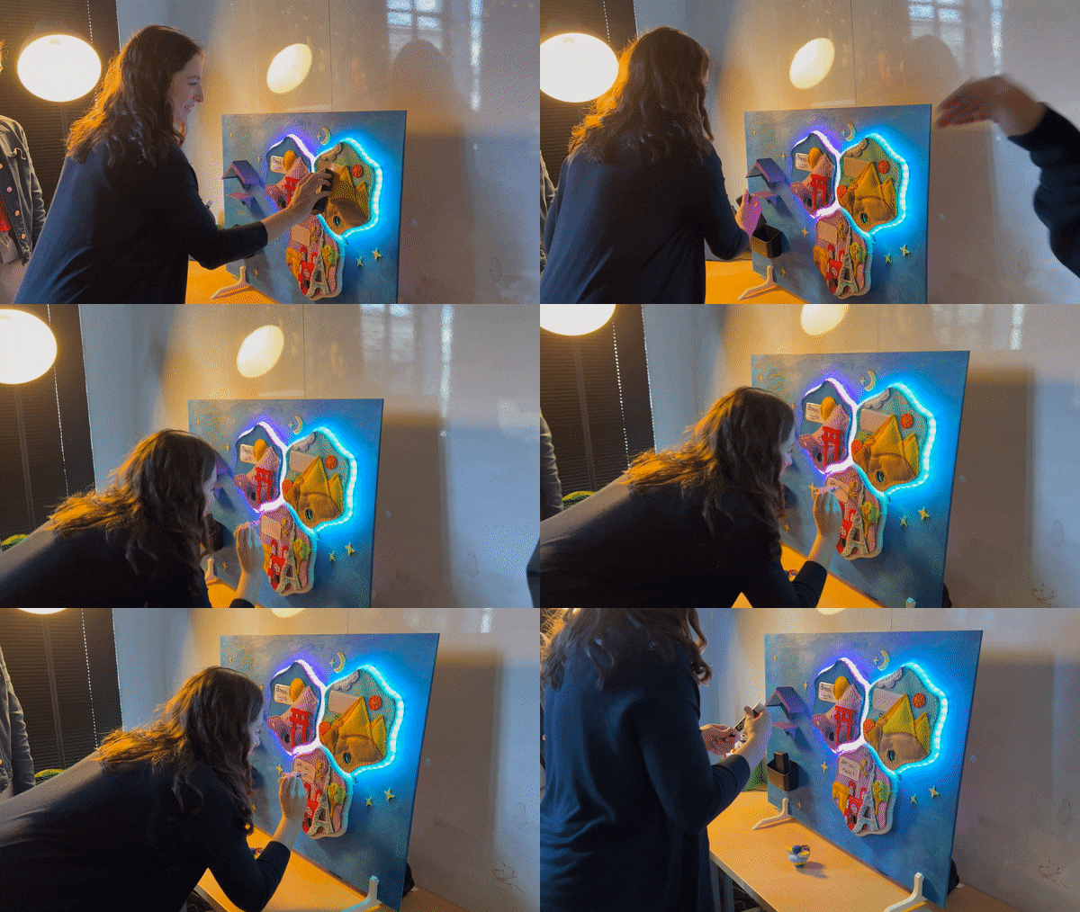
Users can easily write, erase, and modify checklist tasks in the designated area using a dry erase pen.

A Magnetic Bird that can be easily attached to a board to check off tasks
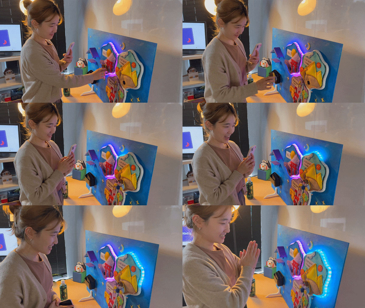
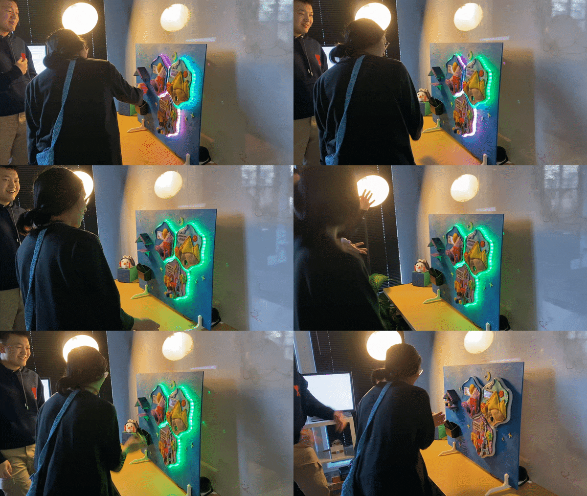
Tasks are completed by placing the bird magnet on the matching tile. Lights and sounds will indicate task completion, and tapping the bird magnet will provide a satisfying sense of crossing something off the list.

Provide Short fun facts as a form of encouragement
The tiles light up and reveal monument trivia when tasks are completed. This encourages kids to finish their homework and learn new things every night.

Customizable Themes for greater personalization
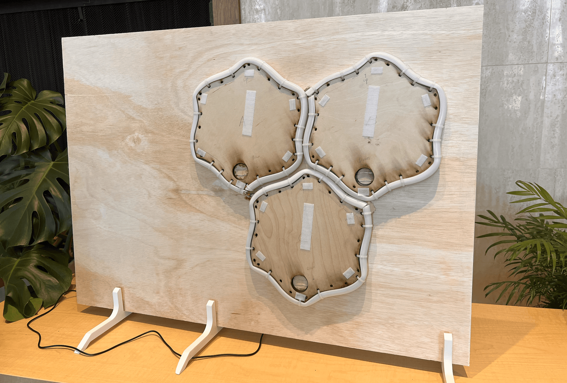
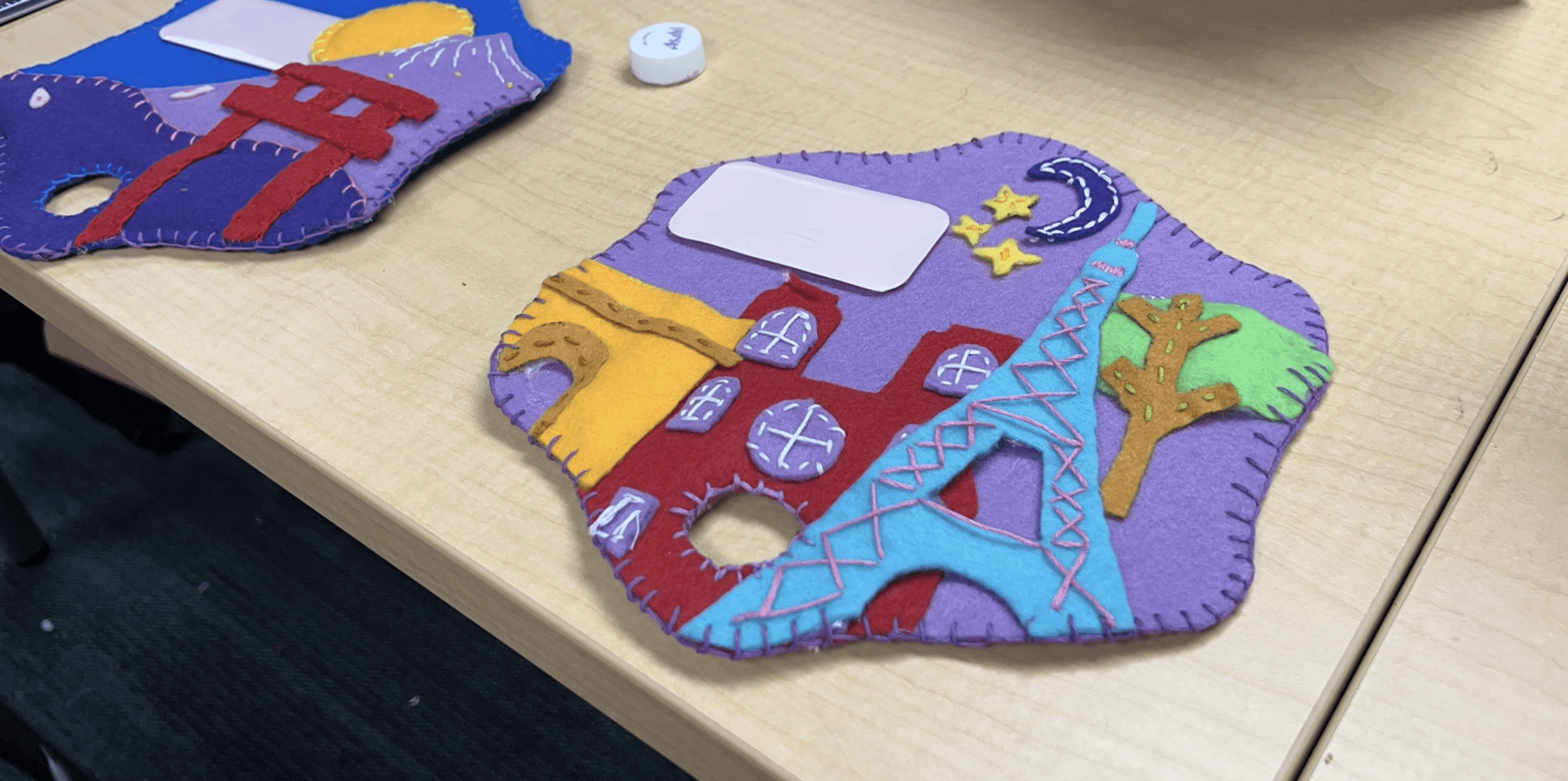
By using velcro, parents have the flexibility to replace each tile with a theme that their children are interested in. This motivates children to check off tasks and listen to fun facts related to the chosen theme.

The shapes are designed for easy tile attachment and removal
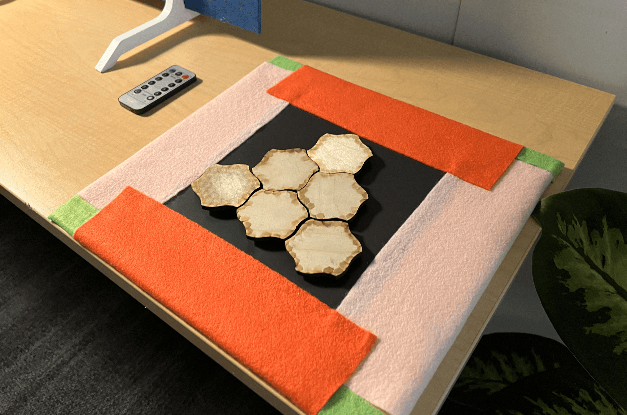
The tile shape was purposefully designed for seamless attachment, offering an added level of flexibility for structuring routines.

Designed with children's safety in mind
We selected child-friendly materials, avoiding any sharp or hazardous elements. Moreover, the soft and easy-to-clean tiles make it convenient and enjoyable for both children and parents to use.

Please look on a tablet or desktop for the most optimal user experience!
OVERALL DESIGN PROCESS
Use prototyping as a form of research to drive iterative refinement


BACKGROUND
A design that mediates home care
The prompt of this project was to create an interactive artifact that mediates home care. Our team researched and created 20+ design concepts for each problem we identified. We then narrowed our focus to parent-child care using dot-voting, considering alignment with the prompt, feasibility, feedback, and personal interest.
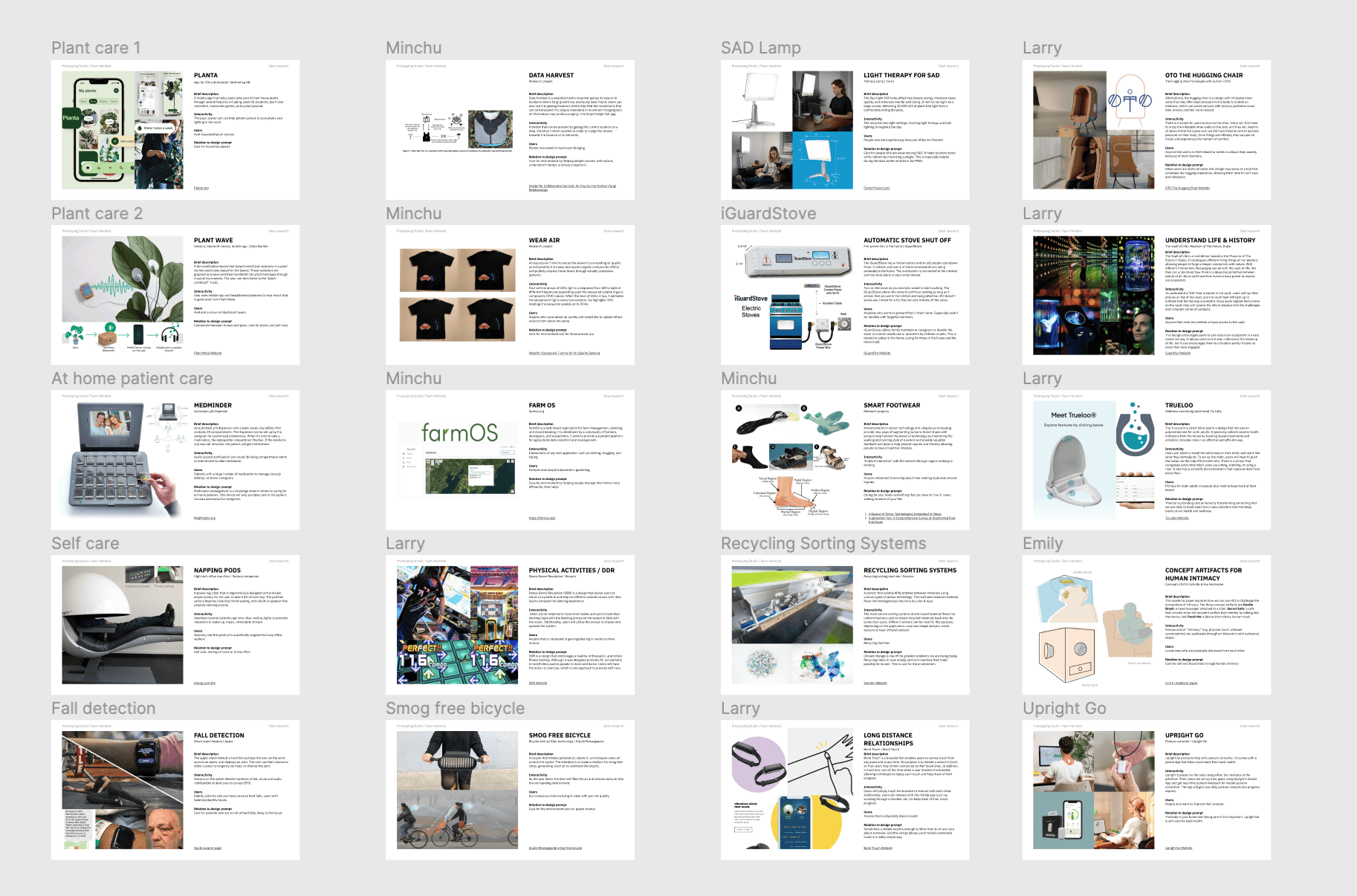

The ideas we brainstormed based on our initial findings from different problem spaces
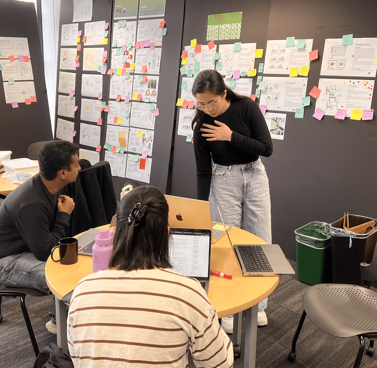

We received feedback from our peers and synthesized the data together
PROBLEM SETTING
Focus on issues with bedwetting
After studying child-parent relationships, the team discovered that some potty-trained children still wet the bed due to a lack of motivation to use the bathroom before bed. As a result, we chose potty-trained children (5 to 8 years old) and devised the following design challenge:
Initial Design Challenge
How might we motivate children to use the bathroom before bed to prevent bedwetting?
HYPOTHESIS
The current bathroom experience is not fun for children
I assumed that kids lack motivation to use the bathroom because the experience is not fun. I also assumed that children enjoy positive reinforcement and that they often want some sort of reward to be motivated to do things.
DESK RESEARCH
Understand children's behaviors and motivators
I read 5 articles and watched 10 Youtube videos about children's behaviors and motivators in order to find inspirations that promote bathroom use before bed. I also conducted competitive analysis of tools such as bed alarms to identify their strengths and areas for improvement.
OUTCOMES
Determine the initial design features based on our research findings
Use light shows to motivate children
Use voice assistant to provide instructions
Add limitations to prevent disruption to children's sleep
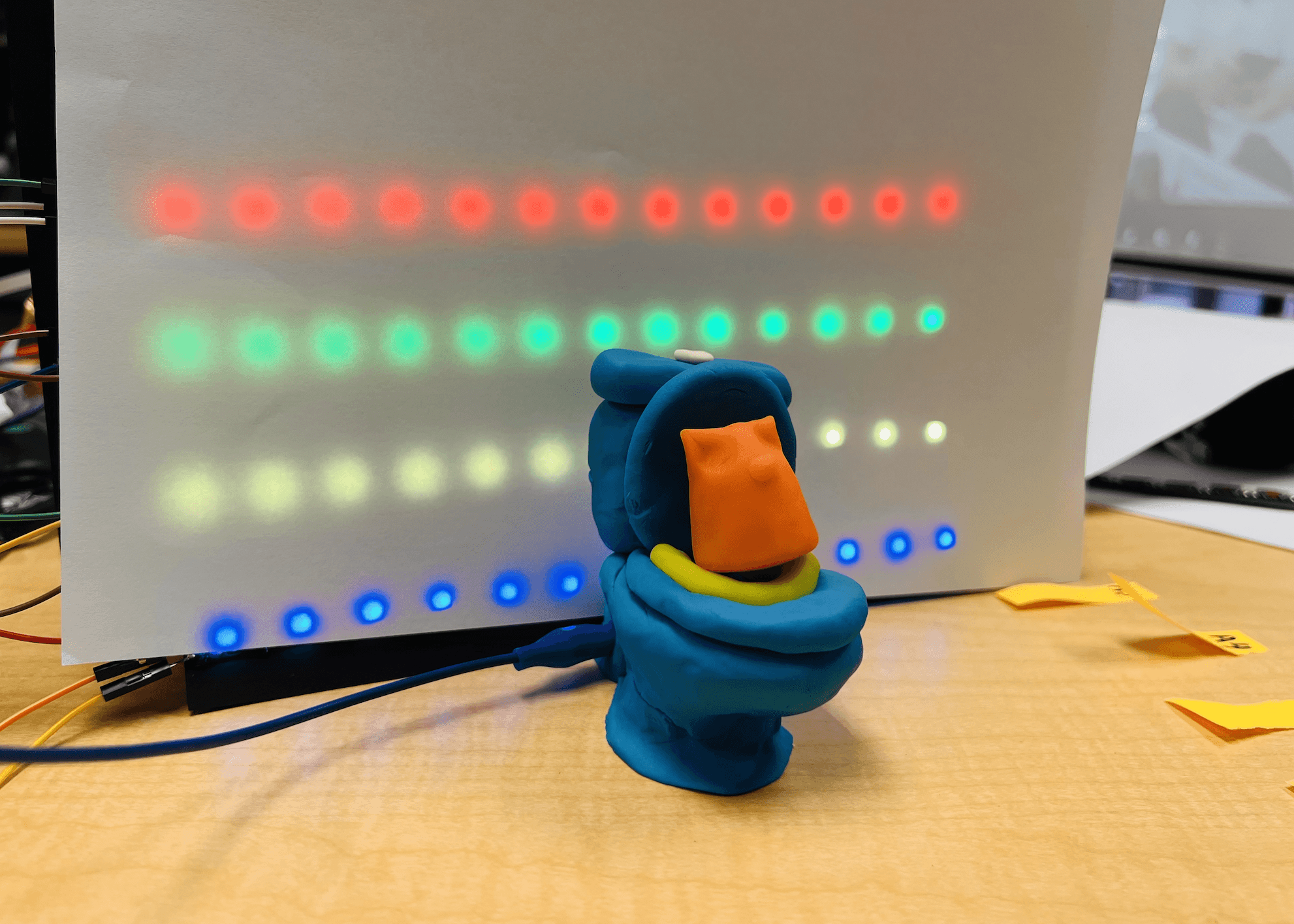

I found that children are he team created a bathroom wall with a light show to simulate the experience
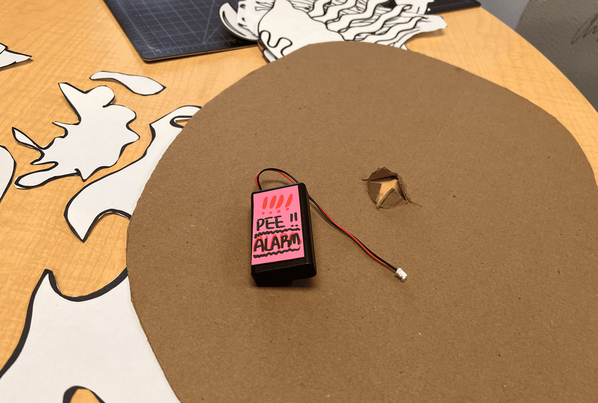

I created a bed alarm prototype to demonstrate the disadvantage of it in our next step
VIDEO PROTOTYPE
Immerse in a child's bedroom to communicate and assess design concepts
I was in responsible for making video props, sketching wireframes, setting up the space, co-shooting the video, presenting our ideas, and getting input from our peers for the next iteration.
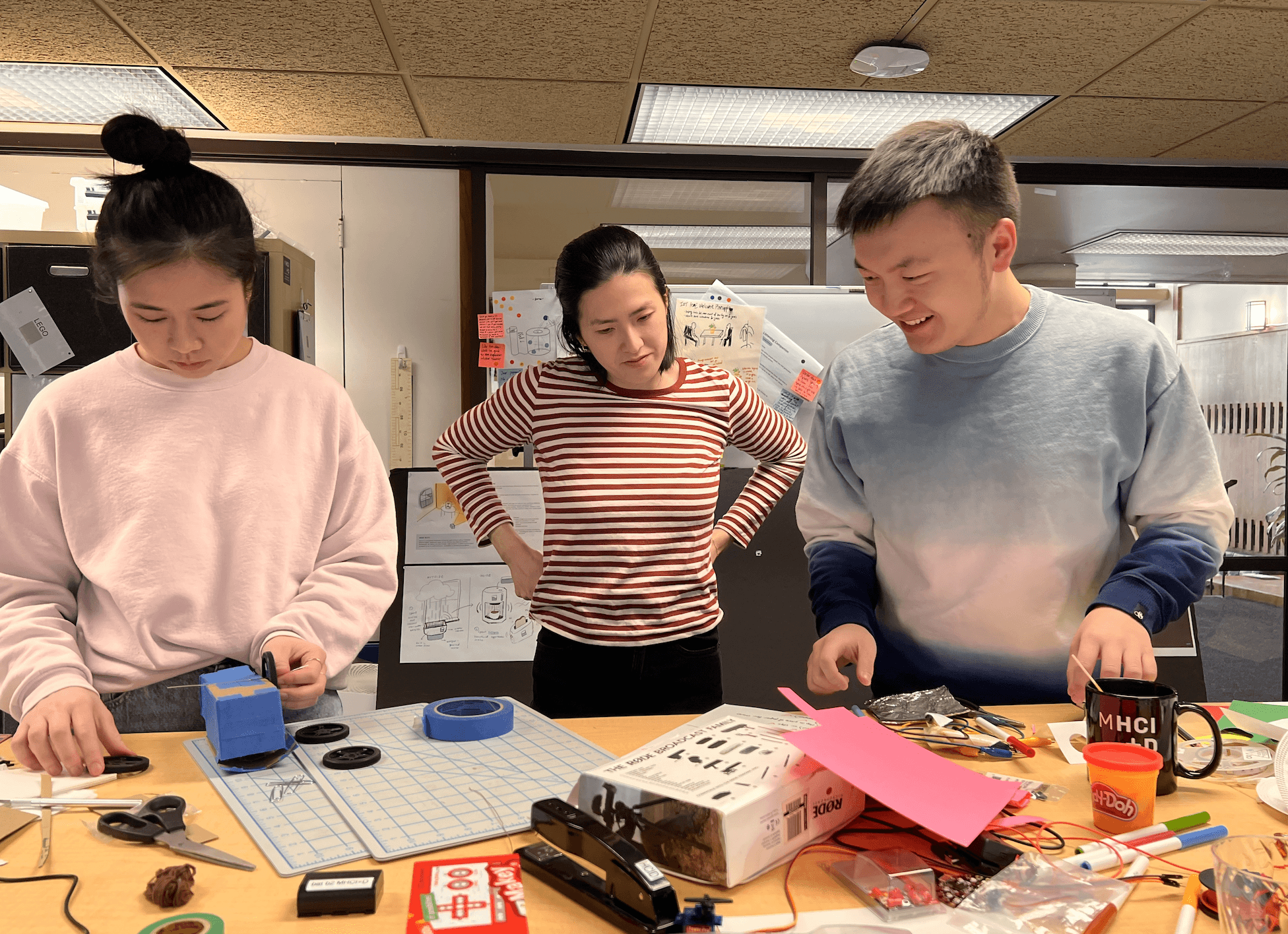

I worked with my teammates to create various components for our video prototype
OUTCOMES
Focus on the world map concept with less interactions
We discovered that using a voice assistant to connect a child's bedroom and bathroom could introduce complex interactions and overwhelm users. Also, the "Around The World" narrative was more engaging and provided more opportunities for theming the overall experience.
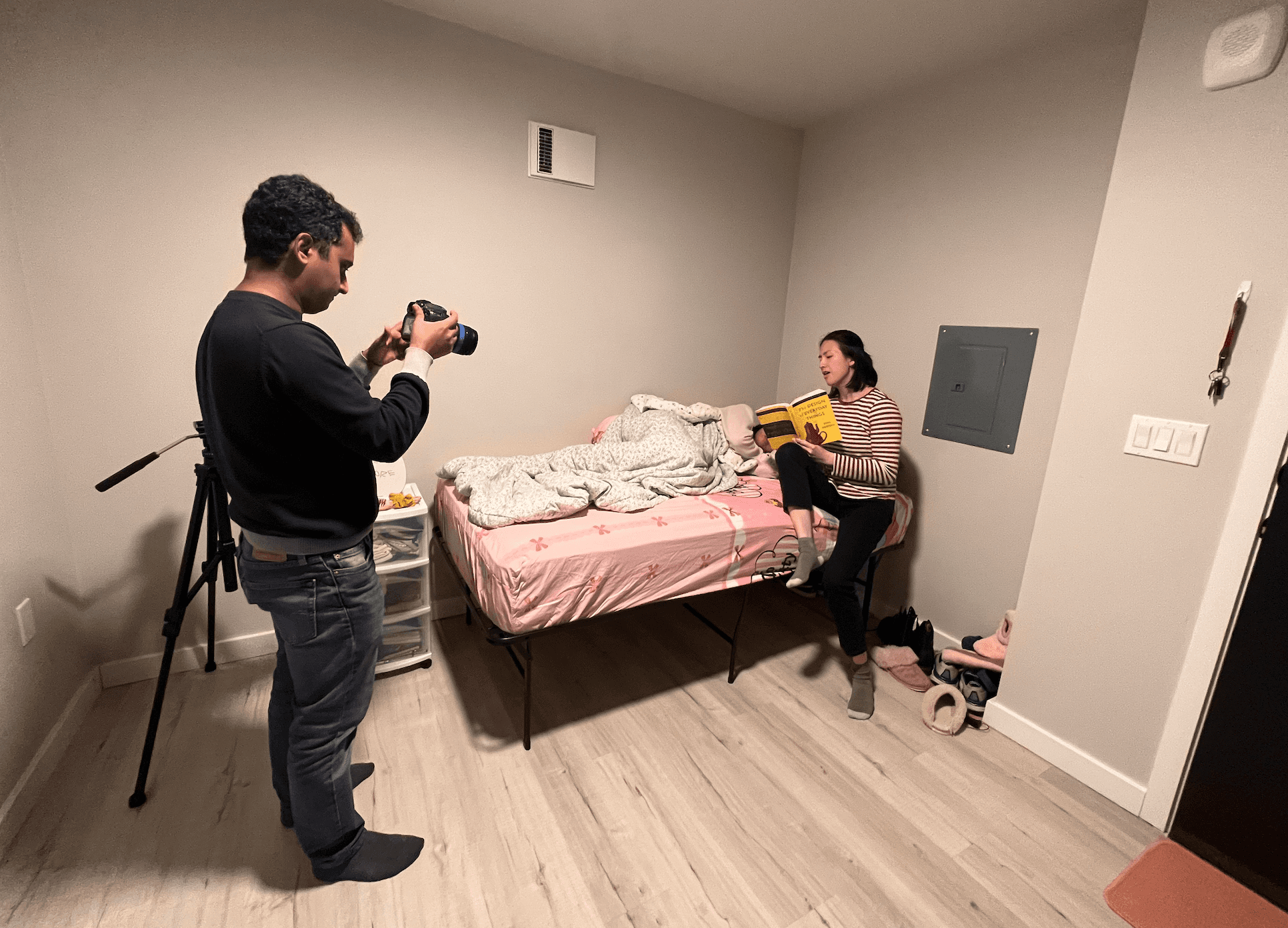

I helped directing the production of our video prototype
WOZ PROTOTYPE
Examine user interactions and behaviors through manipulated input
I was in charge of preparing our study plan and session guide, soldering and testing electrical connections, scheduling and moderating all 3 testing sessions, and doing 2 post-testing interviews with parents.
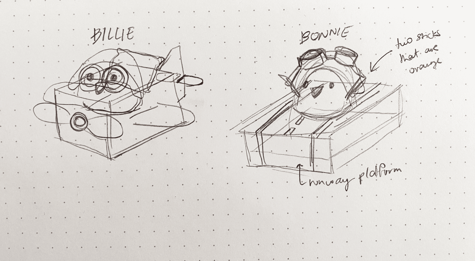

We sketched the voice assistants design to make them fit with the story theme


We iterated and refined the form factors based on previous prototype


We built the map prototype using a foam board; coded the CPXs to simulate the feedback of a tapping interaction
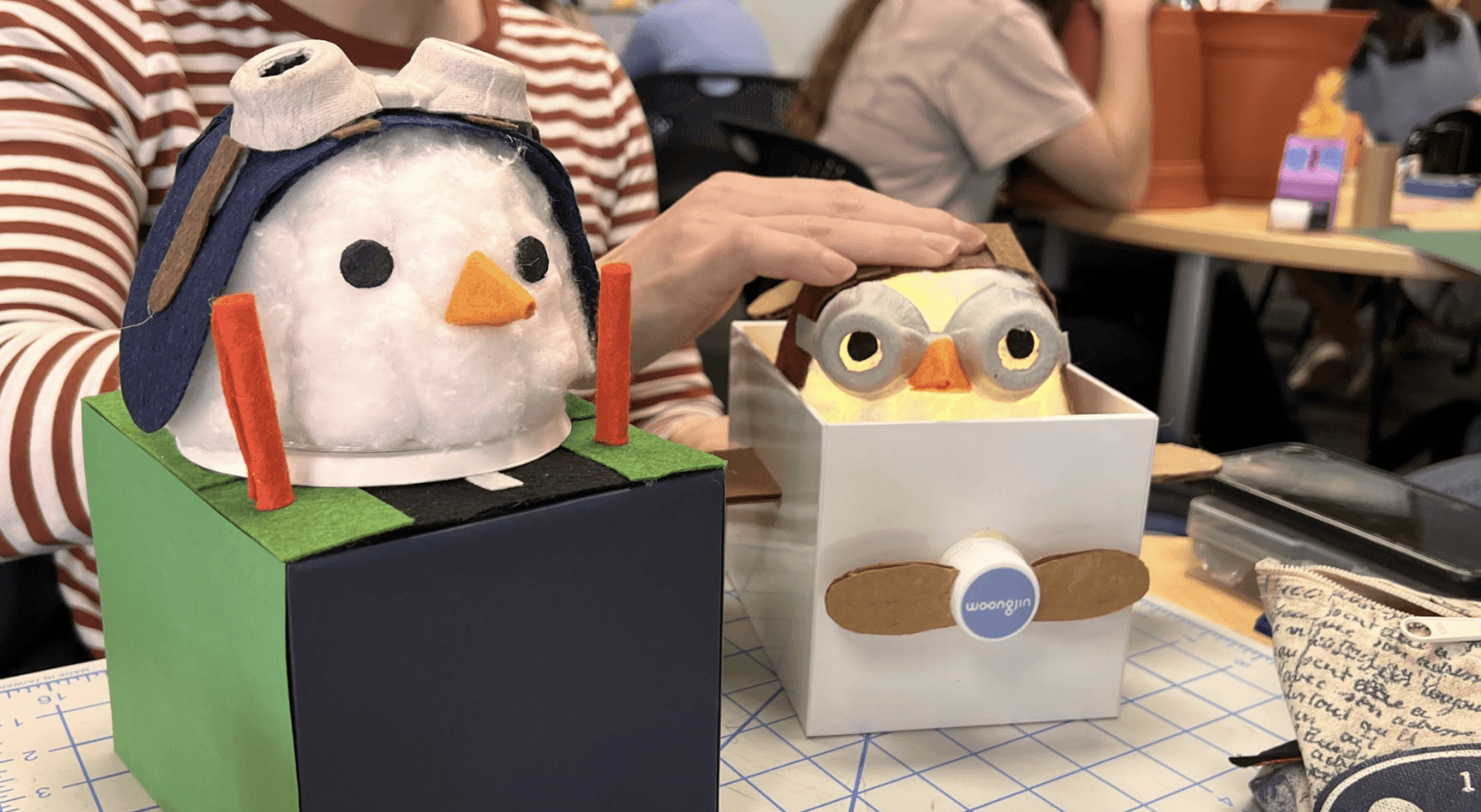

We connected the prototype with CPXs, and pre-recorded audios for the mascots to simulate the voice assistant
OUTCOMES
Reconsider our design since it hinders parent-child connection
Having a voice assistant read stories without parents was unusual, and voice assistants should not replace parental involvement because children sometimes misunderstood them and relied more on their parents.
Disclaimer: All photos and videos were taken with the parents' permission.
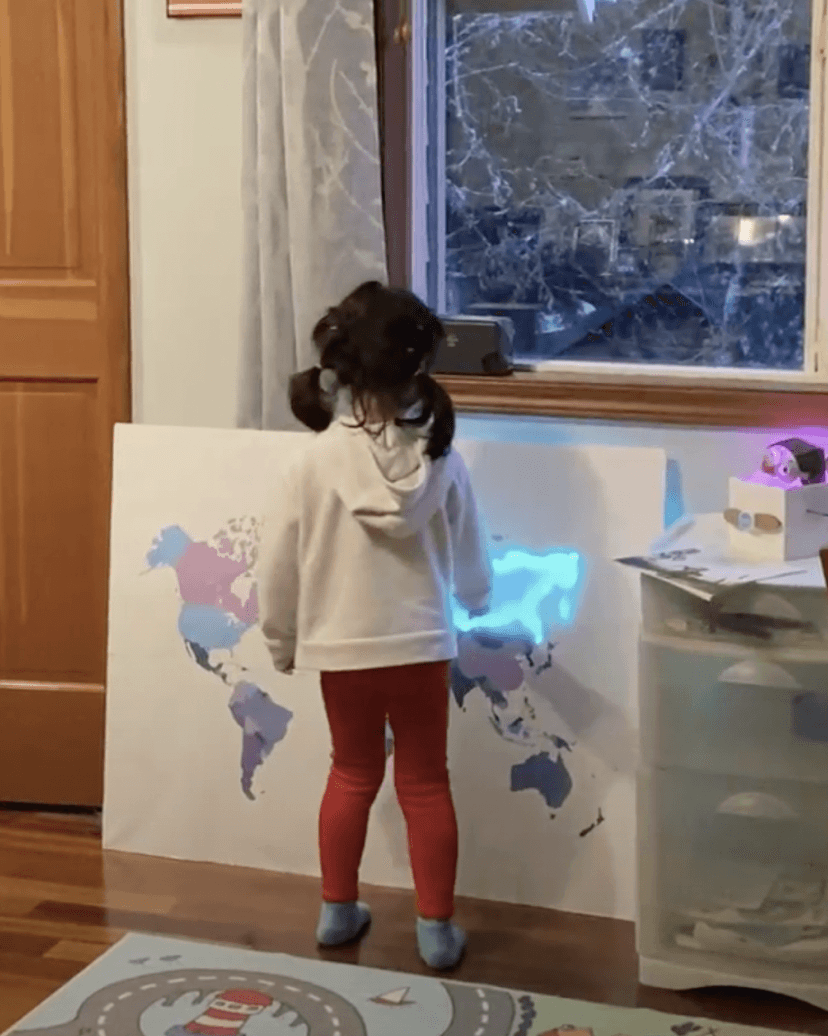

Our participant kept interacting with the map instead of following the instructions
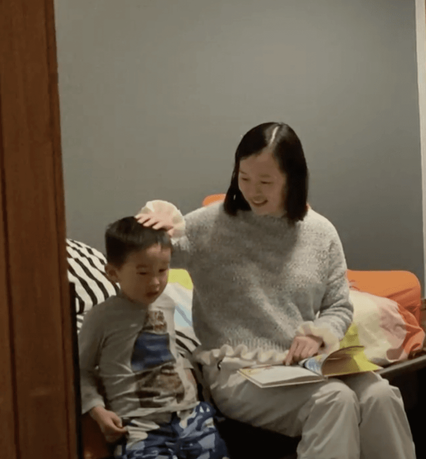

Parent misinterpreted the instruction provided by the mascot
Additionally, the following findings helped us in reconsidering the role of our design and informing our next design direction.
The "world map" concept had to be redesigned
Positive reinforcements brought joy to children
The number of interactions still needed to be reduced
Safety was a big concern for parents
PIVOTING
Switch the design focus from bedwetting to bedtime routine
Since the team determined that our design did not satisfy the needs of users, we did two more user interviews with parents concerning bedtime parenting and came across the following quote:
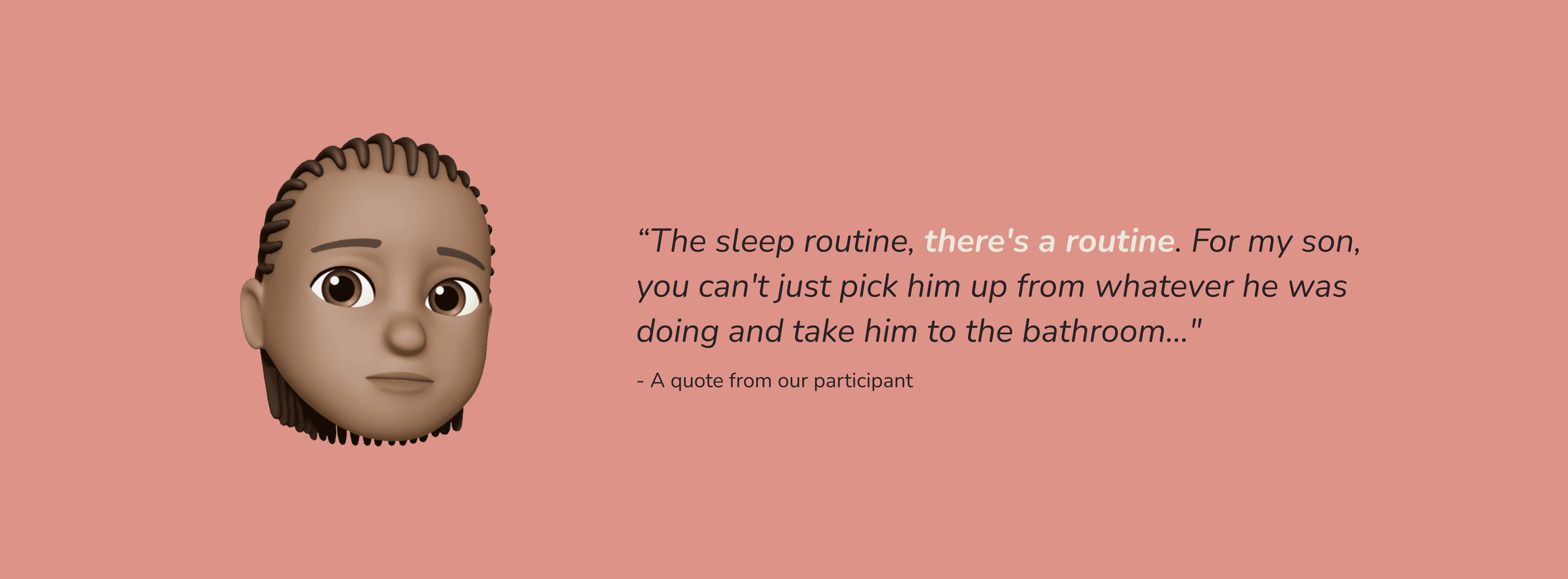

In relation to the findings from the Woz Prototype testing, my team discovered that parents preferred structured routines for their children right before bedtime. With this finding, we refined our design challenge:
Refined Design Challenge
How might we help kids build, structure, and keep track of bedtime routines?
RE-IDEATING
Create an interactive checklist with fun facts
To address this new design challenge, my team re-ideated 10+ ideas. After narrowing down the options, the team decided to shift the design to a checklist with these features to help children structure their bedtime routine:
Fun Form Factor
A screen-less form factor that is suitable for pre-bedtime use and appealing to young children.
Simple Interaction
A child-friendly interaction that is easy to understand and use.
Delight Factor
Include a small element of delight to encourage and motivate children when they complete a task.
Enticing Feedback
A fun and enticing feedback that encourages children to complete a task and check an item off the list
MID-FI PROTOTYPE
Create the "look-and-feel" of our prototype
I was responsible for ideating, sketching wireframes, designing the form and interactions, building low-fi prototypes, soldering and connecting wires, synthesizing feedback, and building mid-fi prototype.
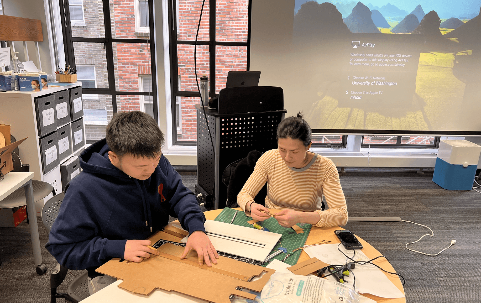

I worked with my teammates to explore various materials and iterate on the interactions of our prototype before perfecting the form
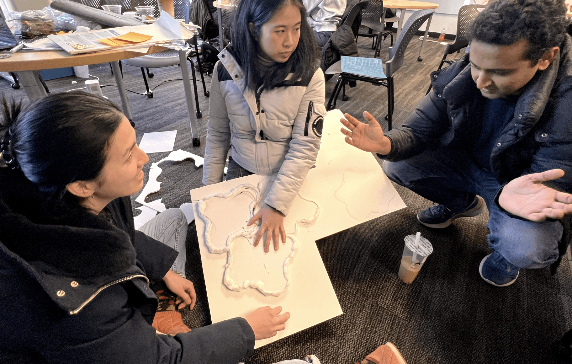

Instead of a world map, we decided to use a form similar to a Catan board, with each land representing a country associated with a specific task
OUTCOMES
Make the theme customizable to suit different children's interests
A child-story expert suggested adding a customizable feature because it's hard to find a "perfect theme" that appeals to everyone. Overall, our design concept was validated when people saw our design as simple and meeting parents' needs.
HIGH-FI PROTOTYPE
Include customizable themes and tasks while improving the quality of the prototype
During the building process, I created a study plan, collected materials and used laser cutting to structure the forms, built prototypes, set up electrical connections, designed the hanging board to connect task tiles, and co-moderated user testing interviews.
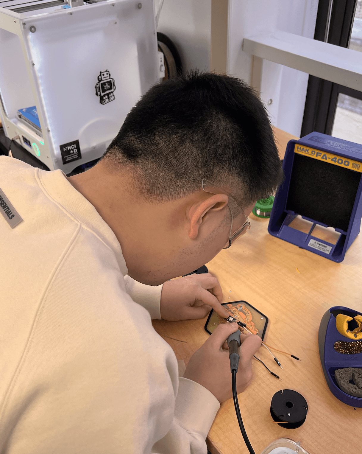

I soldered the wires to connect the lights with CPX
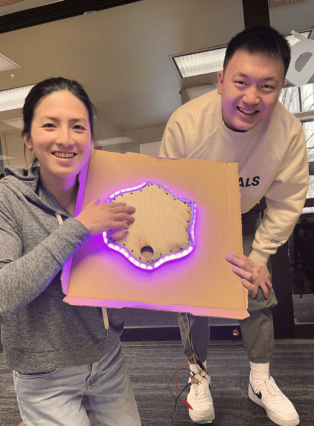

We used a quick light show to provide fun and enticing feedback when a task is checked off
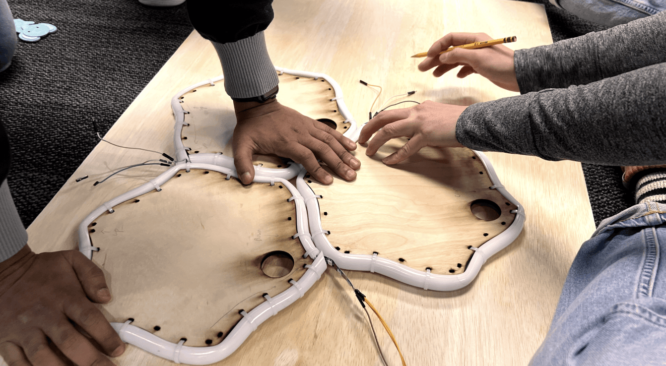

We developed a higher fidelity form factor using materials such as wood and plastic tubing
EVALUATING IMPACT
The design received validation from all participants during our testing sessions
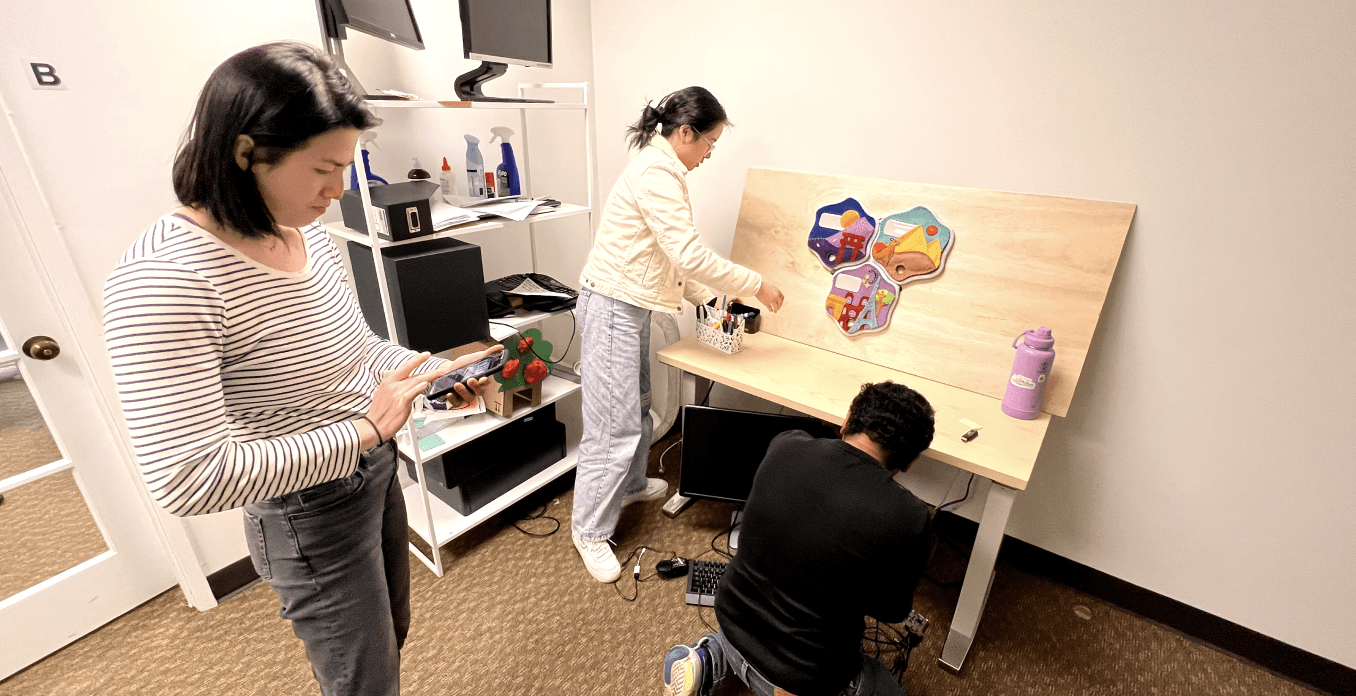

Setting up our prototype for a user test at the studio
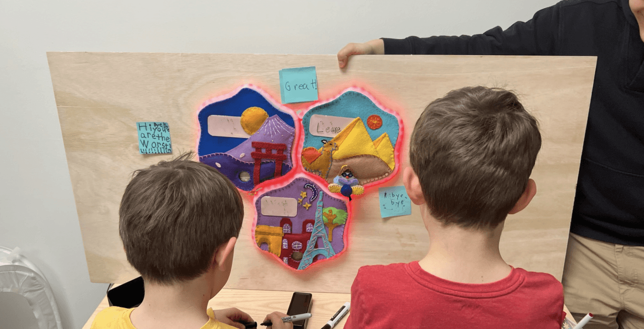

Two participants interacting with our prototype
Parents liked the customizability of writing their own tasks for their children
The checklist helps parents add structure to their children’s bedtime routine
Parents liked the aesthetics of the form, and they don't see it as something that is distractive
FINAL DESIGN
Project Showcase
REFLECTIONS
Prototyping can be an effective research method for rapid idea generation
Throughout this project, I realized that fast prototyping is an effective way for doing user research and determining the viability of our proposed solutions. Furthermore, I discovered that design can be used as a problem-setting tool, drawing attention to new challenges that drive iterations of an existing design.
I would also approach critical user feedback differently, building on ideas rather than discarding them right away. In times of uncertainty, it's best to settle for "good enough" solutions and make decisions to keep the progress going.
Finally, designing for kids is hard because their thoughts, feelings, and experiences are different from adults'. This experience showed how important it is to recognize and address assumptions during the design process to ensure that the design meets user needs and isn't based on personal biases.
Acknowledgement
I'd like to thank all of my teammates and the faculty for providing constructive feedback that allowed us to progress. I'd also want to thank our participants for their support and willingness to participate in our project. I couldn't have done it without them <3.


Team Hemlock (left to right): Minchu Kulkarni, Emily Shu, Carista Eliani, Larry Tian