Reserve, Drop & Fly
Redesigned Alaska Airline's pre-boarding service to make traveling with a carry-on bag more convenient for customers
/Service design

TIMELINE
5 weeks
ROLES
Service Designer
User Researcher
Prototyper
ADVISOR
Jacob Wobbrock
TEAM
5 Designers
OVERVIEW
Through our research, we found that airport travel with a carry-on can be a stressful experience for customers due to uncertainties about overhead bin availability and the need to ensure carry-on security.
To address this, our team redesigned the carry-on process, allowing customers to reserve an overhead bin and use a complimentary service to drop off their carry-on early, streamlining their airport waiting and pre-boarding experience.
Over a span of 5 weeks, the team conducted field observation, designed, tested, used methods such as experience prototype to iterate and refine our service design.
MY ROLE
As the UX designer on the team, I was responsible for:
Structuring study plan for user research
Conducting field observation
Moderating 2 user interviews to understand the problem space
Ideating ideas and drafting key scenarios to understand the intended experiences of our design
Creating prototypes to test the information experience
Moderating 4 user testing sessions and iterating designs based on participants' feedback
Creating video prototype to demonstrate the ideal experience
Background
For this service design class, my team and I wanted to understand how customers perceive current airport experiences and see if there are any challenges they encounter.
Problem Setting
To investigate the problem space, our team made a list of the various touchpoints we expected to encounter at the airport. We then discussed and shared the challenges we had faced collectively for each touchpoint.
The list of touchpoints and challenges we identified
Based on our own experiences, the crowded airport environment presents numerous uncertainties and information to process, which can easily lead to customers feeling overwhelmed and anxious while waiting. As a result, we decided to focus our attention on the pre-boarding touchpoint at SeaTac airport.
Hypothesis
Based on our assumptions, we believed the difficulties we encountered while waiting at the airport were likely shared by others. We also assumed that current airport experiences were overwhelming for customers, contributing to a negative and anxious travel experiences.
Research
To validate our assumptions, the team decided to conduct a field observation at SeaTac airport and interview passengers in the waiting area about their current airport experiences while waiting.
During this process, I was responsible for structuring the study plan, moderating interviews, taking notes during the field observation, and synthesizing our data.
Primary Research Goal: understand how people perceive the current pre-boarding process and identify challenges they face.
Method Rationale: field observation shows real-world experiences, revealing subtle nuances and context; semi-structured interviews allow us to efficiently probe participants' perspectives within a consistent and flexible framework.
Hypothesis: people don't like the current pre-boarding process and often face challenges, causing them to feel overwhelmed and anxious at the airport.
Key findings
People want certainty and immediate access to information
Having a carry-on influences some people's airport experiences
People didn’t like the disordered pre-boarding process, especially lines and unexpected changes
Design Challenge
How might we improve the airport experience in order to provide certainty and prevent potential inconveniences for passengers during the pre-boarding process?
Ideation
Overall, the team brainstormed 40+ ideas. During this process, I ideated 10 ideas, created wireframes, discussed with my teammates to come up with design principles, drafted 2 user stories, and down-selected.

We each sketched out our ideas and included a short description underneath
The concept
After down-selecting, the team decided to focus on the carry-on reservation idea with a complementary drop off service that allows users to drop off their carry-on early at the gate. The staff will pre-load all the bags to shorten the boarding time.
I created sketches to better demonstrate the key scenarios of our envisioned design in a visual way.
The key scenarios I sketched based on the stories we drafted for the carry-on reservation concept
Customer journey Map
To better convey the full customer experience in our design, my team produced a customer journey map. During this approach, we were able to discover four touchpoints that play critical roles in our design that we should focus on since they set the foundation of the overall experience.

The four important touchpoints we identified in our customer journey map
To understand the structure of our design, the team created a user flow diagram to map out the sequence of steps and interactions that users go through within our design.
The user flow diagram we created to visualize the structure of our design
During this process, I was considering some of the extreme cases and brought them to the attention of my teammates.
Extreme case #1:
What if Andrea is unable to reserve an overhead bin that is right above her seat?
Solution #1:
Allow customers to reserve a spot on either side of or across from their seats.
Extreme case #2:
Will there be overhead bin space for passengers with carry-on bags who opt out of the reservation system?
Solution #2:
Let the system to automatically assign the space to customers who have indicated that they would be bringing a carry-on.
Lean Canvas & Competitor Analysis
To understand the existing solutions and identify how our design is better to those of our competitors, the team created a lean canvas and conducted competitor analysis with other airlines.

The lean canvas we created to recognize our advantages

Airlines that we conducted competitive analysis with
Key findings
Many airlines don't offer pre-reserved overhead bins
Some airlines offer free gate-checked carry-ons, but customers don't like waiting for their carry-ons at baggage claim
Unlike other existing carry-on reservation services, our service provides certainty for consumers
People can't off load their carry-on early with existing services
Since this is a free service, we need to design a feature to offset the cost of maintenance
To test our concept, the team decided to build an experience prototype that would allow participants to test our design in an airport-like setting and immerse themselves in the airport experience.
During this process, I was responsible for planning the prototype building process, designing visuals, envisioning the information experience within our service, creating information signage that mimics the informal SeaTac experience (a key finding from user testing), and constructing the airport waiting area to match the prototype and airport theme
User Testing & Iterations
Overall, we conducted 4 user testing sessions and iterated our design in response to the feedback we received after each session.
During this process, I was responsible for moderating all 4 user testing sessions and interviews, and I was responsible for taking photos/videos while users interact with our prototype for documentation.
Primary Research Goal: understand how participants perceive our design and identify any challenges they encountered while interacting with it
Method Rationale: allows us to determine whether our design aligns with user needs and expectations, identify any usability issues, and collect valuable feedback early on in order to iterate and improve before moving on to a higher fidelity prototype.
Hypothesis:
Users can follow instructions provided by the kiosk interface during testing.
Users recognize the value of our service and are willing to use it in the future.
Iterations & OUtcomes
Session #1
Iterated our notifications design to include picture evidence to provide extra layer of certainty
Added a note explaining the automated overhead bin selection during check-in to avoid confusion
Session #2
Added a mobile boarding pass & receipt for carry-on drop-off
Added a procedure to leave the carry-on bins open so passenger can immediately see bag when they board
Session #3
Re-arranged the drop-off kiosk area to avoid user confusion about where to drop off their carry-on
Changed the arrows on way-finding signage to avoid confusion about where the waiting room is
REflections
What I would do differently…
Conduct additional evaluative testing
Be ok with "good enough" so that we can keep moving forward
Get feedback from the airline employees
Acknowledge our assumptions and revisit our findings earlier
What I learned
Story-telling was important for visualizing the end-to-end idea
Experience prototyping can allow you to add context for the idea
Edge cases can play a role to help us better understand the customer experience and flesh out our ideas
Constraints did help!
Experience design shifted our focus away from technology/UI.
Acknowledgement
I'd like to thank all of my teammates, as well as the faculties for providing critical feedback that helped us move forward. I couldn't have done it without them <3.
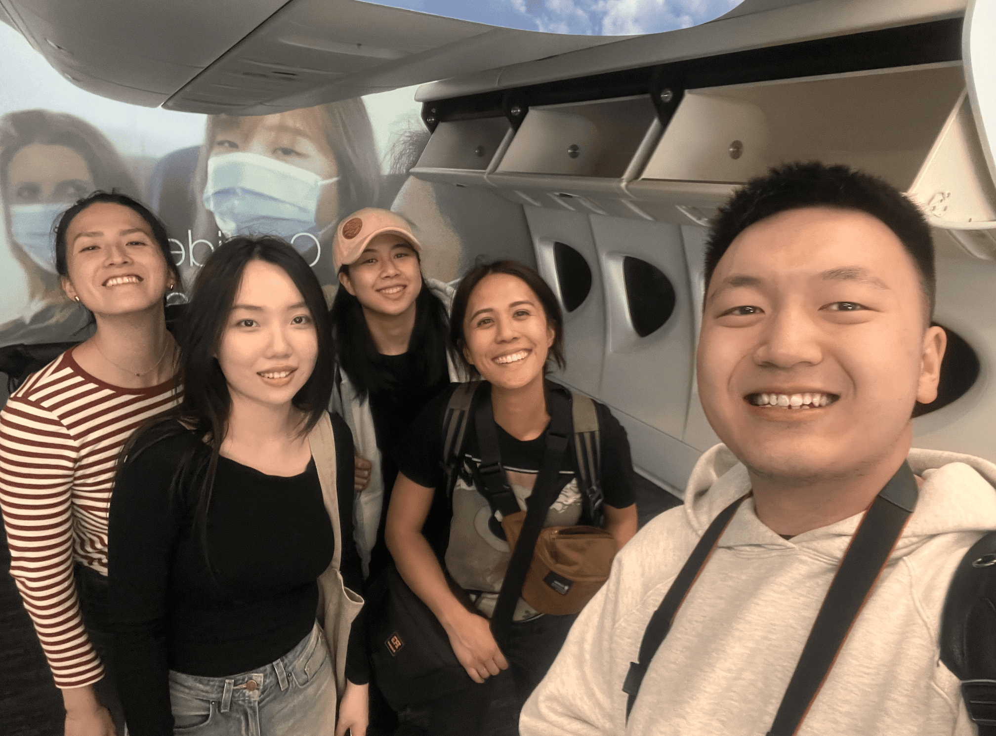
Team Captcha (left to right): Emily Shu, Zoe Zuo, Carista Eliani, Veneza Yuzon, Larry Tian