Taisk
TAISK
A task management AI system that helps people with cognitive disability in managing their schedules and tasks to reduce cognitive load.
A task management AI system that helps people with cognitive disability to manage their schedules and tasks to reduce cognitive load
/Accessibiltiy Design +
Co-Design
/Accessibiltiy Design +
Co-Design
TIMELINE
8 weeks
ROLES
Lead Product Designer
UX Researcher
Prototyper
ADVISOR
Sarah Coppola
Sourojit Ghosh
TEAM
3 Designers
1 Researcher
OVERVIEW
Over the course of 8 weeks, the team designed an AI-powered work management system to help an engaged community member who is dealing with PVC-related cognitive difficulties in handling his weekly tasks and meeting responsibilities.
MY ROLE
As the UX designer lead, I was responsible for planning user research, conducting on-site observations, co-moderating user interviews and co-design sessions, and leading the design and prototyping process to address our participant's interdisciplinary challenges caused by his disabilities.
Design Report
Participant Background
The project is designed for a specific participant who faces various challenges associated with his disabilities.
Emotional Value
Wants to be independent and have control over daily decisions
Symptoms
Easy to forget about upcoming events and tasks; hard to move around and carry his physical notes with him
Occasions
Community service meetings, family events, doctor appointments, friends gatherings
Medium
Prefers to work and meet people at his dining table for ease of mobility
DESIGN
Features
User Flow
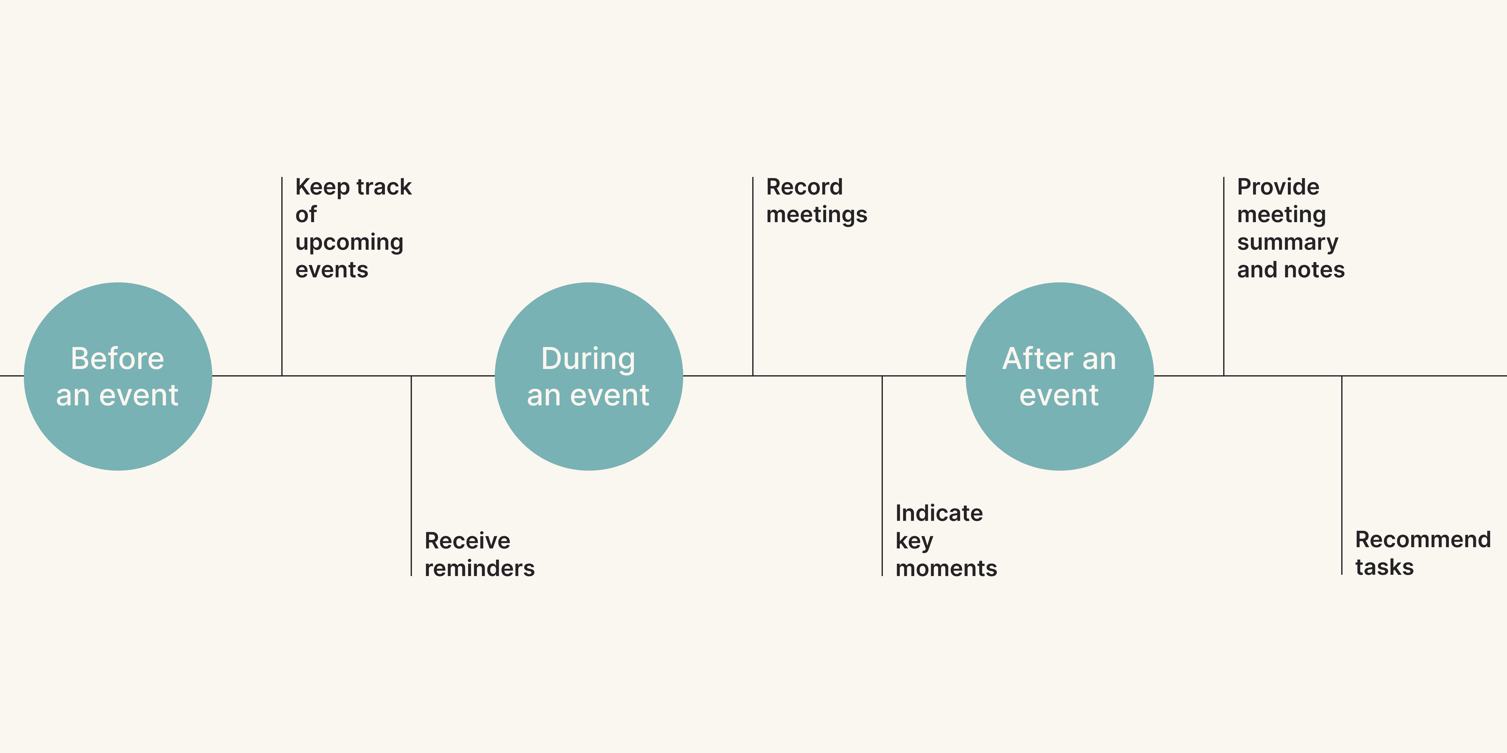
Overall, our design touches on 3 different touch-points.

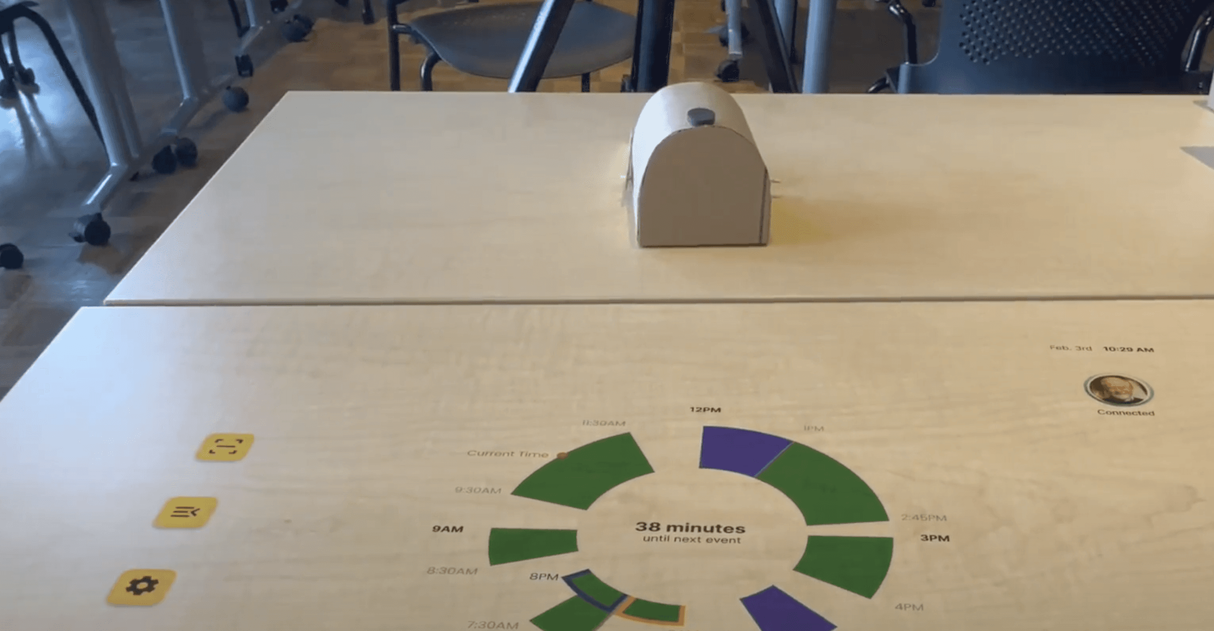
Portable tabletop projector
A tabletop projector that can be easily set up and removed on a dining table when needed.

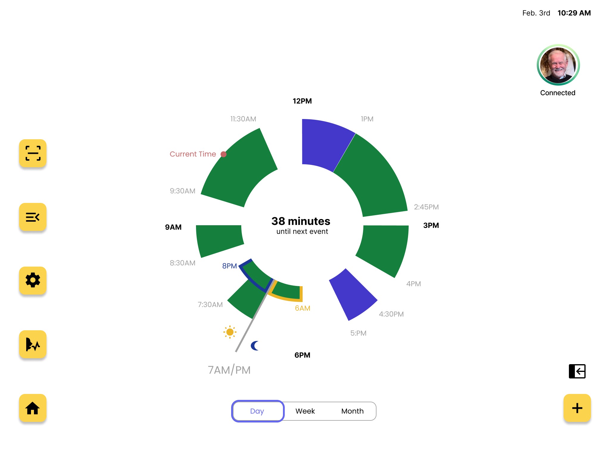
A simplified view of daily events to reduce cognitive load
Users can quickly grasp their schedule with a circular pie graph that displays the upcoming events in a clock format.

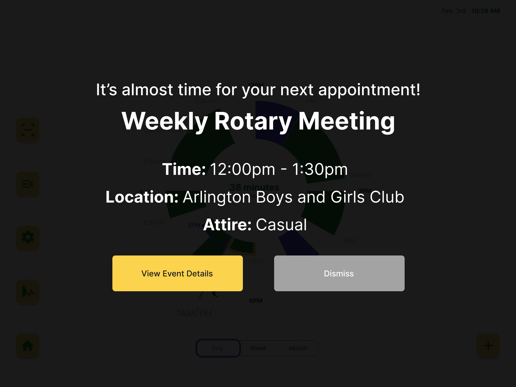
"In Your Face" Event Reminder
Proactive, timely, and unmissable notifications for upcoming events and tasks.

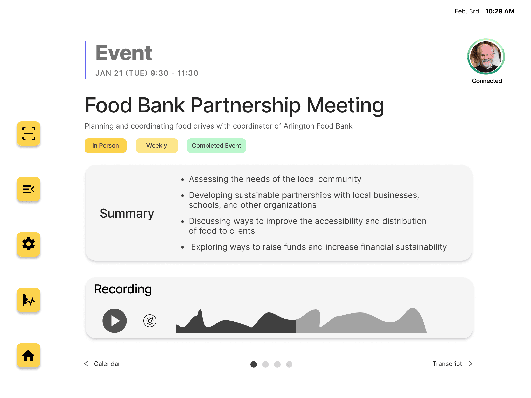
AI-Summarized Event Details to avoid surprises
Provide an event summarization page that highlights key events, recommends tasks, and displays upcoming meetings to allow users to focus on important information.
Feature 2 - AI-summarized event details to avoid surprises
Extracting and highlighting the key points of events, tasks, and meetings, allowing users to focus on essential information.

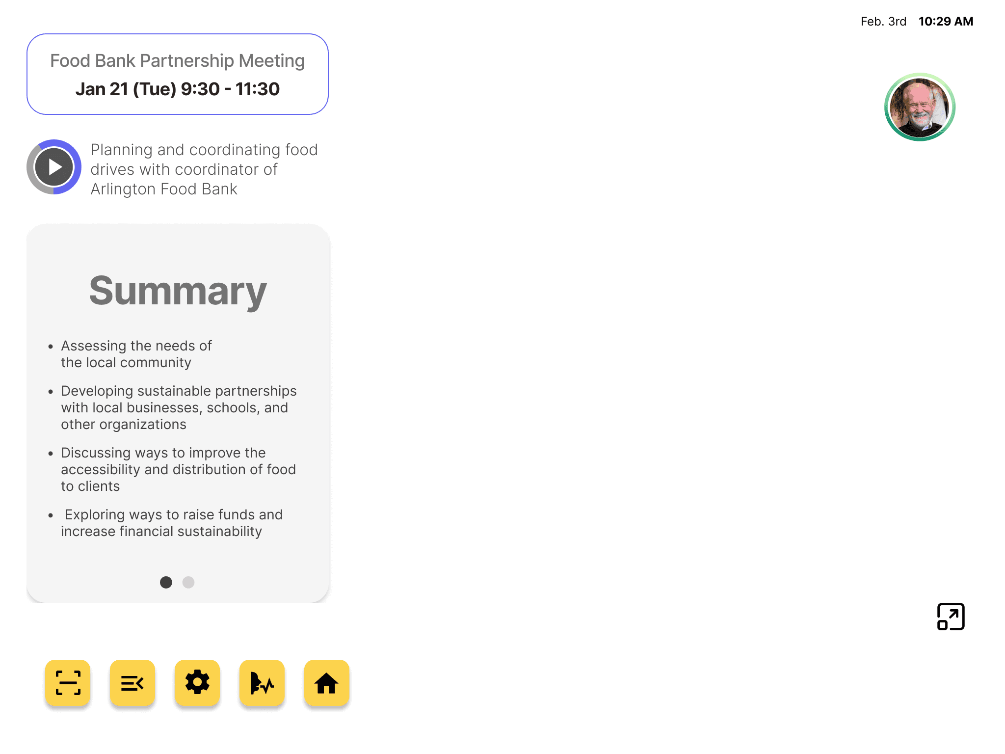
Clean Mode for better tabletop access
A clutter-free display option that retains only essential information, allowing users to still have room working with other devices.

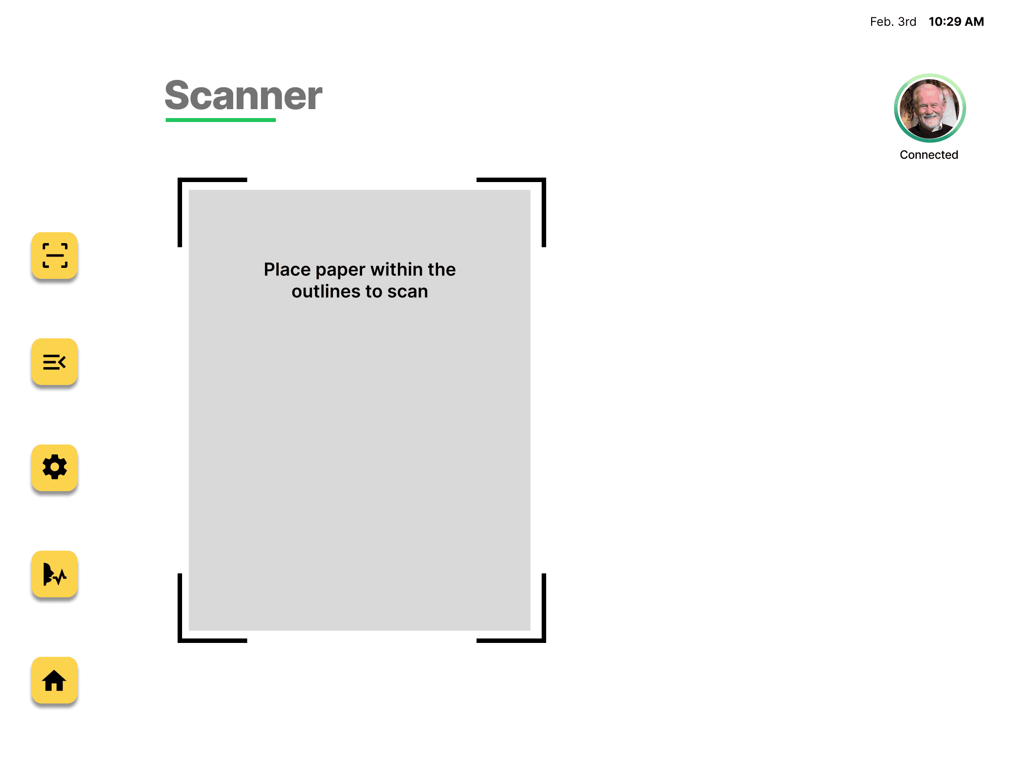
Document scanner for easy digitization
Instant digitalization of paper documents, streamlining storage and access.

Please look on a tablet or desktop for the most optimal user experience!
OVERALL DESIGN PROCESS
An inclusive design process centered on one participant with interdisciplinary challenges


BACKGROUND
A participatory design project addressing cognitive challenges
In an Accessibility and Inclusive Design course, our group worked on a participatory design project with a participant who faced mobility challenges due to the loss of his feet's bottoms from sepsis. He also dealt with cognitive difficulties caused by premature ventricular contractions (PVCs) and age-related cognitive decline, leading to memory impairments.
HYPOTHESIS
Assume that our participant's difficulties are primarily caused by his physical disability
Based on the participant's abilities, we assumed he had many unmet needs, the most significant of which were his physical disability and wheelchair dependence. We also assumed that his multiple disabilities required daily assistance from family and friends, which could have an impact on his relationships with them.
INTRODUCTORY MEETING
Use introductory meeting to establish trust and respect for inclusive design
We conducted an introductory meeting with our participant to clarify our design goals and understand how he expresses his disabilities in his own terms to foster an inclusive design process. We also took the opportunity to inform him about the scope of his participation, ensuring his comfort and obtaining his consent for documenting the process.
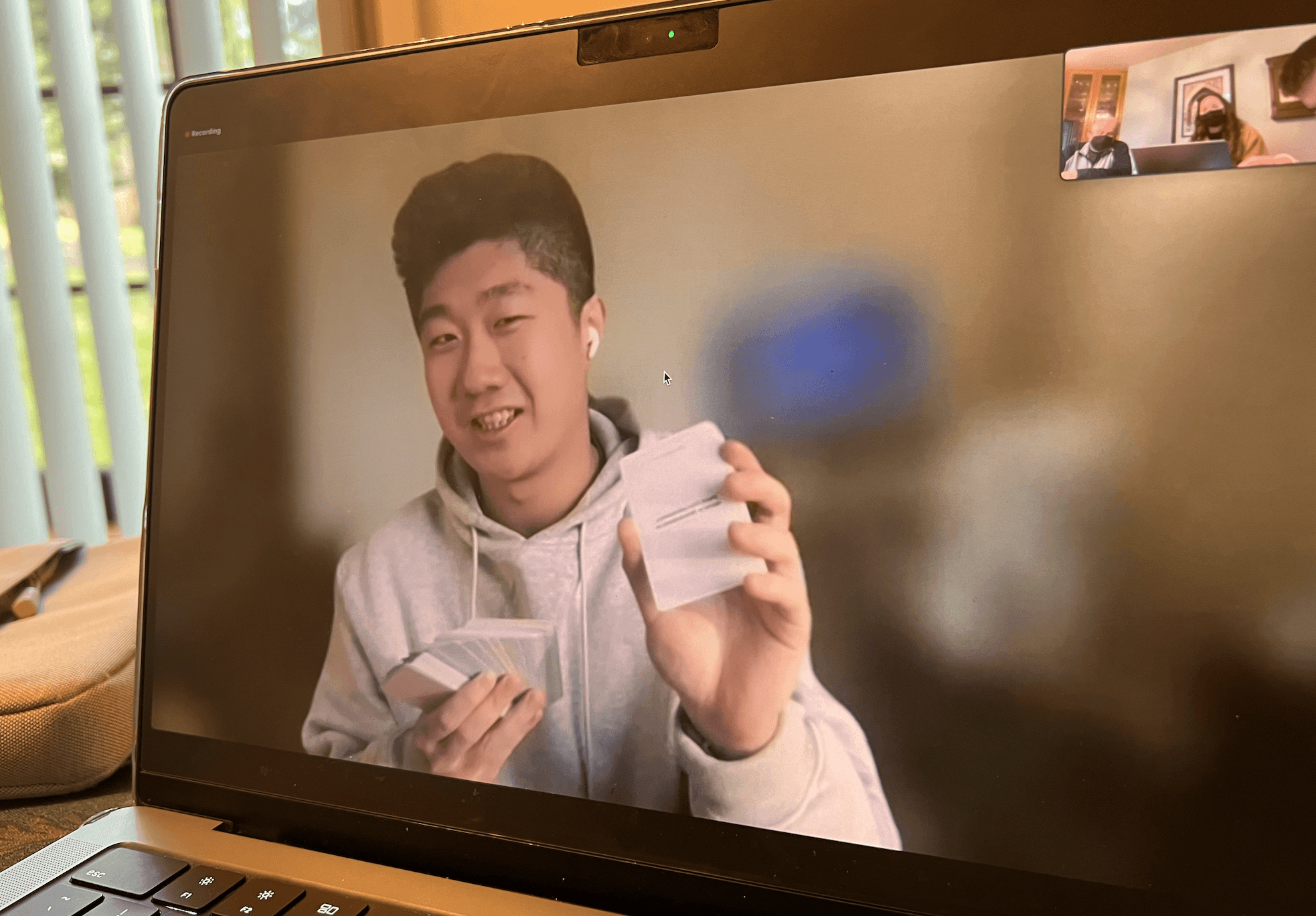
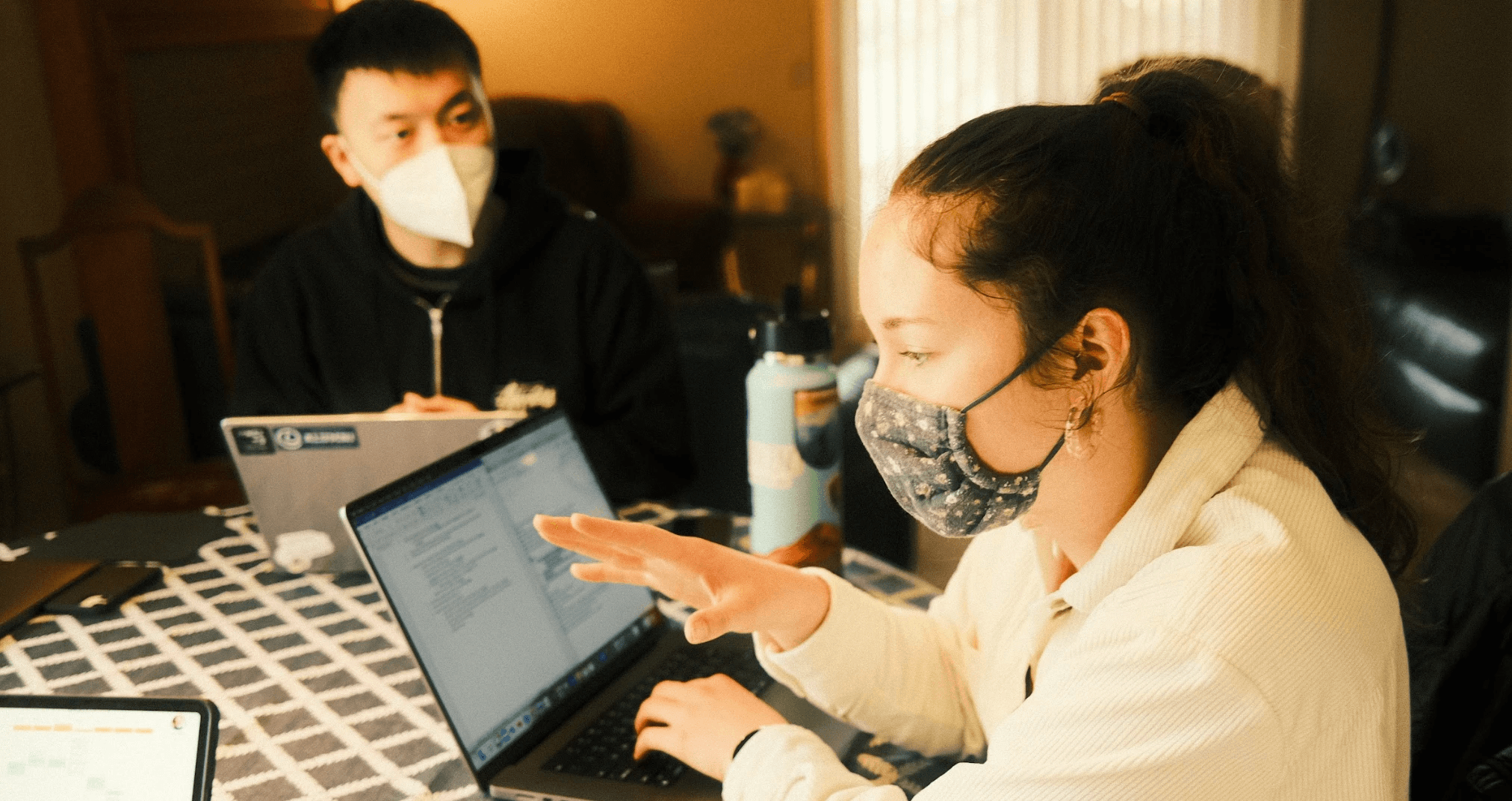
The team used Table Topic Cards as an icebreaker tool to introduce ourselves
USER INTERVIEW & OBSERVATION
Evaluate hypothesis and take context into consideration
We conducted a semi-structured interview at the participant's home to gain findings into his challenges and validate our assumptions. I was responsible for planning the session guide, co-moderating the interview, observing the participant, and documenting.
Disclaimer: All photos and videos in this case study were taken with participants' consent.
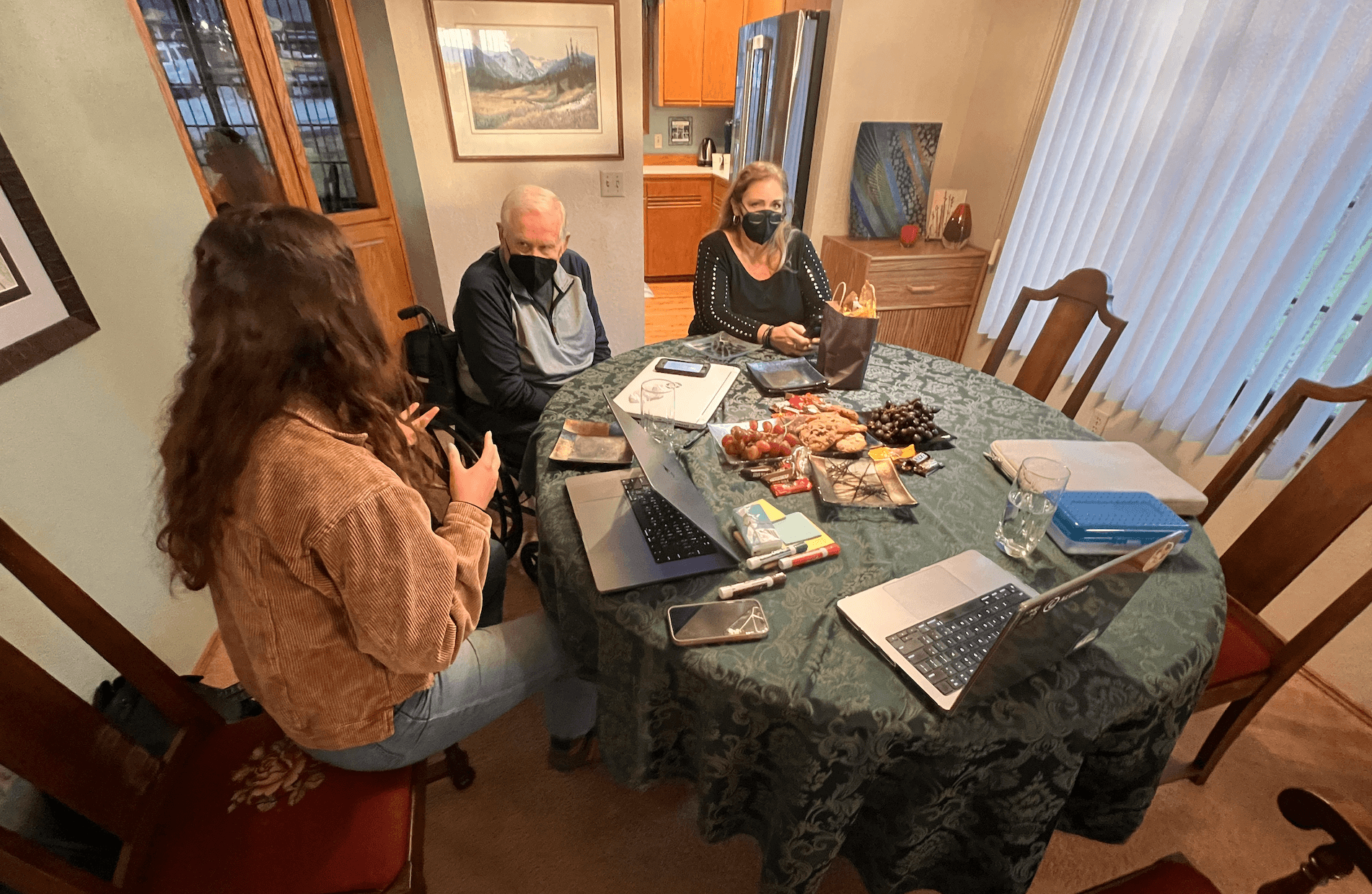

My teammate and I conducted the interview at our participant's house
FINDINGS
Change our focus to cognitive load instead of physical disability
Even though our participant mentioned a few physical challenges in his multi-floor home, he prioritized having something that would remind him of upcoming tasks and keep track of his schedule because he frequently forgets about a few "surprises" on his calendar.
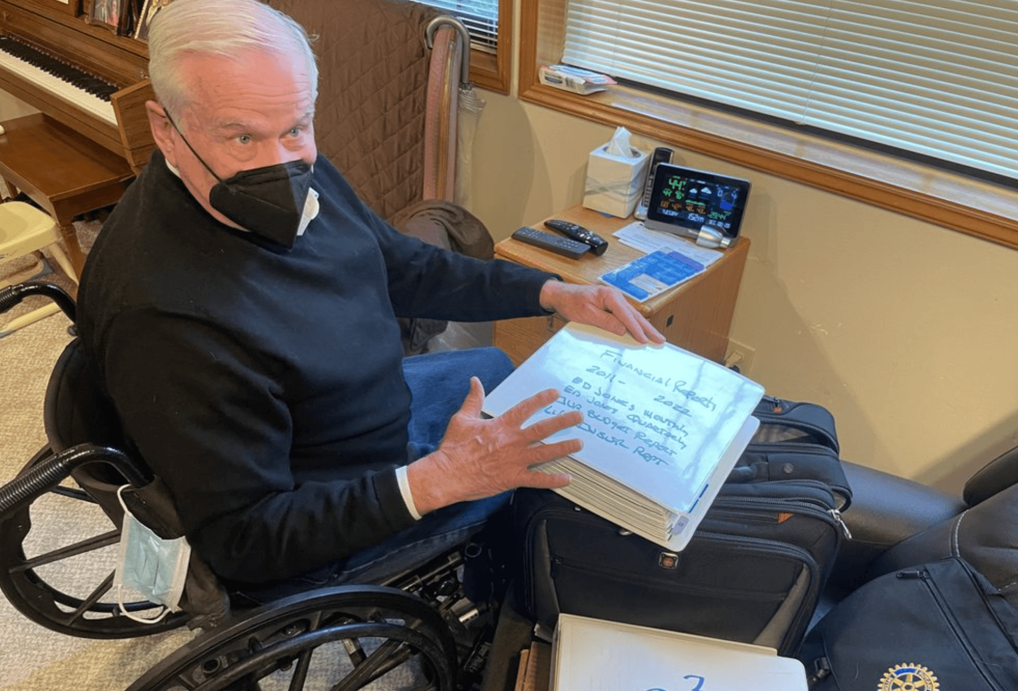

The participant demonstrating how tiring it could be when attending meetings since he organizes his notes physically
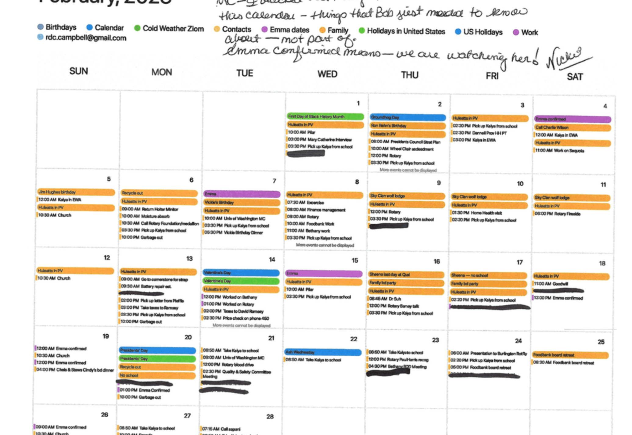

Our participant showed us the tools he used to manage his schedule
The participant relies on verbal reminders due to his impaired memory retention
The participant wants to digitize his schedule and tasks
The participant was familiar with technology
Family plays an important role in the participant's life
Design Challenge
How might we help people with PVC in keeping track of their schedules and tasks so they can be prepared for their events without surprises?
IDEATION
Employ co-design as a strategy for inclusive design
Overall, the team categorized 20+ ideas. Instead of narrowing down ideas ourselves, the team decided to co-design with our participant to incorporate his feedback into our design decisions.
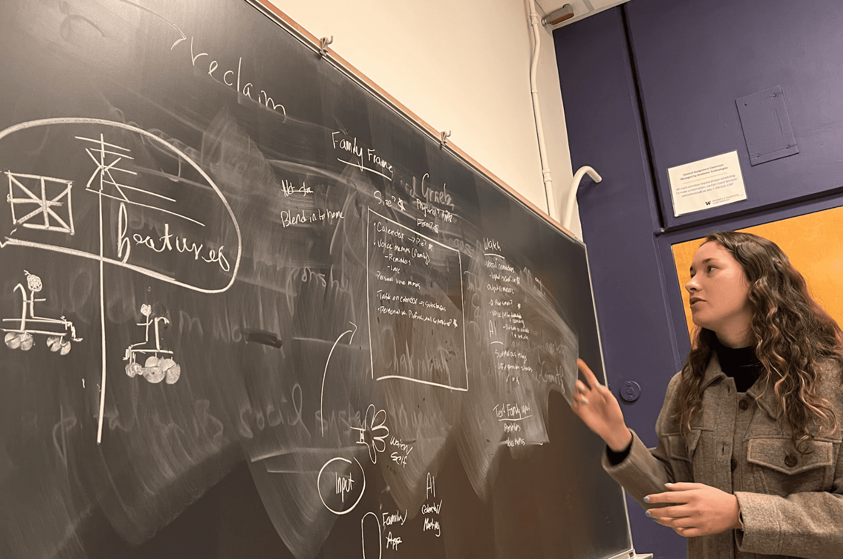

My team brainstorming about potential features
CO-DESIGN
Design an AI-powered tabletop task management tool based on participant preferences
In our co-design process, we employed a "build your own pizza" approach to explore different combinations of ideas based on participant preferences. This helped us to incorporate participant preferences and concluded that developing a tabletop AI-based task management system would best suit our participant's needs.
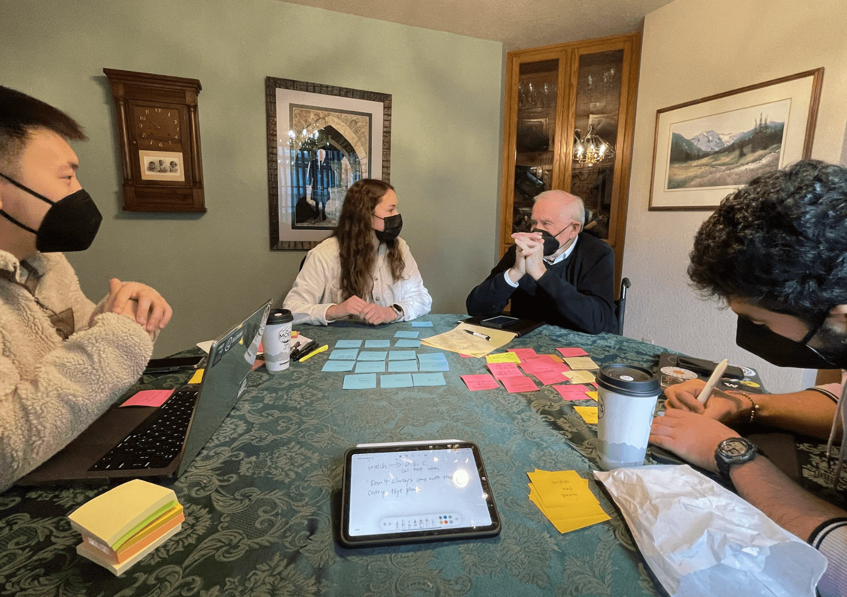

Participant providing feedback during co-design session
PROTOTYPING
Create various prototypes to communicate the design
I designed wireframes and low-fidelity prototypes and oversaw the development of prototype interfaces. I also proposed using a video prototype for our final prototype to effectively showcase the user experience and interactions.
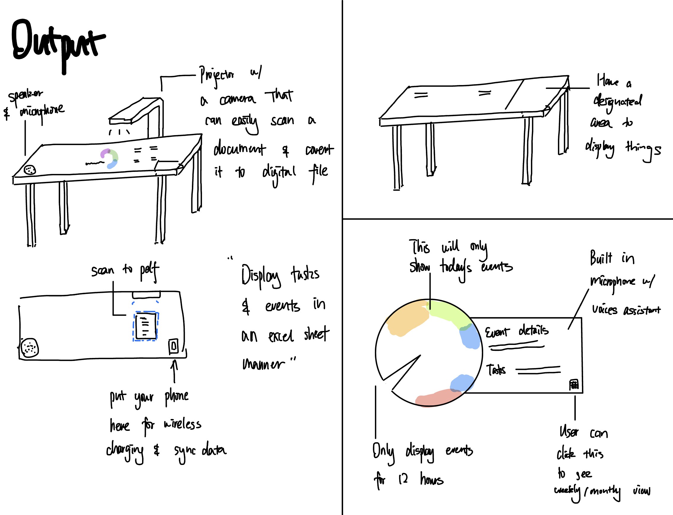

I made wireframe sketches to communicate design direction to the team
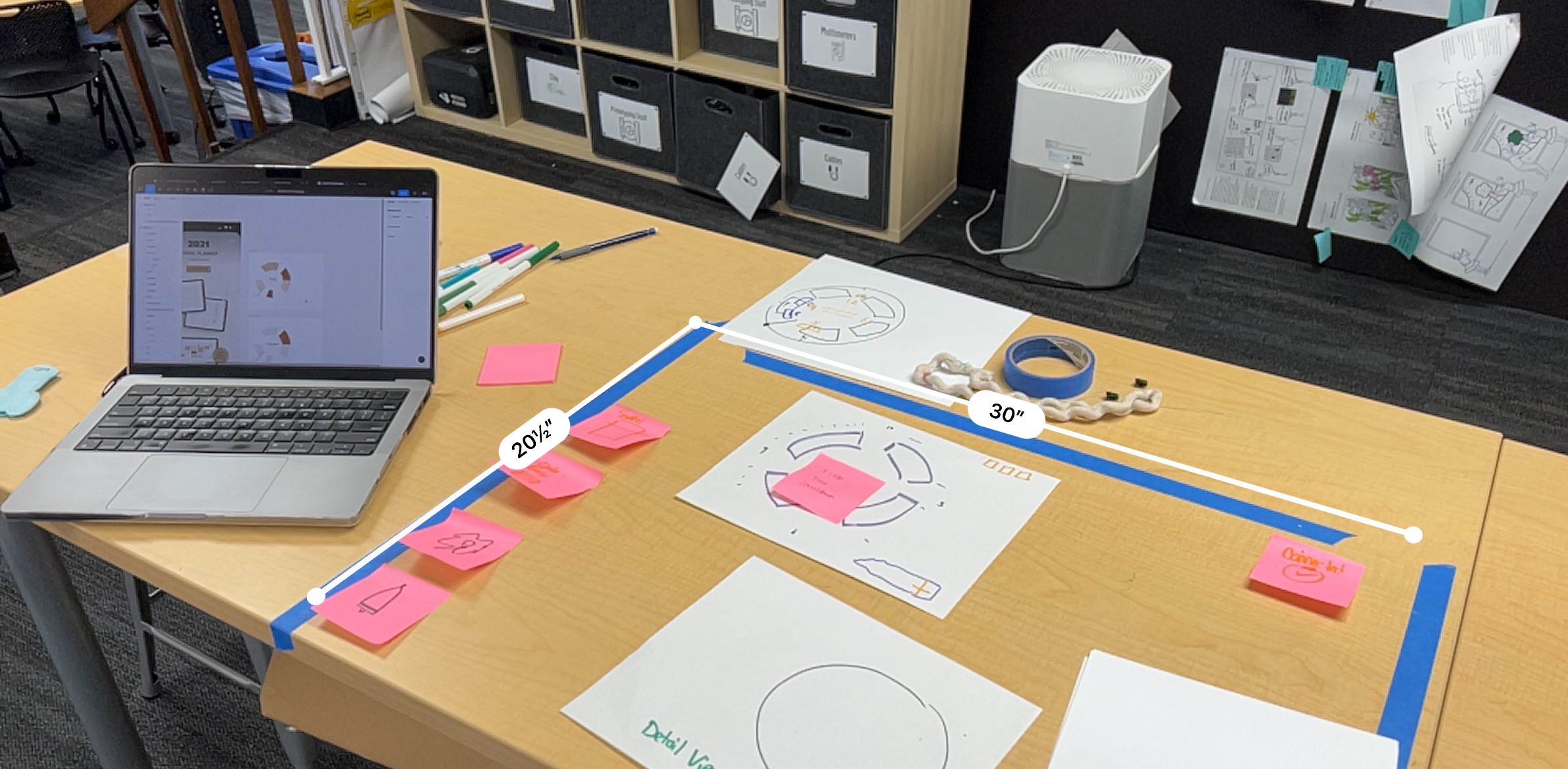

We measured the tabletop to match with the screen size on Figma so everything could be combined into a video prototype
USER TESTING
Assess the effectiveness of our design
We conducted a usability testing session with our participant and gathered valuable feedback for future improvements. In this process, I was responsible for organizing the session, moderating the interview, and documenting the participant's feedback and areas for further enhancement.
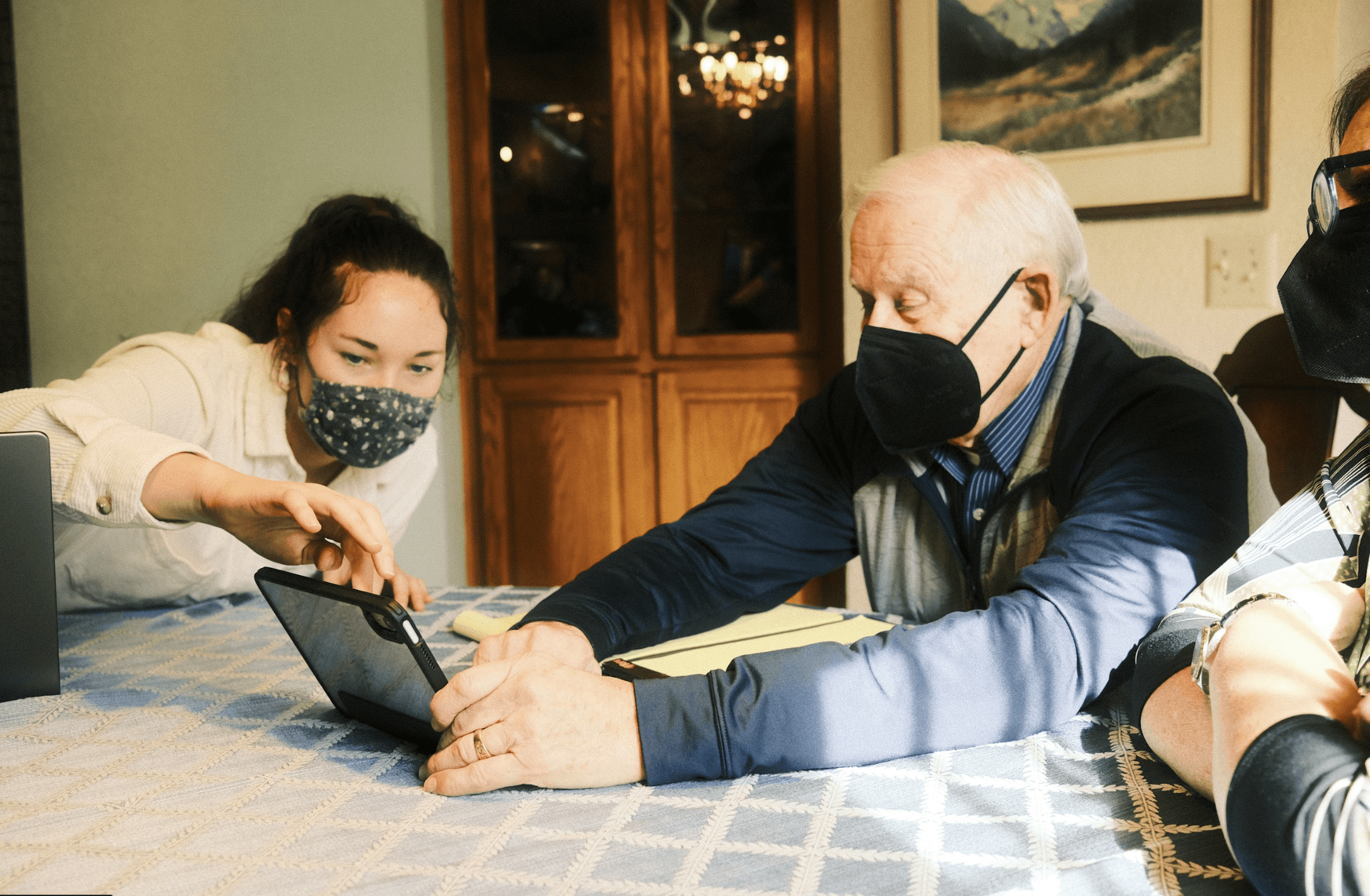

My teammate showcasing our video prototype
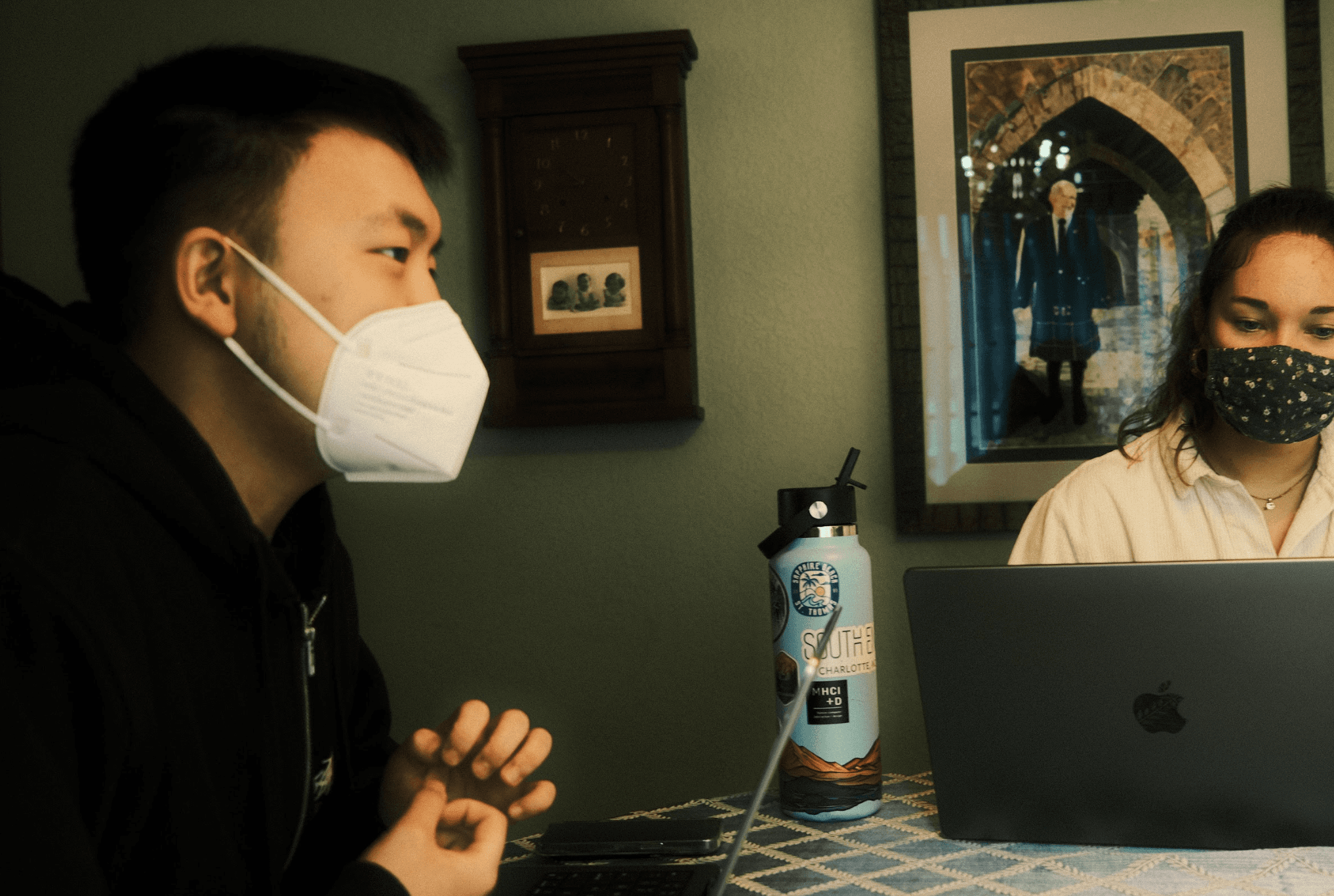

I co-moderated the session and asked follow up questions
RECOMMENDATIONS
Prioritize clarity over simplicity
We chose simplicity over clarity to avoid information overload, but some designs lacked visual/physical feedback, which worried the participant that he would forget those different functionality. We should add more feedback and labels to better indicate functionality in our next iteration.
Icons without labels caused confusion
Family members should be included in the design
Accuracy concerns can arise when it comes to AI
Consider "search" as an important feature for better navigation
DESIGN IMPACT
A design that addresses interdisciplinary challenges
The participant found our design solution satisfying, as it has the potential to simplify task scheduling and reduce cognitive load. He valued our consideration of his suggestions, which resulted in a well-rounded product that addressed his interdisciplinary challenges.
GENERALIZABILITY
Solve for One, Extend to Many
Following Microsoft's Inclusive Design Principles of "Solve for One, Extend to Many," our design demonstrates benefits for seniors, individuals with ADHD, Dyslexia, and Dysgraphia. We recognize that our product requires more adaptation and inclusion, and that additional co-design processes and iterations are required to address the communities we ignored.
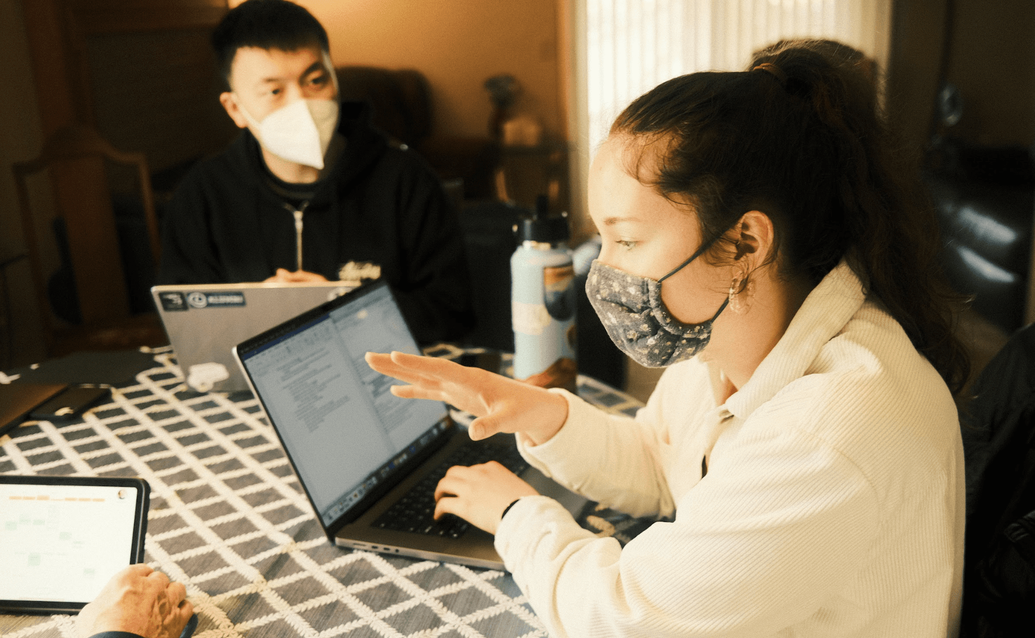

My teammate explaining how our design could be used in different ways
REFLECTIONS
Use ability-based design to address accessibility
This project showed me that design is not always linear and that sketching low-fi prototypes may not be the best way to test ideas. Co-design and "build your own pizza" helped us prioritize participant preferences, eliminate unsuitable ideas, and maintain a user-centric design approach without assumptions. If given a chance, I would give the co-design session more time for on-the-spot iteration and prototype sketching with participants.
I also discovered that accessibility design extends beyond addressing physical disabilities, which caused me to reconsider its scope. I also learned that the most effective approach is to understand individual's needs and design for their interdisciplinary abilities rather than seeking one-size-fits-all solutions.
Lastly, as we approached the participant with our assumption of focusing on his physical disability, we discovered how his cognitive disability affected his desire to remember things. This experience taught me the value of ability-based design, shifting the focus from disability to individual abilities.
ACKNOWLEDGEMENT
I'd like to thank all of my teammates and the faculty for providing constructive feedback that allowed us to progress. I'd also want to thank our participants for their support and willingness to participate in our project. I couldn't have done it without them <3.
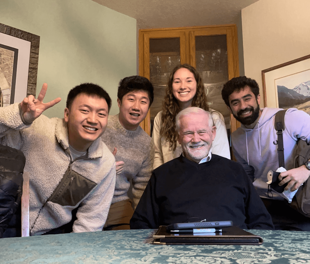

My team (left to right): Larry Tian, Dave Cai, Mary Catherine Meno, Our participant, Ribhav Dihgra