Luminance
Luminance
A finance management tool that challenges fast-spending culture in order to nurture mindful financial habits
/Product design + Experience design
/Product design + Experience design
TIMELINE
20 weeks
ROLES
Product Designer
Visual Designer
User Researcher
ADVISOR
Holly Hirzel
Axel Roesler
Scott Ichikawa
TEAM
3 Designers
OVERVIEW
Over the course of 20 weeks, the team found that many young adults prioritize the present over retirement planning, so we designed a finance management tool that nurtures reflective financial habits, allowing young adults to better balance their saving and spending.
MY ROLE
As the UX designer, I planned and conducted user research, including literature reviews, cultural probes, competitor analysis, and user interviews. I also led the visual design, created user flows, mockups, and the design system, iterated designs by creating various storyboards, photographed the hero image, created animations, and directed/edited a video prototype to demonstrate the ideal experience.
DESIGN
Features
Main Touch-Points
Our design touches on 5 different touch-points that work together to help young adults develop good financial habits


Spending - Include resistance to prompt refections when making a purchase
By holding on the payment button, users can have time to think about what that purchase means to them so they can be more mindful of their spending.
(It may take a few seconds to load the video)
Spending - Categorize the purchase right at the moment
Users can swipe up or down to categorize their spending right at the moment as they complete the transaction, eliminating the need for future categorization.
(It may take a few seconds to load the video)
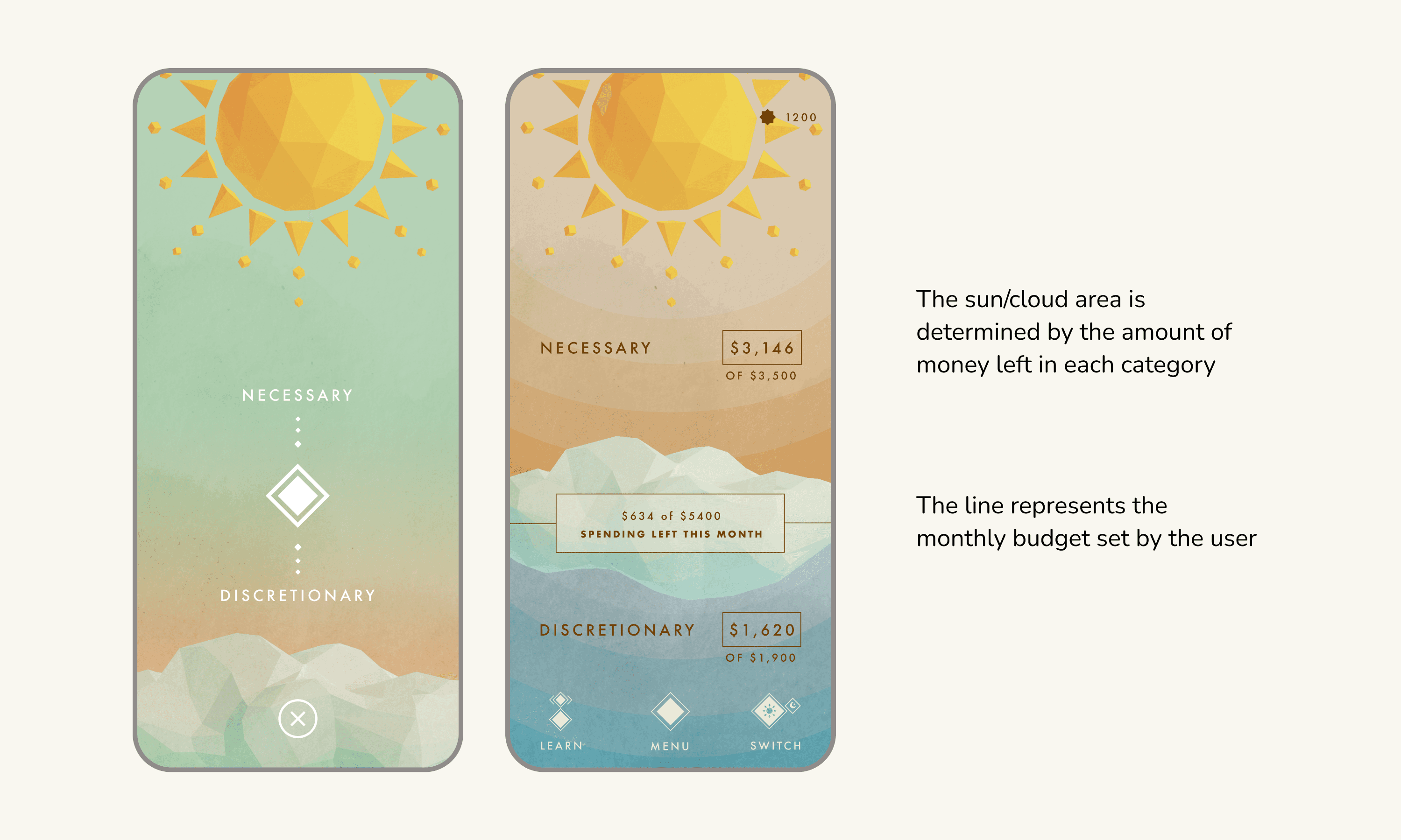
Finance Tracking - Keep track of spending with just two categories
Users can view spending breakdowns and manage finances simply in two categories—necessary and discretionary—to simplify spending tracking.

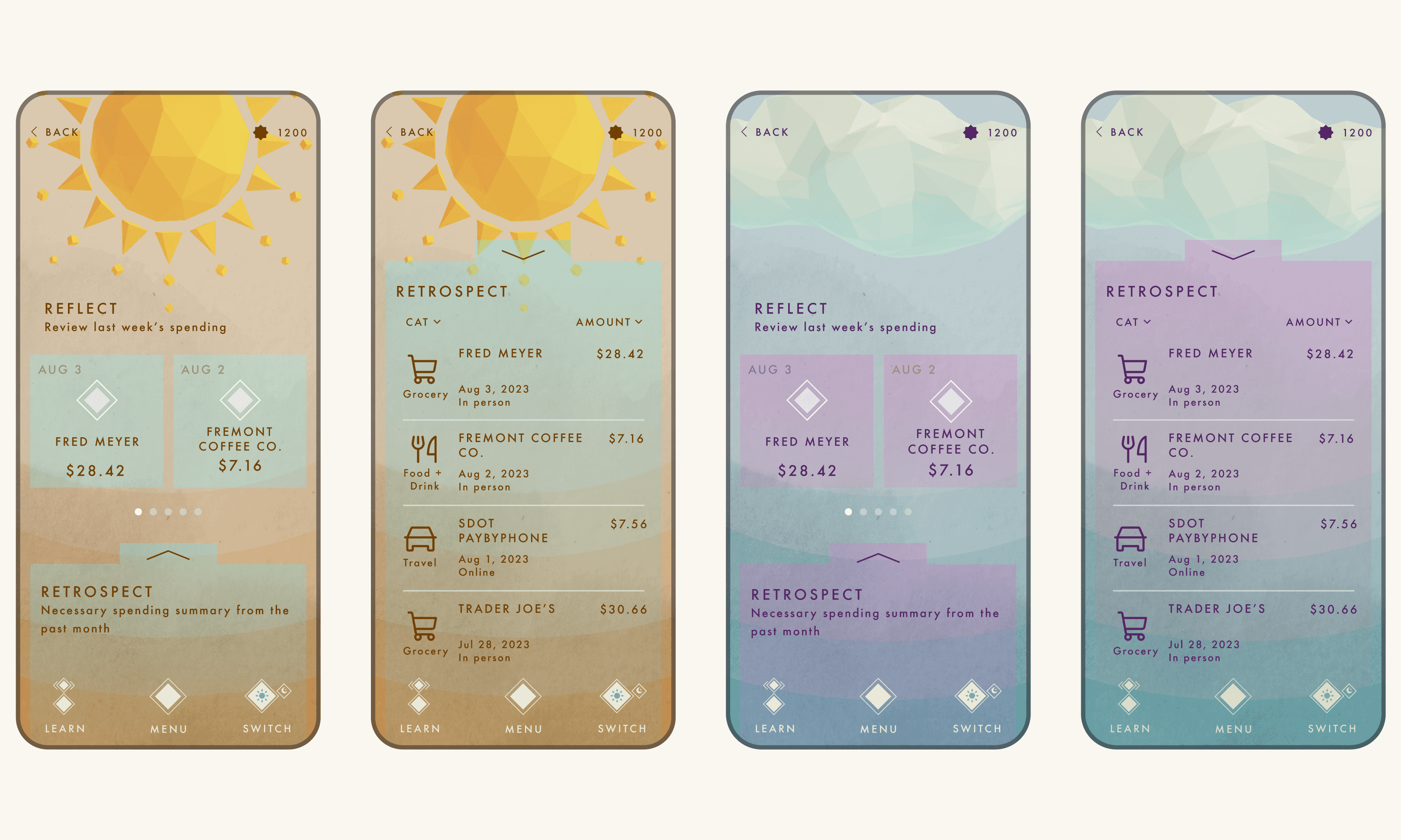
Finance Tracking - Use detailed breakdowns to support informed financial decisions.
Users can look even further into where and what they spent on, so they can better reflect and plan their future spending

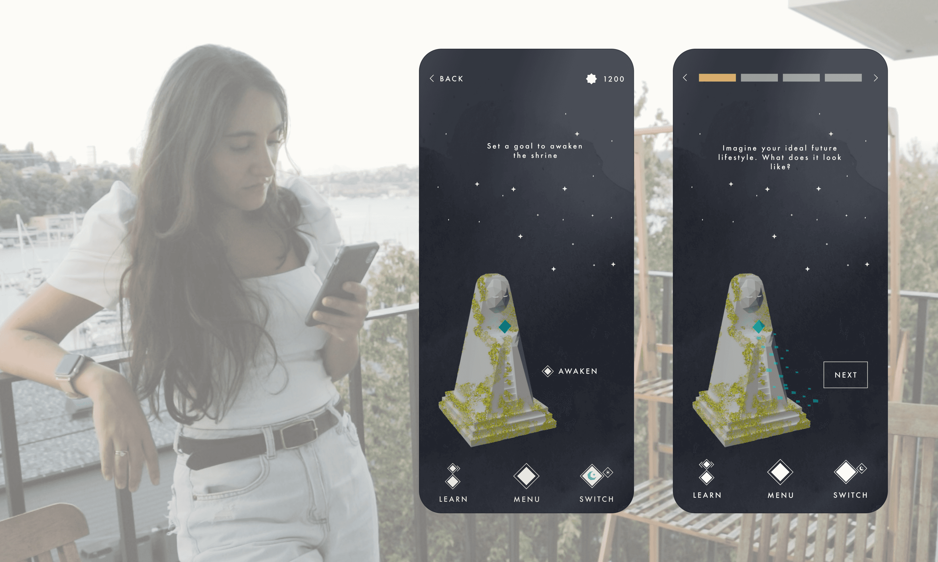
Future Envisioning - Use imagination to Contextualize the future savings goals
Imagination is used to help users visualize an ideal future lifestyle and contextualize their saving goal in order to increase their motivation to save.

Future Envisioning - Explore different opportunities based on the current savings
By navigating the future path, users can explore different things they could do with their savings in the future and better contextualize their saving goals.
(It may take a few seconds to load the video)
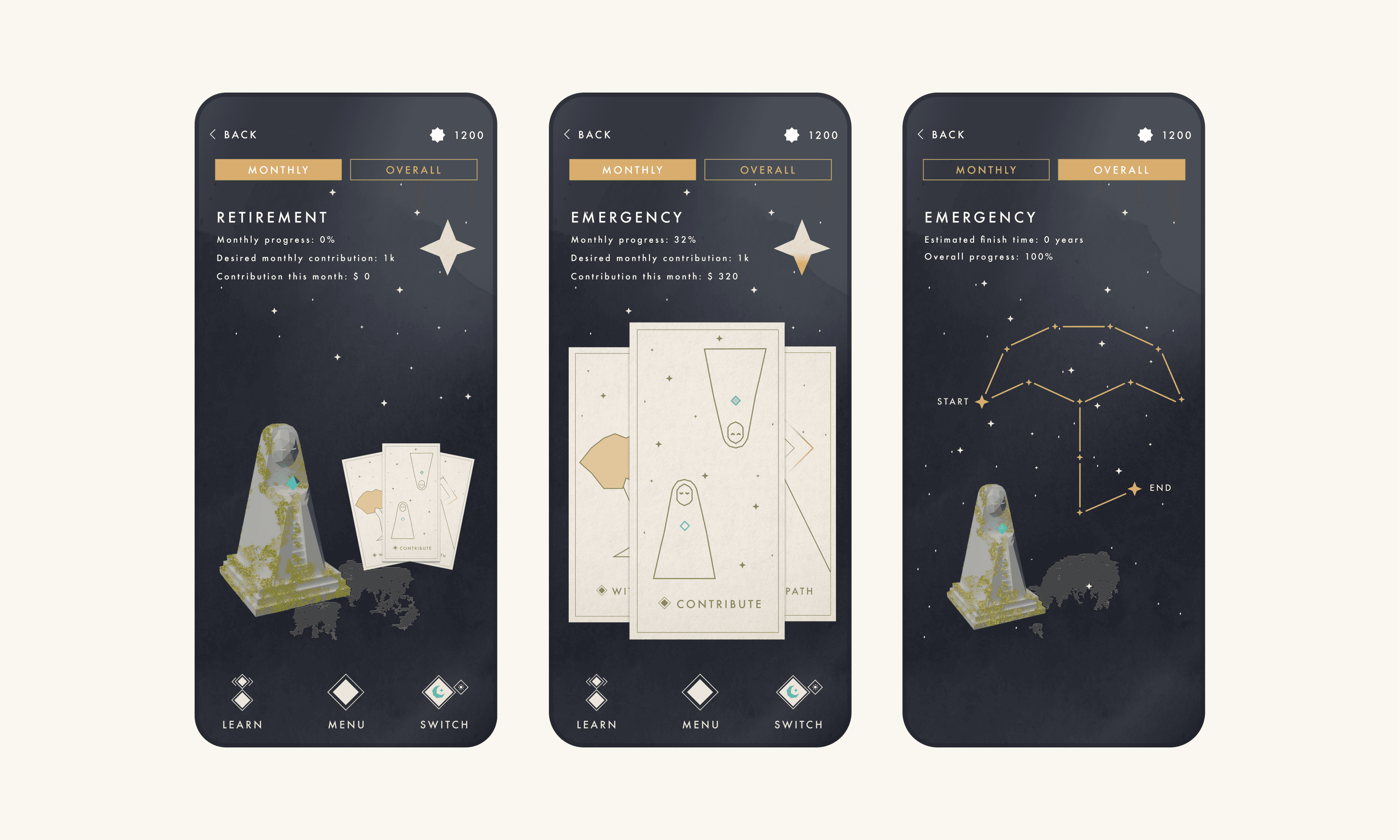
Saving - constellations are used To represent goals and guide users through Their future
Constellations are used as metaphors to represent goal progress in a step-by-step format, making long-term goals feel more achievable and motivating users to save.

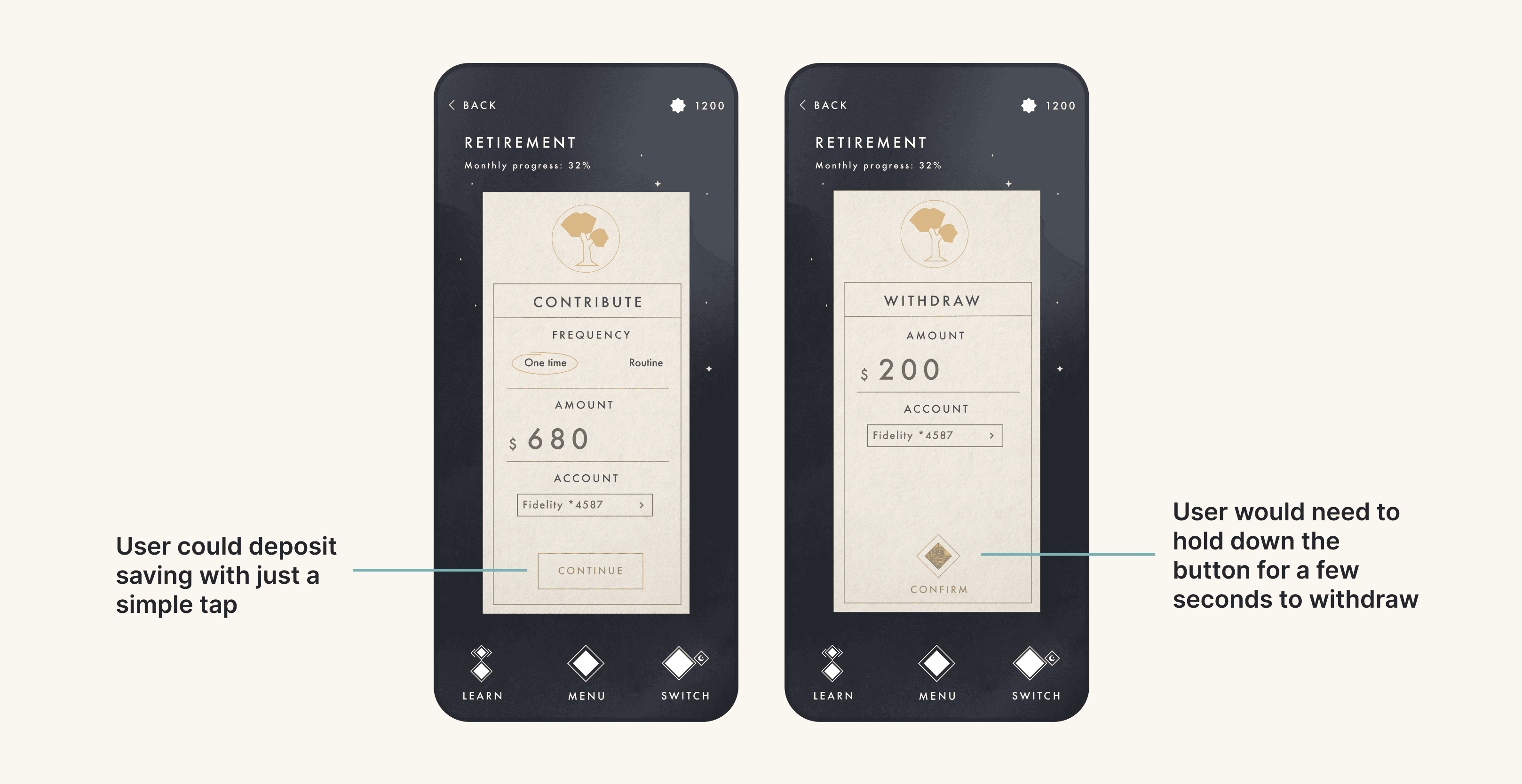
Saving - Easy to deposit, harder to withdraw
Users can easily deposit into their savings with a single tap, whereas withdrawing requires button-holding, providing a reflective pause before proceeding.

Reward - Use rewards to create a balance between spending and saving
By reviewing their spending and saving, users can earn star and use them to purchase travel rewards, allowing them to still enjoy the now and go on meaningful experiences.
(It may take a few seconds to load the video)
Please look on a tablet or desktop for the most optimal user experience!
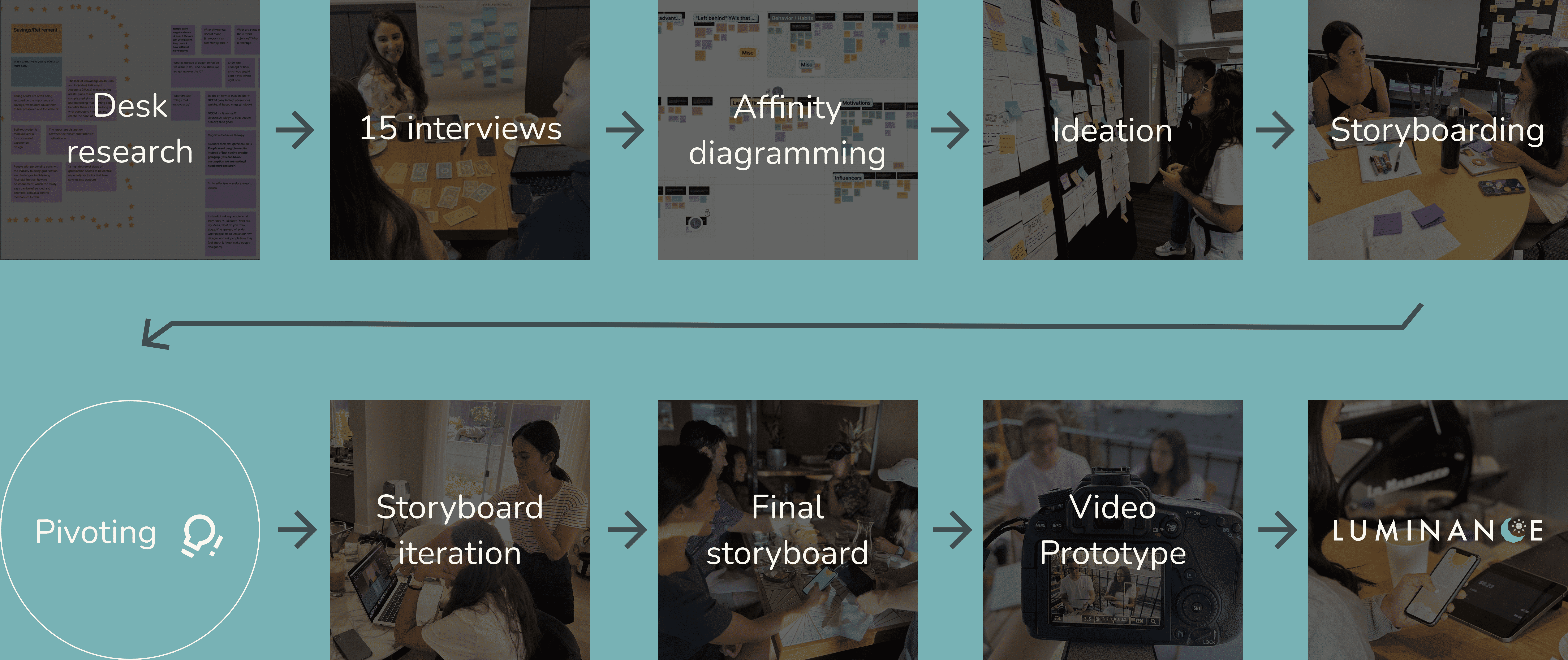
OVERALL DESIGN PROCESS
A process that is rooted in context and stories

PROBLEM SETTING
There is a retirement crisis due to the lack of household savings and early planning
A significant number of US households retire without significant wealth. While early retirement planning can alleviate this issue, it is often ignored by most young adults—66% of whom have no savings in their retirement accounts.
STAKEHOLDER MAP
Narrowing down our primary stakeholders to young adults and financial advisors
With the limited time and resources available, my teammates and I created a stakeholder map and selected financial advisors and young adults as our research focus, assuming they are the most related to and familiar with the problem space.
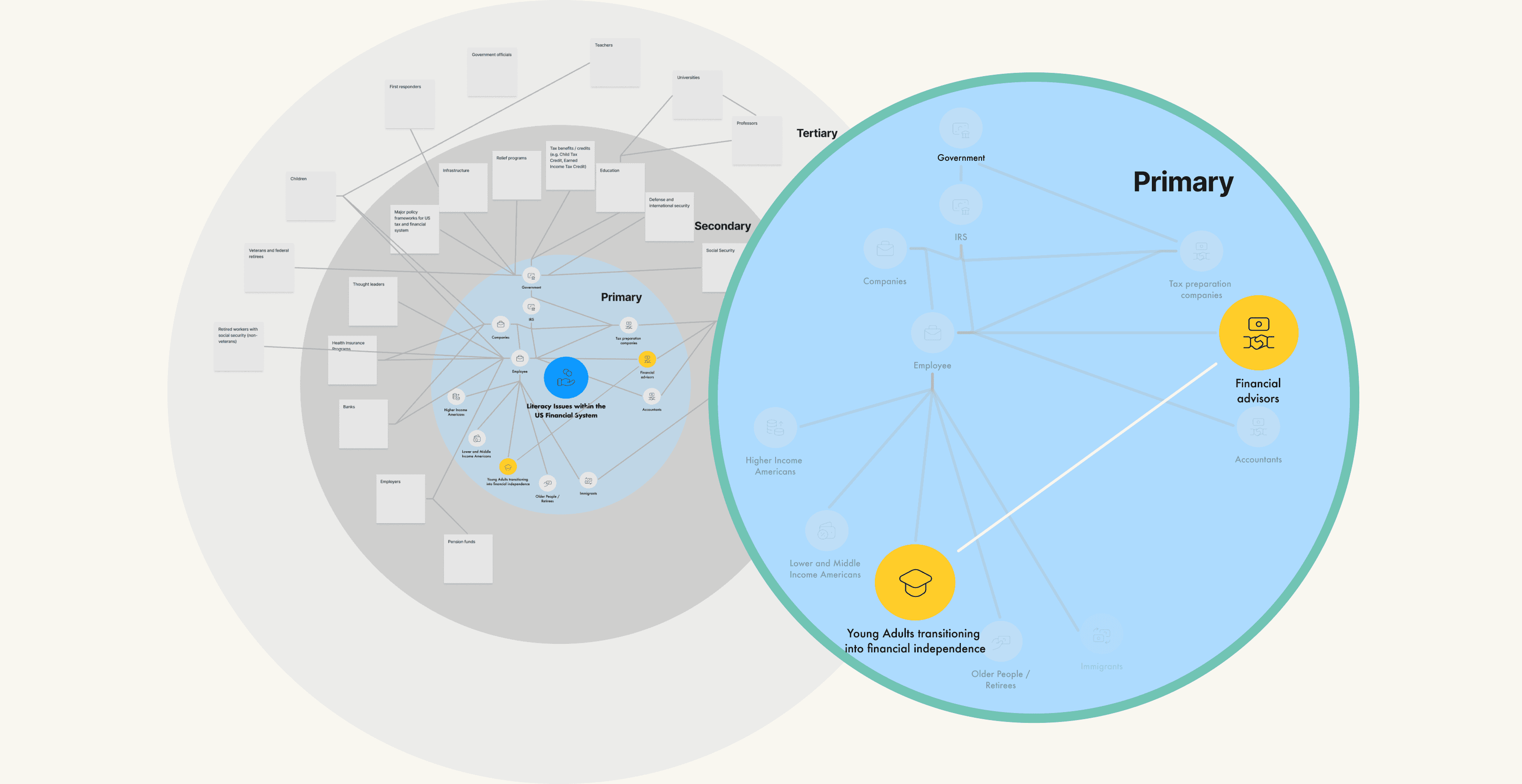

We identified all of the primary, secondary, and tertiary stakeholders, as well as their connections in our stakeholder map
RESEARCH
Identifying the issue
Based on our secondary research, we formed an assumption that young adults find finance boring and don't see the point of retirement planning because it is irrelevant to their lives.

10
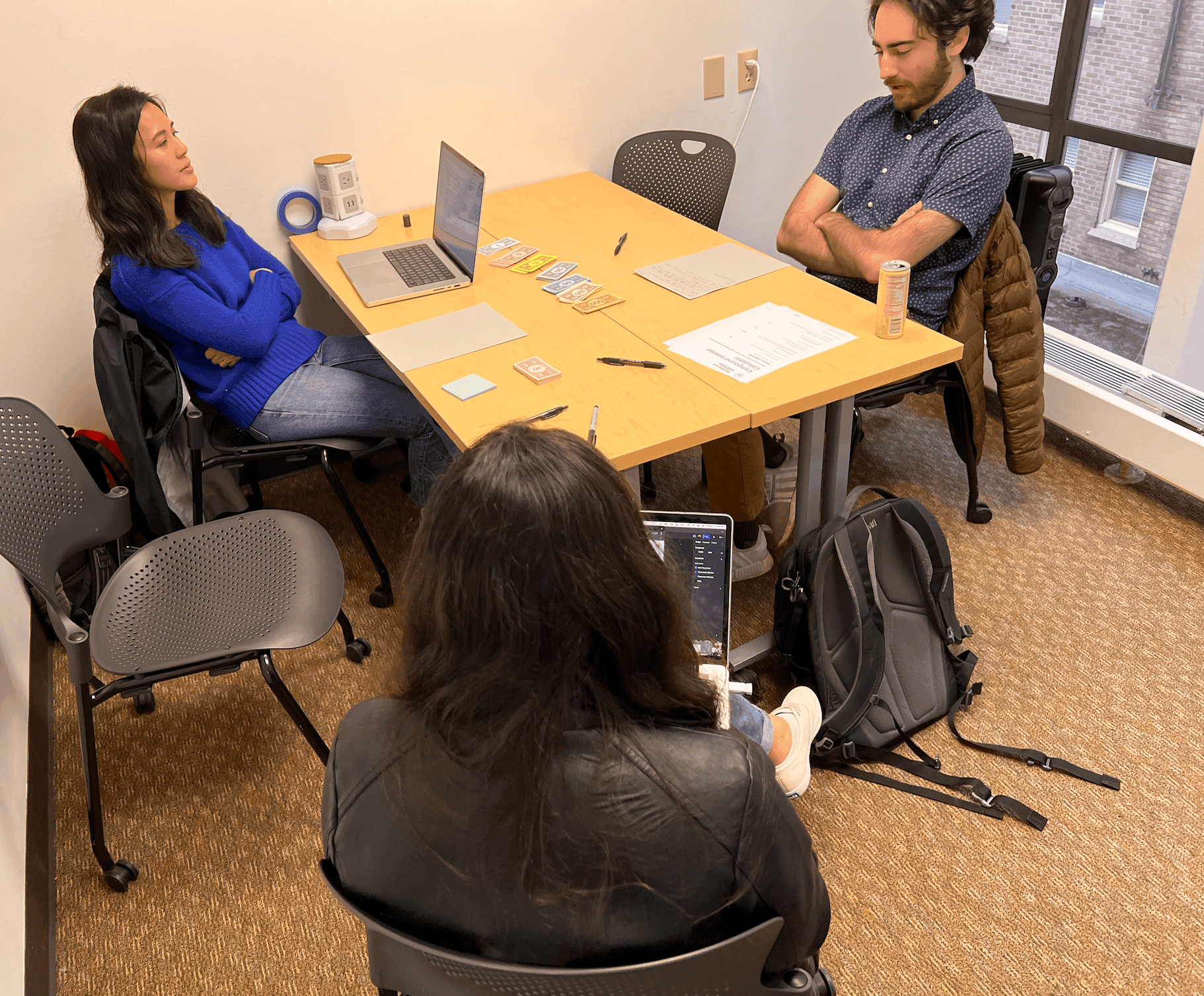
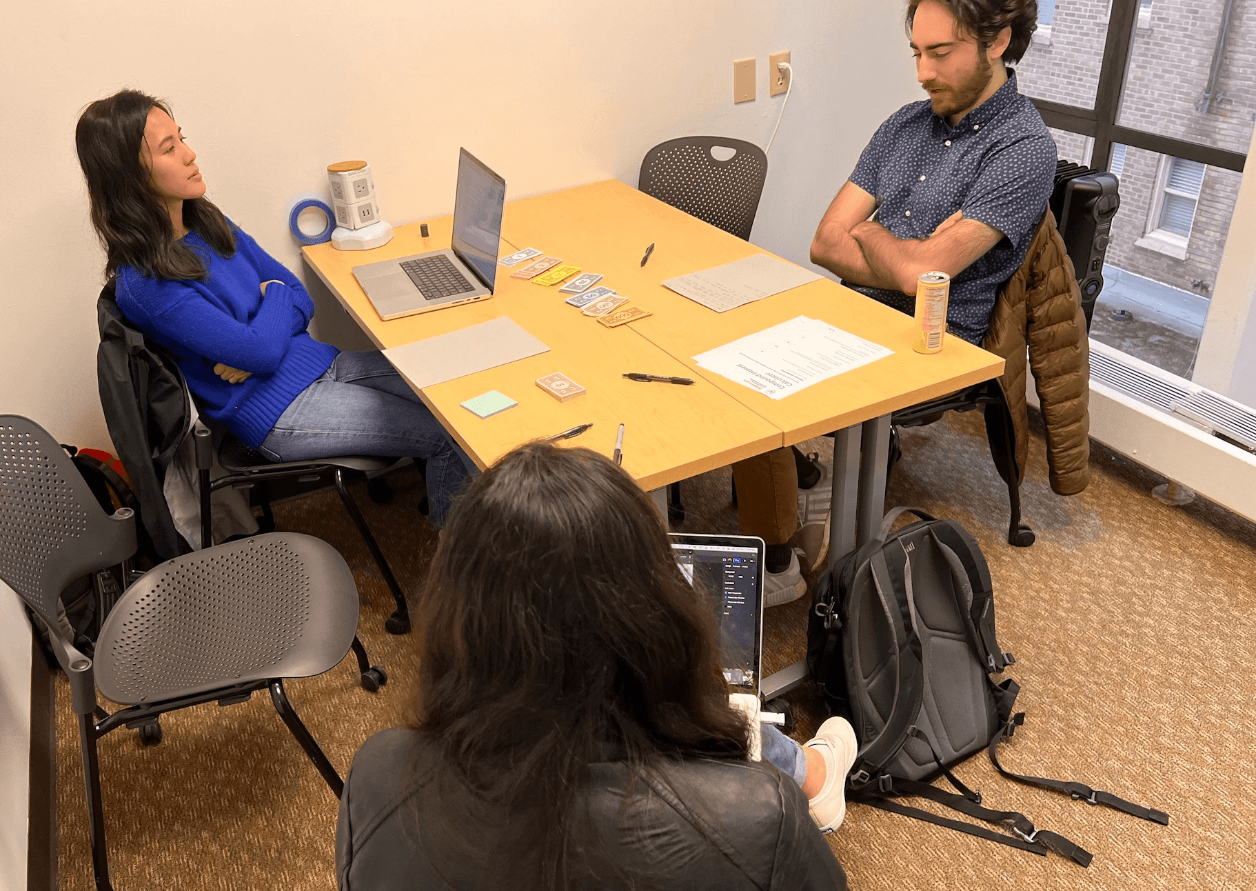
interviews with young adults + SMEs


5
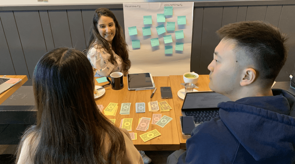
cultural probes with young adtuls


4
competing products evaluation
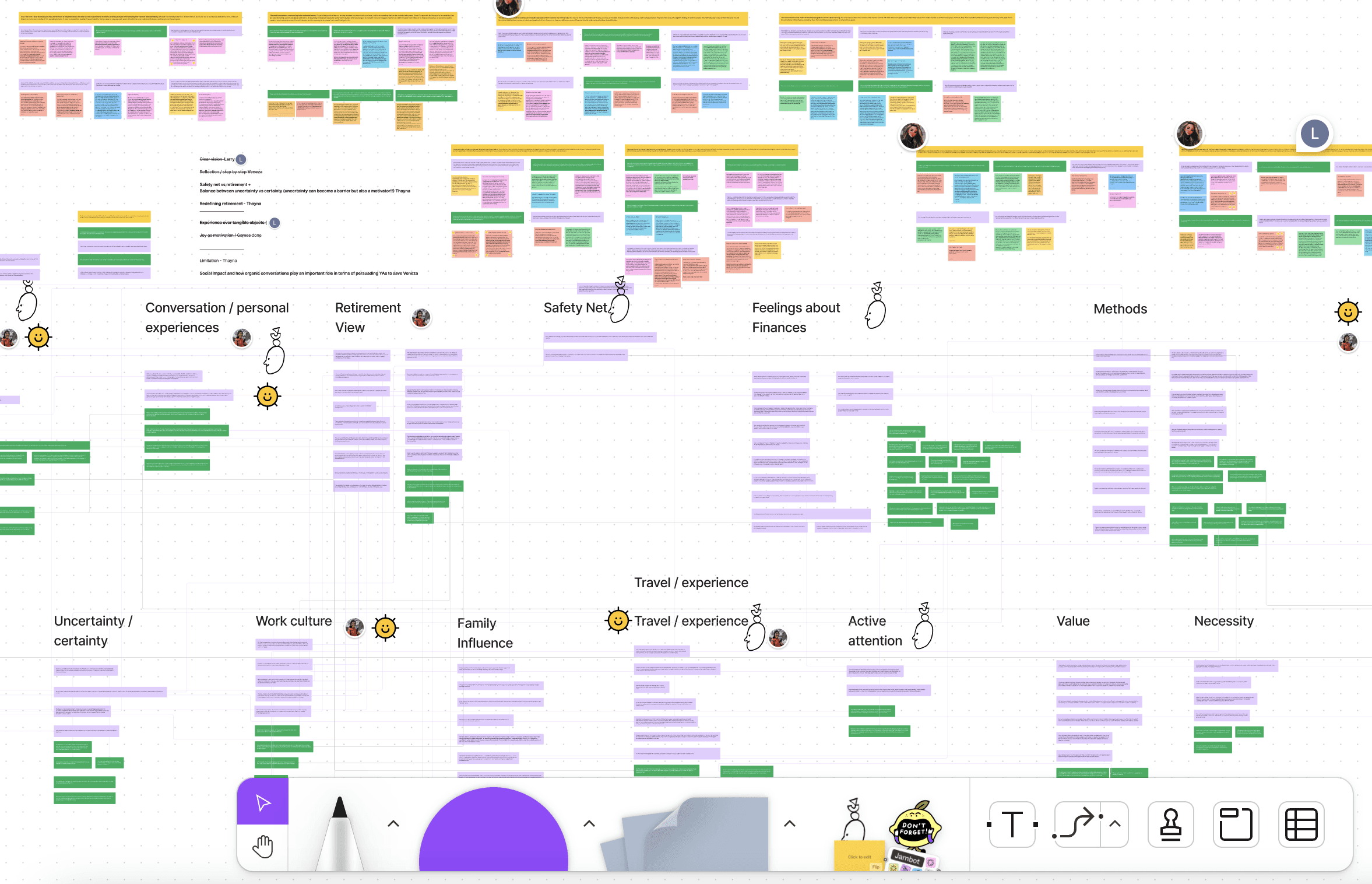


4
rounds of qual data analysis
FINDINGS
Confirming young adults' perceptions on retirement with actionable insights

Young adults often perceive saving as something that restricts their lifestyle and reduces their joy
“But now you showed me the compound interest thing maybe I'll cut some joy out of my life and get 401k, but not all the joy of my life.”
- P4 Young Adults

Young adults need to have a clear financial goal to see the value of saving and feel motivated
Young adults need to have a clear financial goal to see the value of saving and feel motivated
"[About retirement] I don't have like a really concrete sense of my goals and my desires. So it's a lot easier to get myself to do something because someone else wants it… As opposed to oh, I want to do it."
- P5 Young Adults

Associating long-term saving with future security encourages young adults to save intrinsically
"Because saving is ultimately a form of self care, you're protecting your future, you're making sure that you're not anxious in the future, you're making sure that you're well cared in case of an emergency."
- P8 Young Adults

Past and future experiences influence how young adults justify their financial decisions and behaviors
“[Travel]'s like, it's very, it's much, much more memorable. I think that's why I love (spending on) travel so much is like I love the experience and the memories you get from it.”
- P6 Young Adults
Final Research Report
Design Challenge
How might we engage young adults to change their perception about retirement and see the value of it, by viewing it as a long-term future security and building a clear vision of what that future could look like, so they can take proactive actions towards it?
IDEATION
Forming first round of ideation, 79 ideas
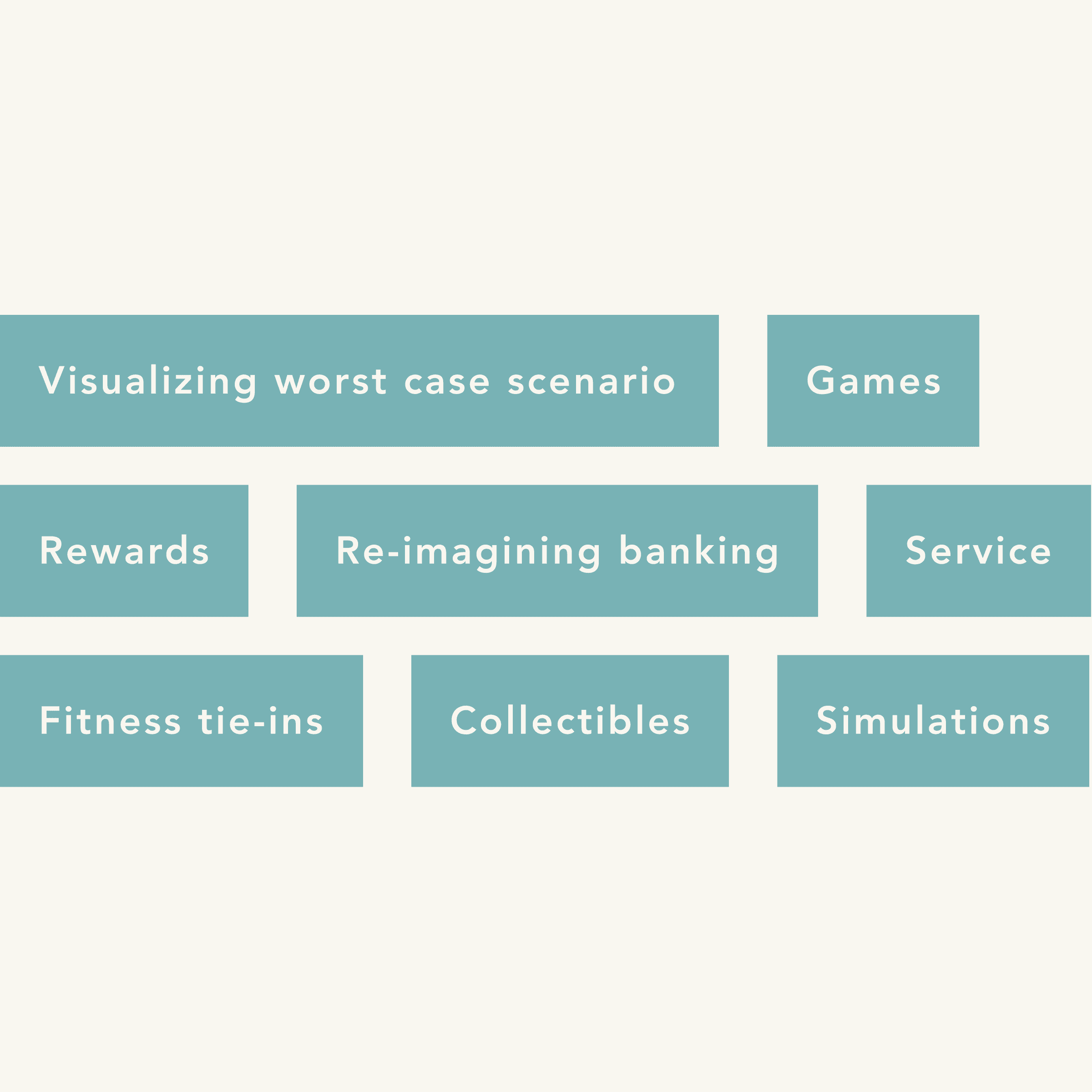
Overall, the team brainstormed 79 ideas and classified the overlapping ones into various categories. We then shared the categories with our peers and received preliminary feedback.

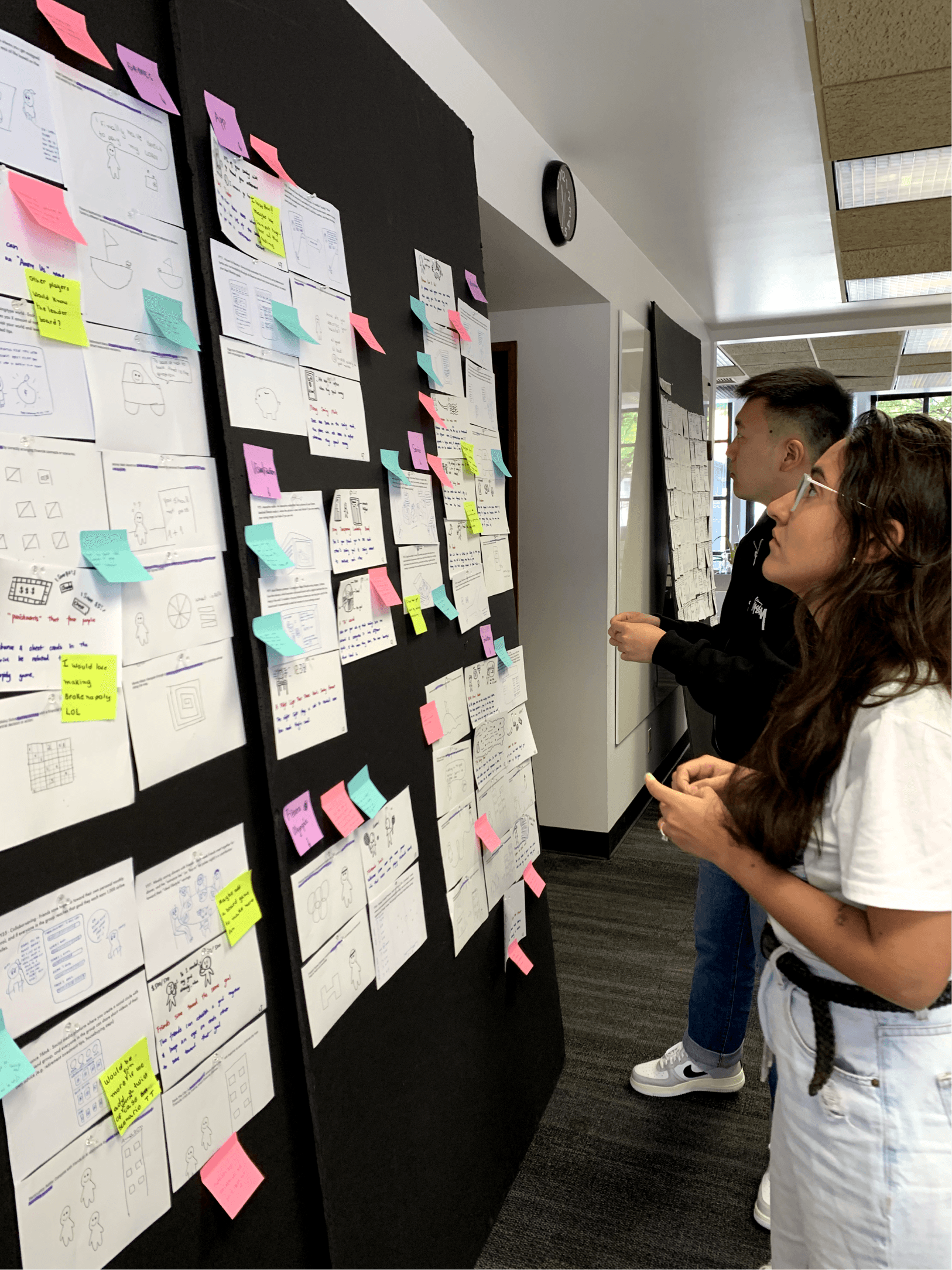

My teammate and I reviewing the feedback we got from our peers
DOWN-SELECTING
Going from 79 to 3 ideas


Using our research, design principles, and desired outcomes, my teammates and I dot-voted on promising ideas, assessed them for pros and cons, and chose three for deeper exploration through storyboarding.
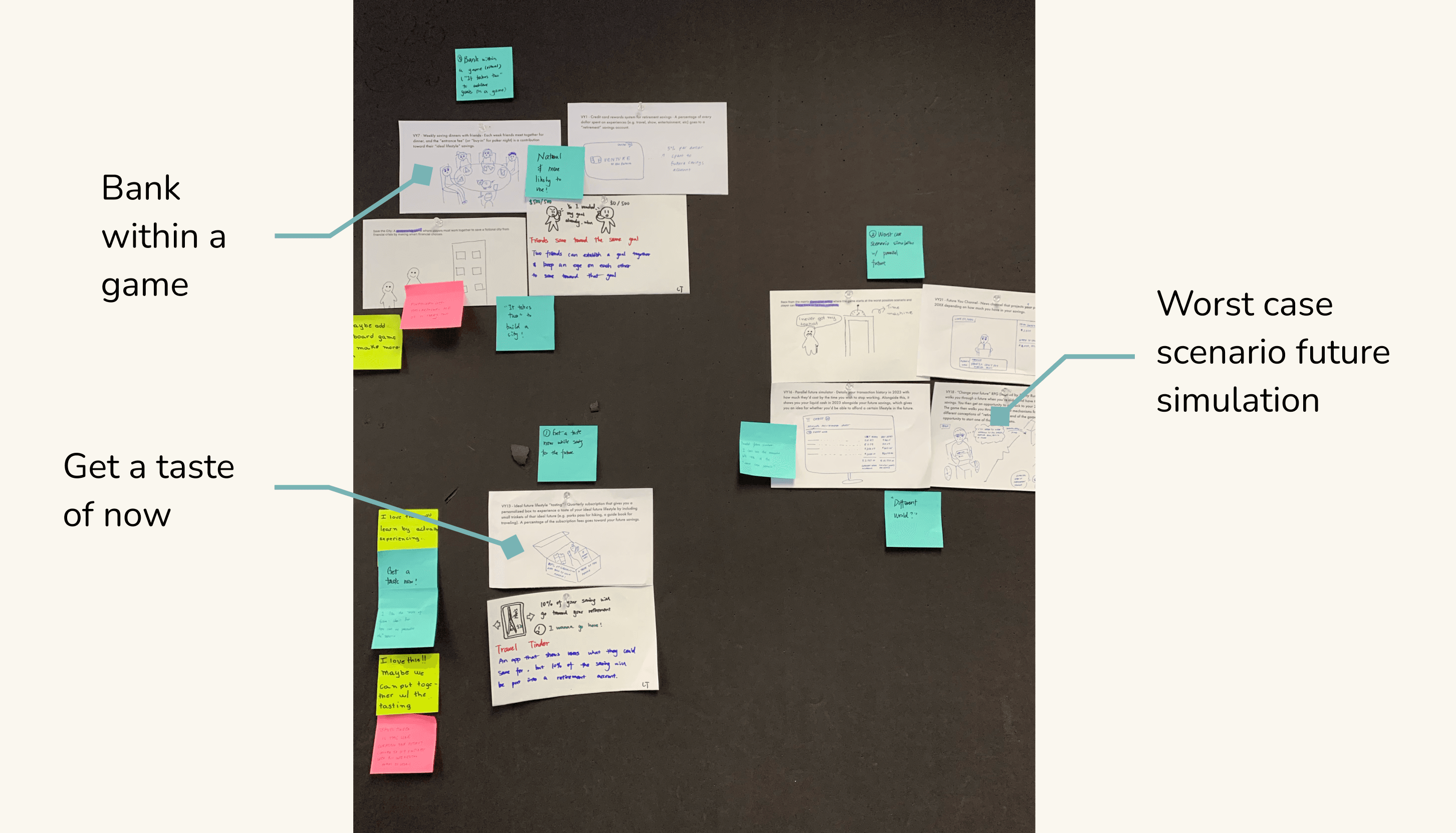

The 3 ideas my team ended up choosing
THE INITIAL CONCEPT
A game that helps young adults in visualizing their future goals and managing their finances
The team discovered that we could merge our three selected ideas into one by creating a finance management game with a "money tree" guarded by goats symbolizing savings.
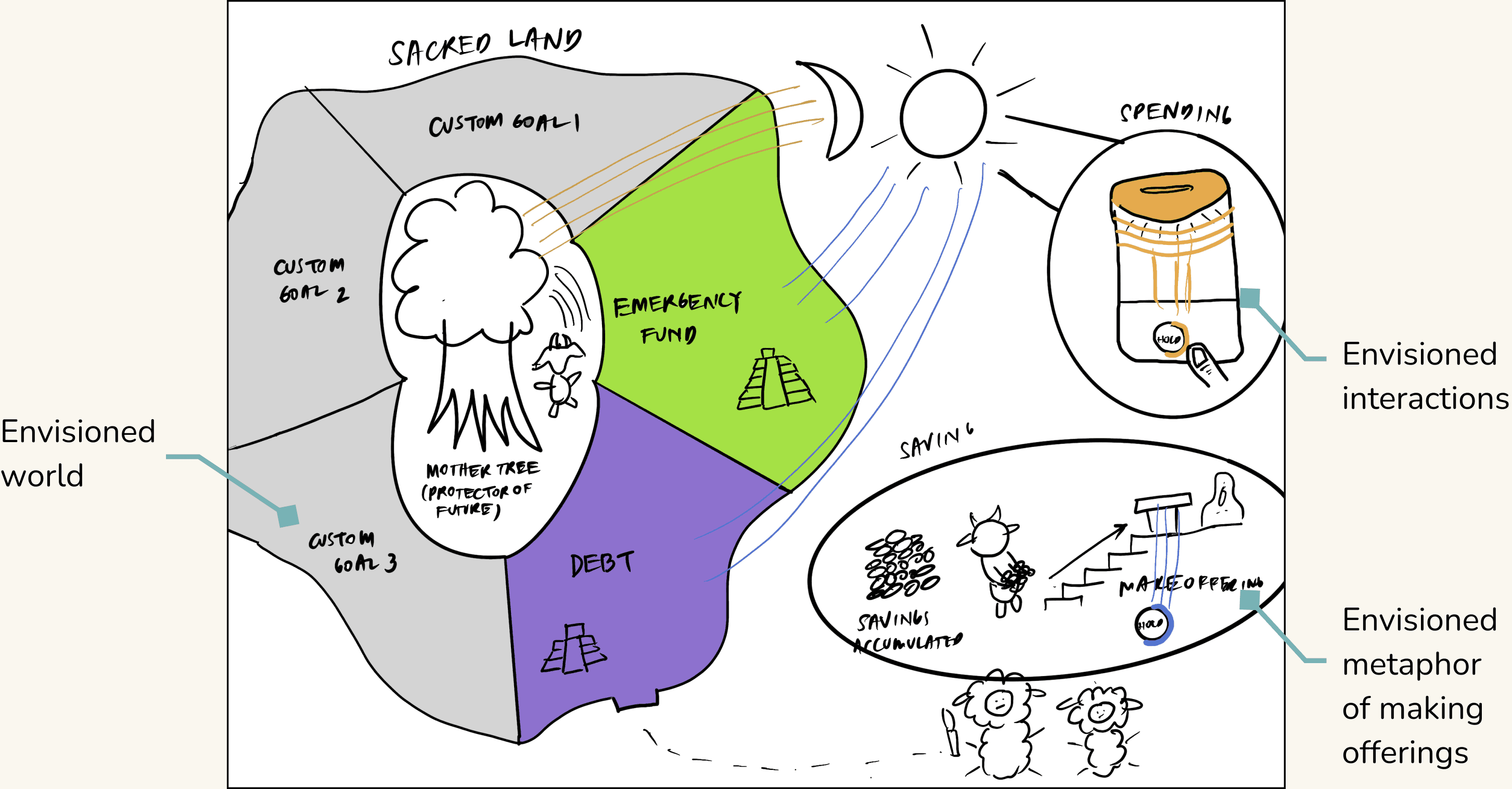

Our initial concept
STORYBOARD (V1)
Trying to understand the design in context
After creating multiple versions of our first storyboard, we realized that the design lacks a reason for "why people would use it in their lives," and our promising idea no longer appears to be so promising…
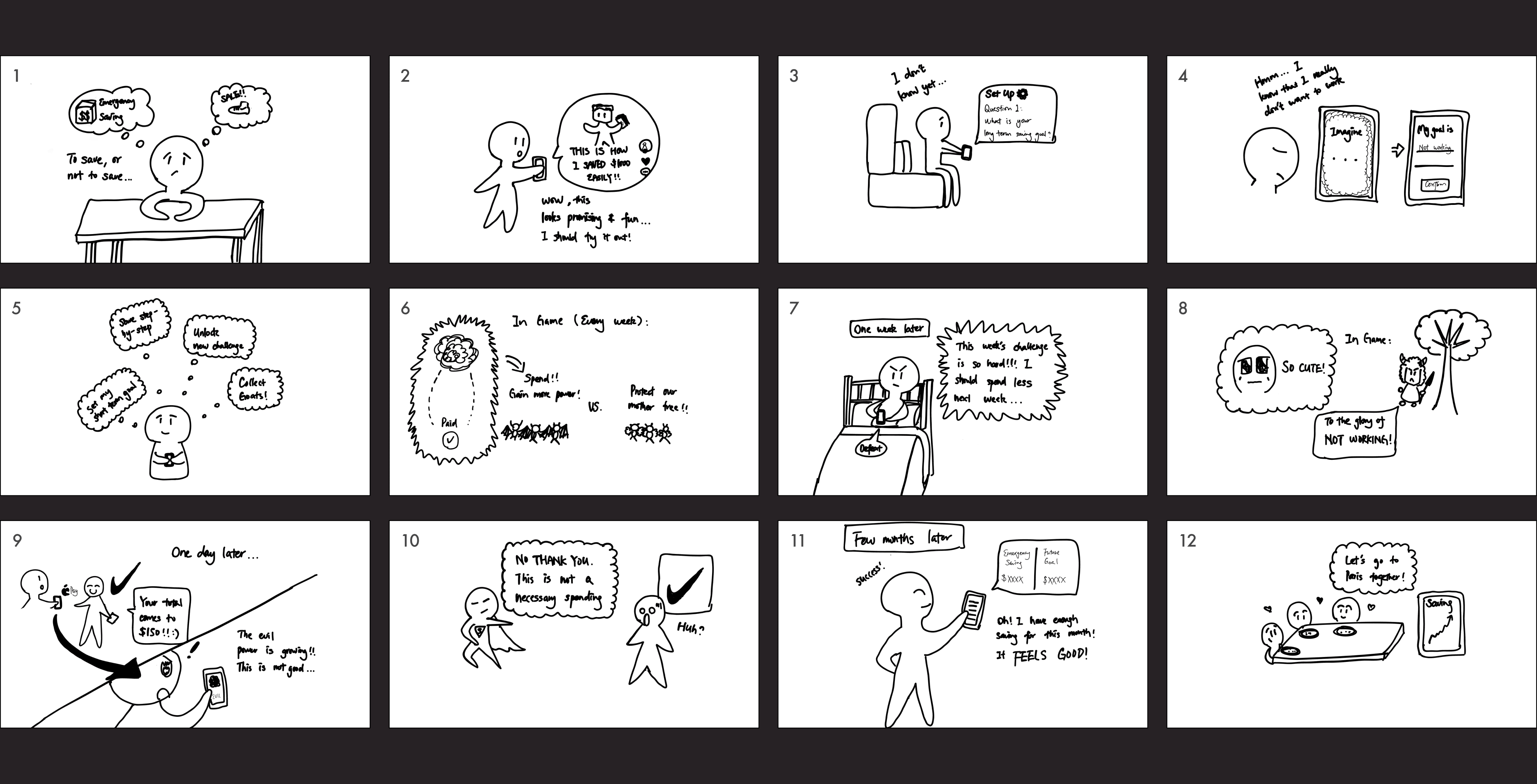

Our initial storyboard (V1)
...gamification for the sake of gamification..."
The feedback from our advisor highlighting our pain point
PITOVTING
Shifting the focus to create an engaging finance app
I proposed to shift our focus to key interactions and connect our design with our research to reflect on why this design is needed. We refined the design through another rounds of discussions and decided to focus on designing a finance app with engaging features.
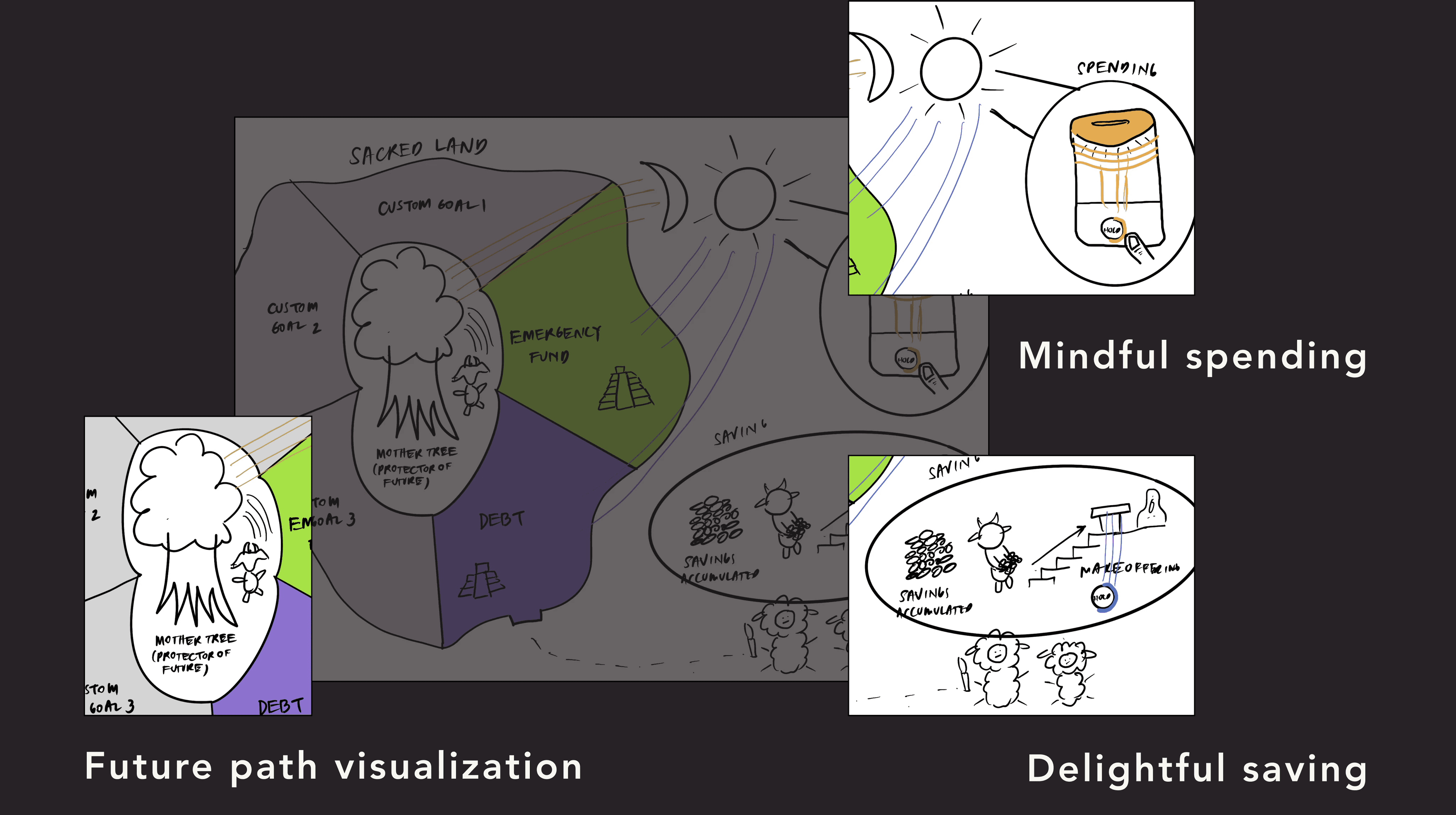

The key interactions we decided to keep from our original design
STORYBOARD (V2)
STORYBOARD (V2) & PROTOTYPING
Refining the design through storytelling
The team integrated interactions into a cohesive finance management tool, and we created user stories to envision seamless integration into users' lives. During this process, I was responsible for visual planning, interface design, mockup creation, storyboarding, and body-storming to build empathy.
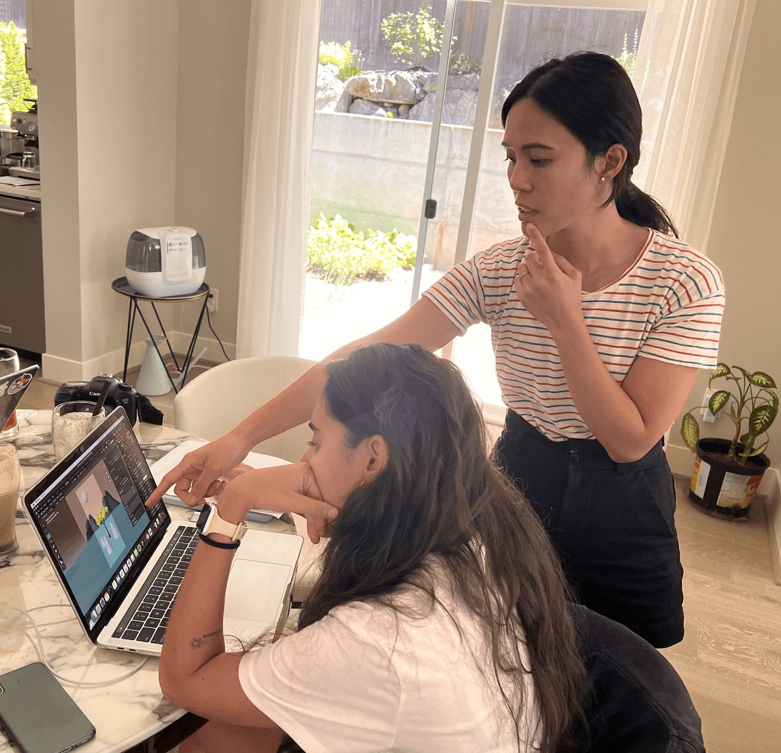

My team collaborating together to learn about Blender
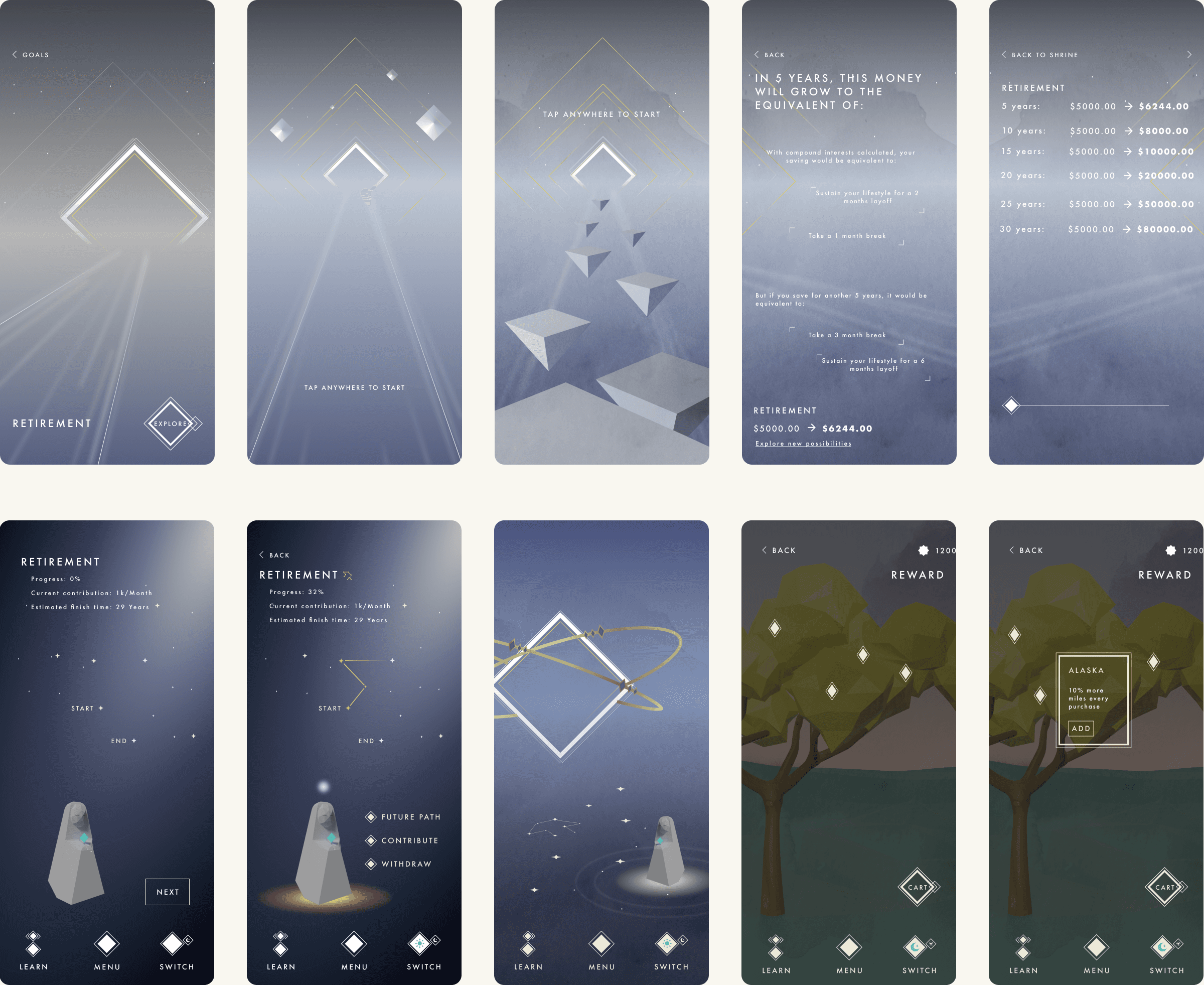

The initial mockups I created to showcase our envisioned interactions and design
OUTCOME
Considering various contexts and iterating the design to simplify interactions
After presenting our storyboard to industry experts and our peers, my team gained insights into the importance of considering contexts beyond people's homes. We also refined our design, simplifying its interactions to better align with our desired outcome.
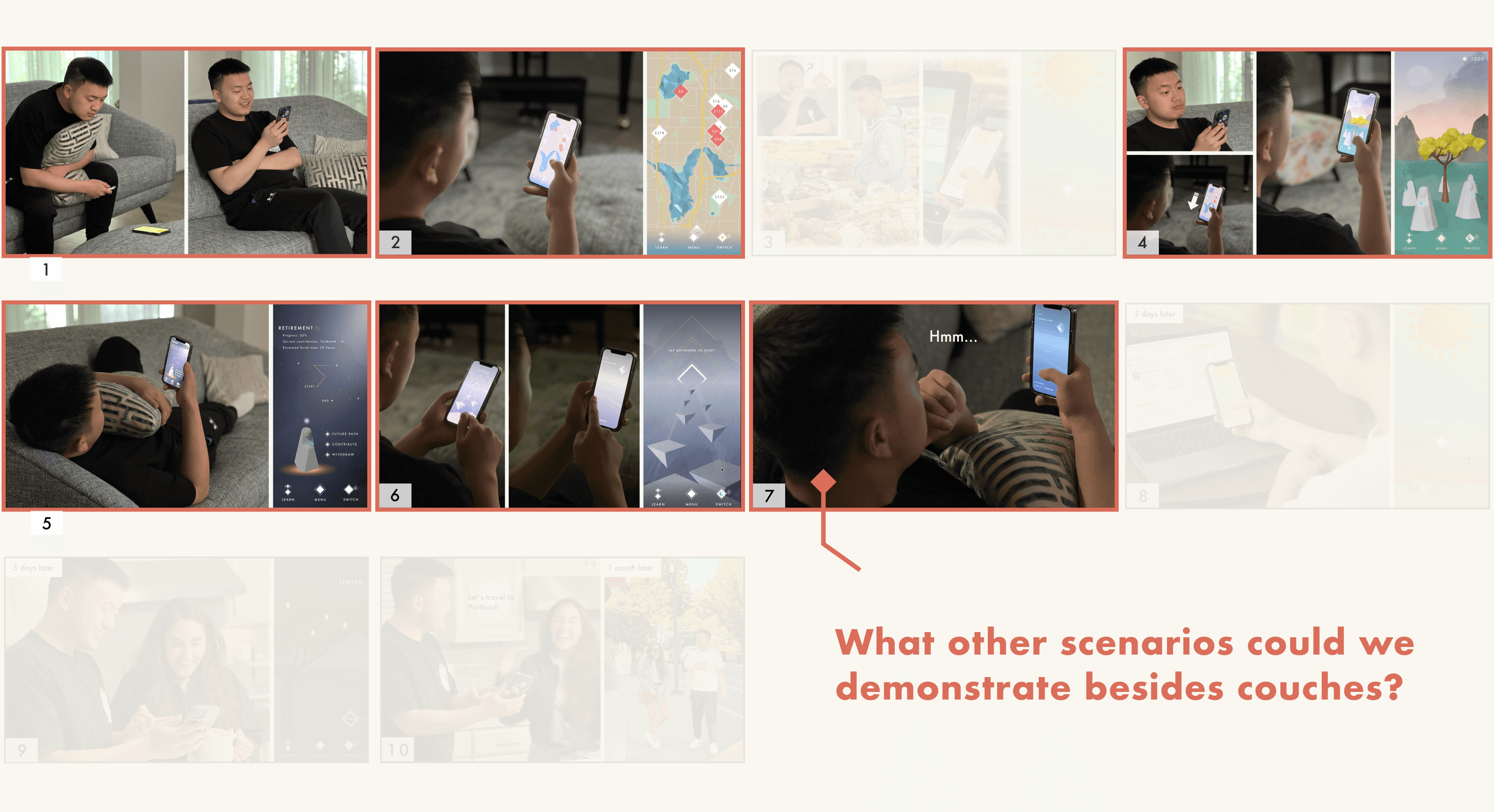

Our storyboard had too many "couch potatoes," which may have limited our context and restricted our ability to envision user interactions with the design
USER FLOW DIAGRAMS
Visualizing user journeys to enhance interactions and refine user stories
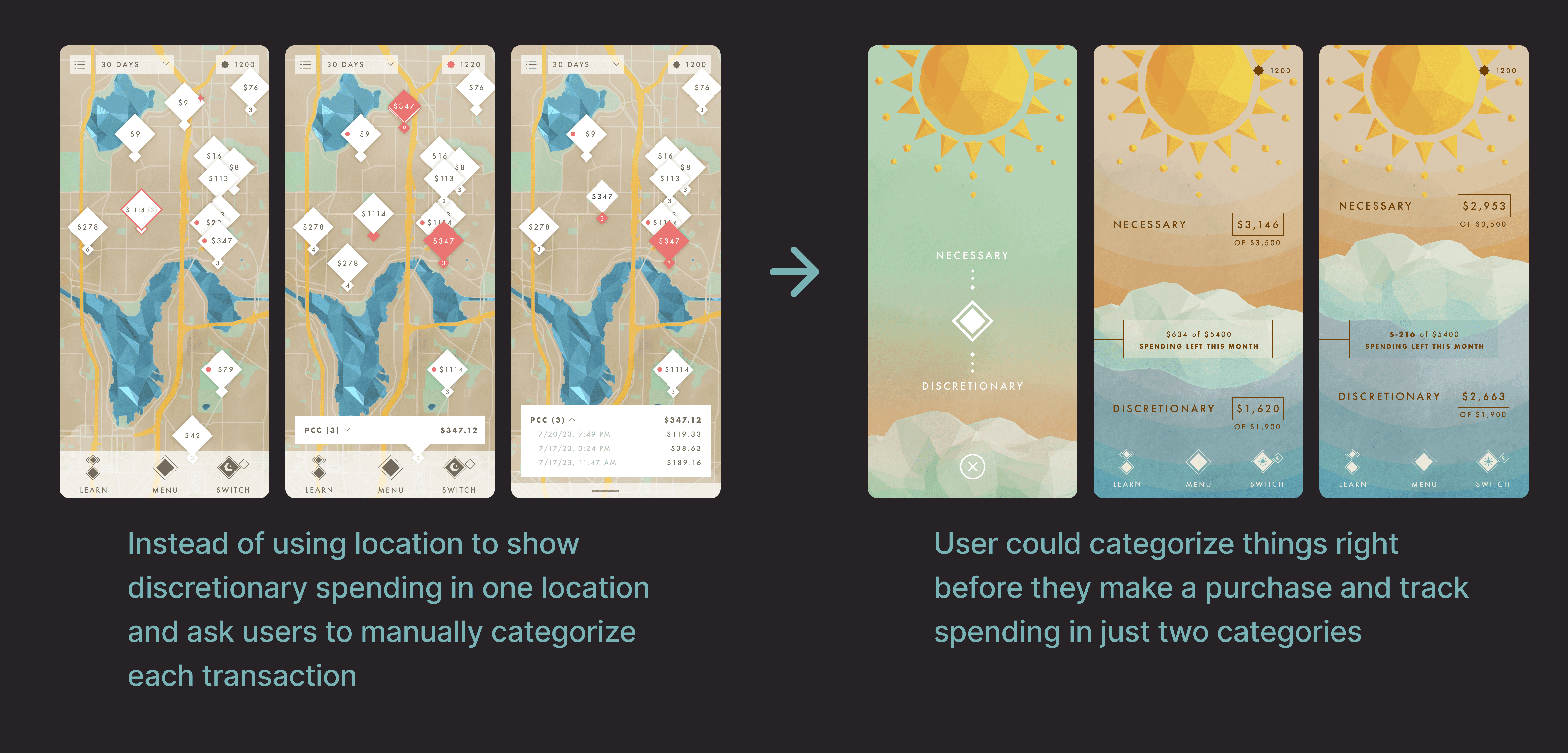
My teammate and I developed user flows for multiple interactions, enhancing our storytelling and visualizing the user experience. This allowed us to streamline and eliminate unnecessary interactions. For example:


Iteration: Moved the prompts for tracking discretionary vs. necessary spending to an earlier phase.



FINAL STORYBOARD (V3)
Extending Design Beyond User's Home
The team considered how our design could serve a purpose outside of a person's home, and we refined our visual designs for a smoother, more natural user experience. I was in charge of storyboarding, photographing, and iterating visual designs for visual clarity.
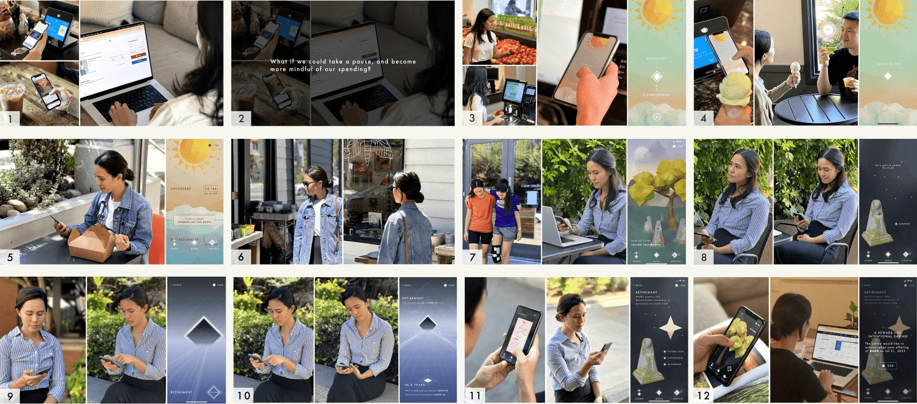

The final storyboard my team created
OUTCOME
Gained insight into setting context, laying a solid foundation for the video prototype
The final storyboard improved our understanding of design context, sharpened my framing abilities, and promoted team ideation for our video prototype scenes.
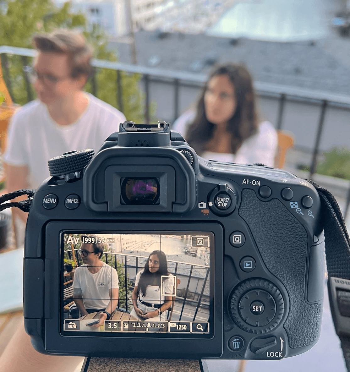

I directed and filmed the scenes for our video prototype
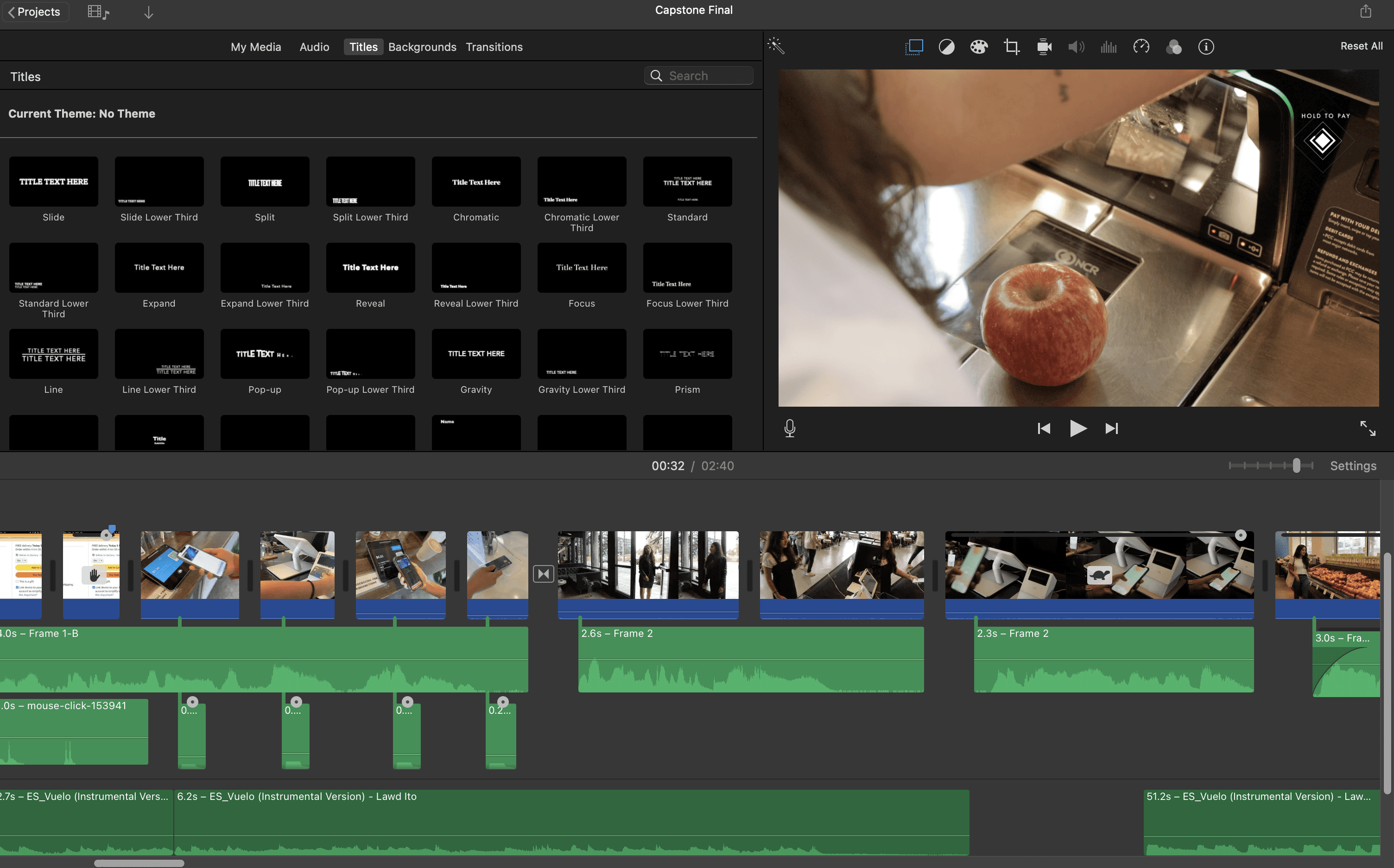

I edited the video prototype in iMovie
DESIGN SYSTEM & DOCUMENTATION
Capturing the design process and rationales
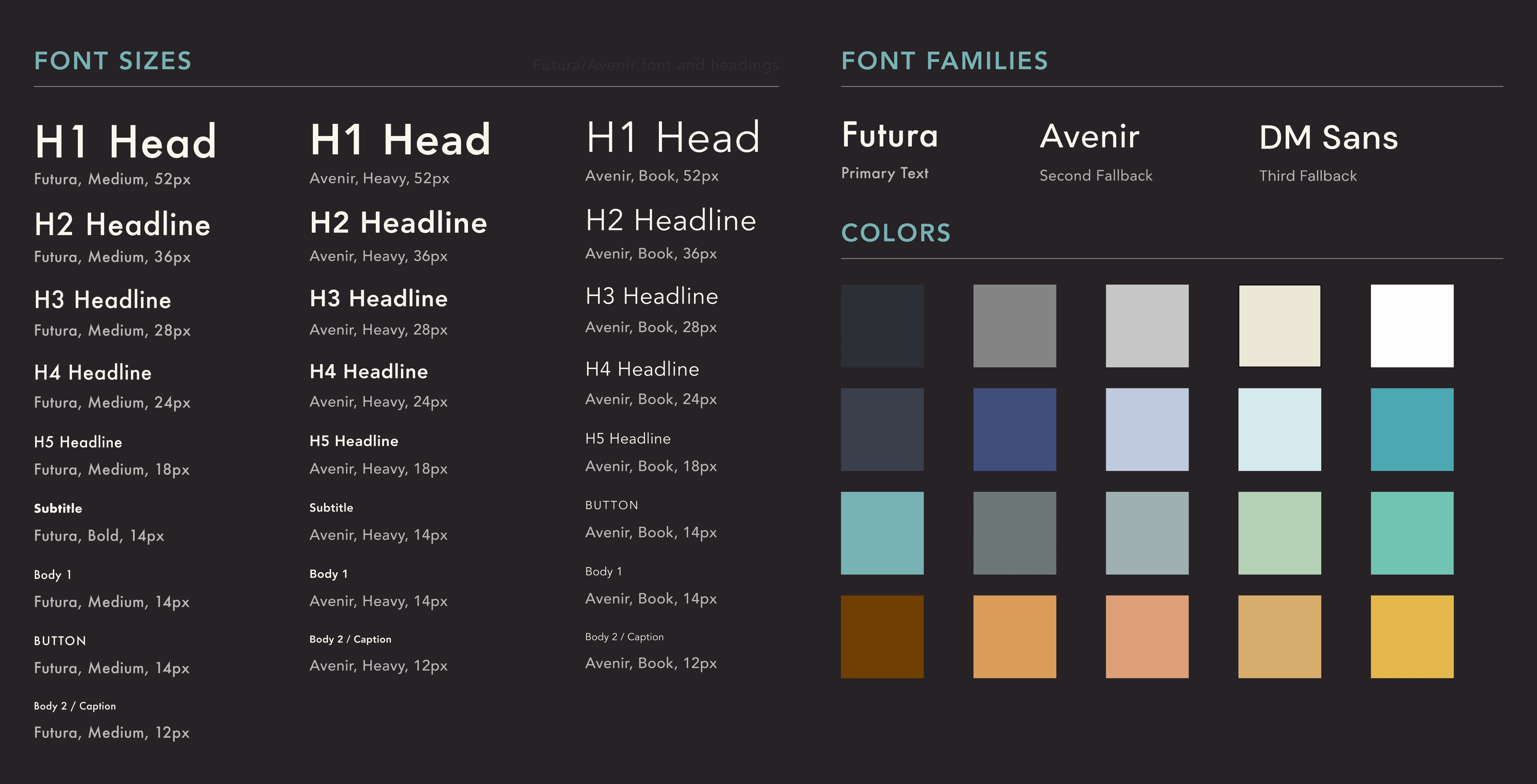
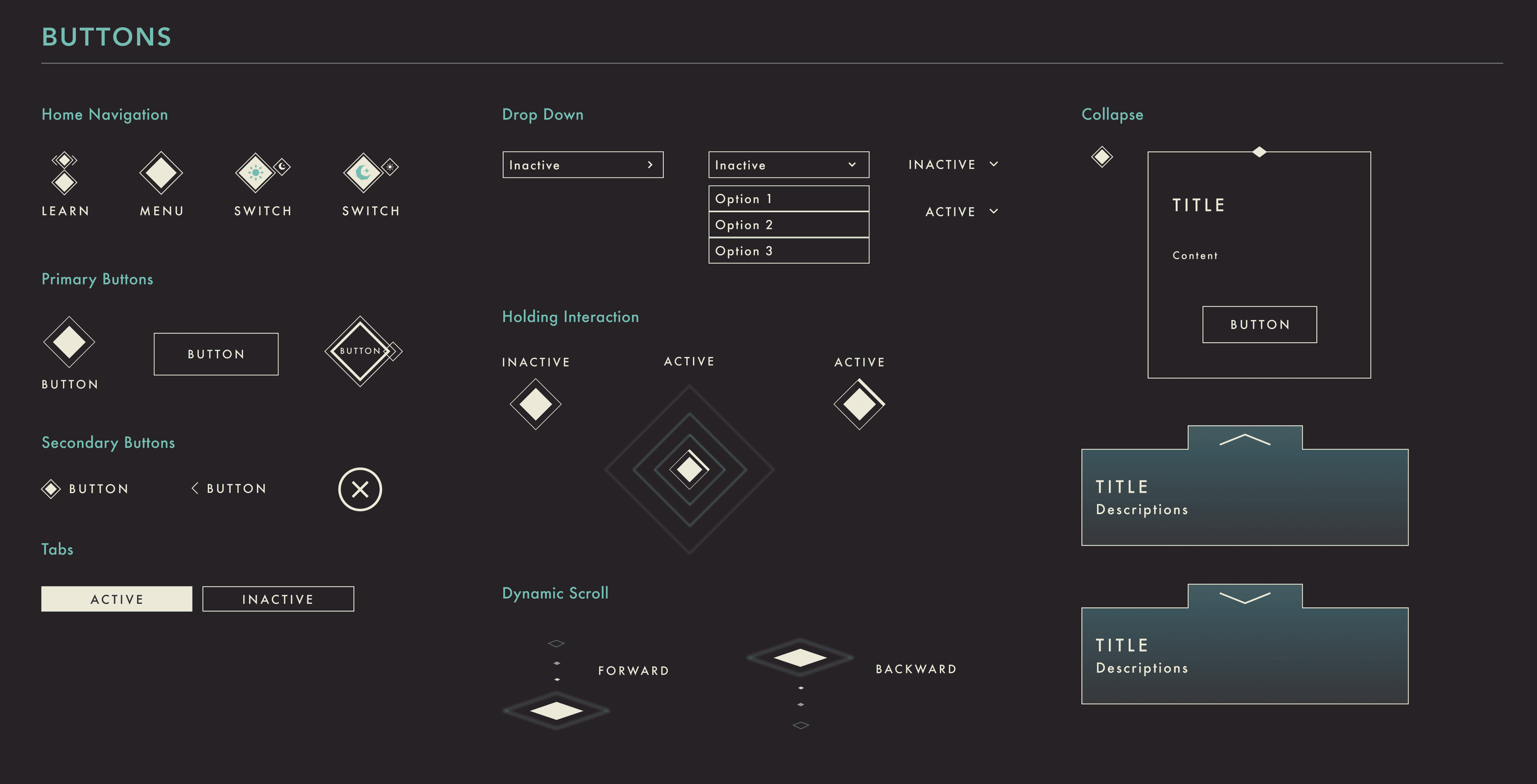
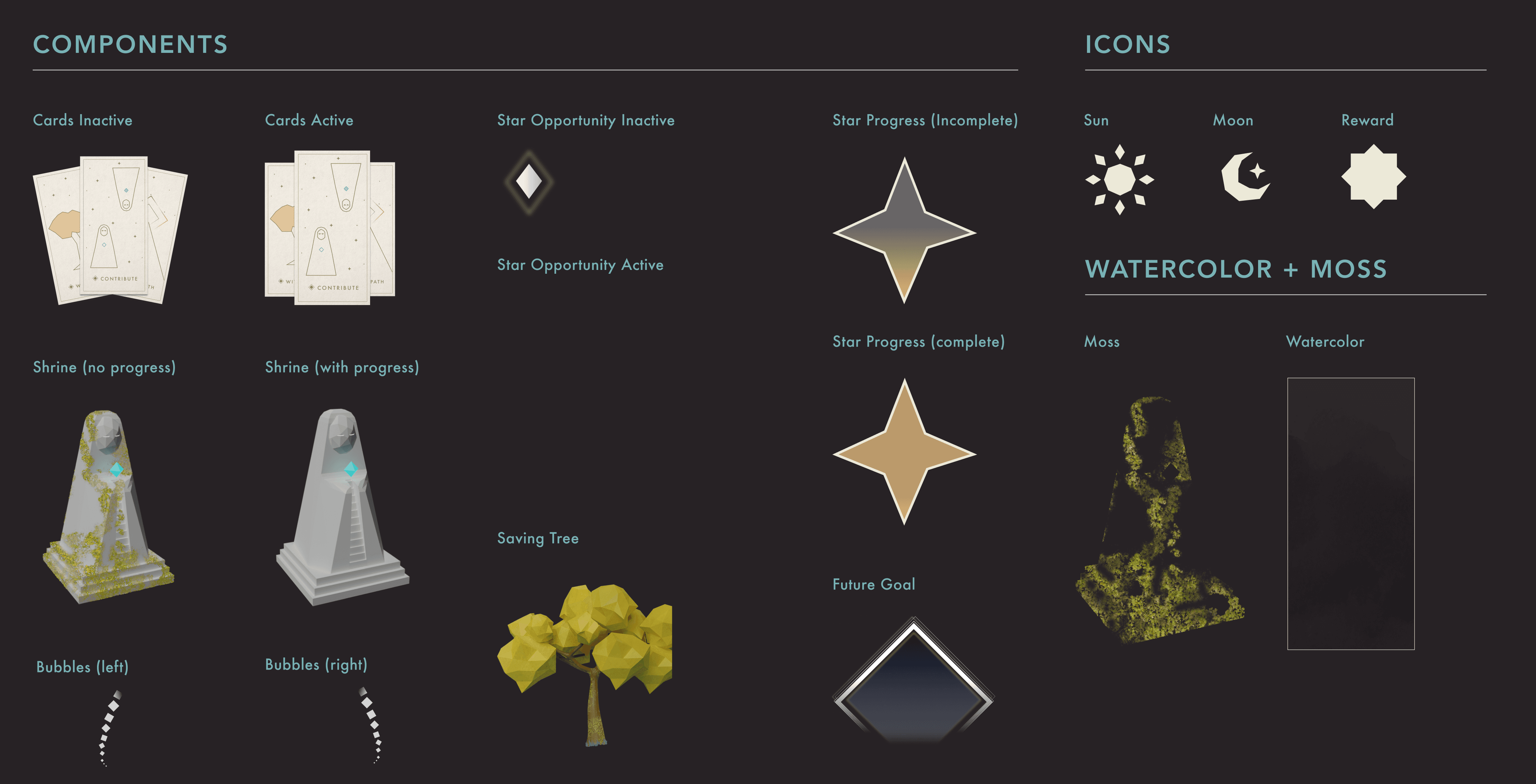
Following this, we brought Luminance to completion during the last two weeks of our Master's program project. Below is a detailed report outlining our process, design flow, and the reasoning behind our decisions. I also created a design system to unify our design and streamline future iterations.
Final Design Documentation



DESIGN IMPACT
A design that challenges rapid spending and promotes a balanced financial future for young adults

Our design, Luminance, streamlines spending categorization for young adults, embedding a future-forward perspective in financial guidance. We hold that neither spending nor saving is intrinsically good or bad; it's the balance that matters. Through mindful financial management, we aim for Luminance to prompt young adults towards intentional spending, fostering both freedom and a stable future.
REFLECTIONS

If we had more time, I would conduct usability and evaluative testing to validate our assumptions
I acknowledge our designs are influenced by personal experiences and assumptions. With more time, I'd initiate evaluative testing to validate these and conduct usability tests to assess user understanding and feelings towards the features we designed.

We should've prioritized the narratives earlier to explore the overall design experience in depth sooner.
Initially, we focused too much on game elements and overlooked the narrative. This project highlighted the narrative's value, and moving forward, I'll prioritize it earlier to thoroughly evaluate the overall design experience.

More time should've been dedicated to examining extreme scenarios and reviewing the design for its business and product impact
Considering our design provides real-world rewards like flight miles, examining potential misuse is essential. It’s also vital to align current features with user needs and business goals, informing our criteria for evaluating design effectiveness.

This is a journey highlighting visual challenges and the essence of teamwork
Despite lacking art experience, we pushed ourselves as a team and learned tools like Blender and AfterEffects together through this project. My visual communication skills, coupled with our mutual support and mentorship, underscored the importance of teamwork and communication in achieving design success.
ACKNOWLEDGEMENT
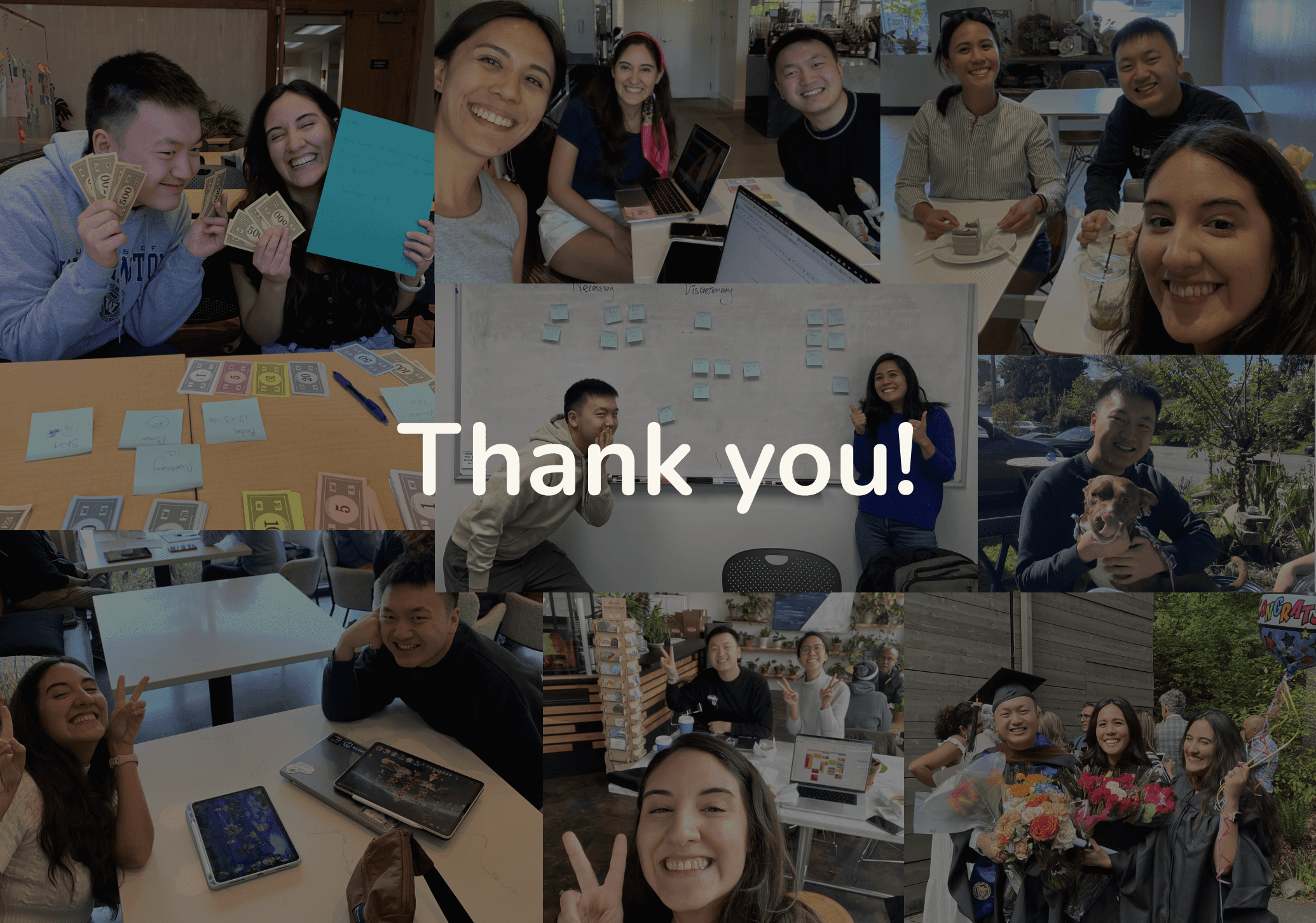

I'd like to thank all of my teammates, as well as the faculties and our advisor Holly for providing critical feedback that helped us move forward. I couldn't have done it without them <3.

