InsurancE
Hub
InsurancE
Hub
A comprehensive insurance hub for a Seattle agency, streamlining customer access to tailored insurance services
/Web design + Service design
/Web design + Service design


TIMELINE
12 weeks
ROLES
UX Designer
User Researcher
Web Developer
COMPANY
NW Financial & Insurance Services
TEAM
1 Designer (Me)
1 IT Manager
1 Insurance Agent
OVERVIEW
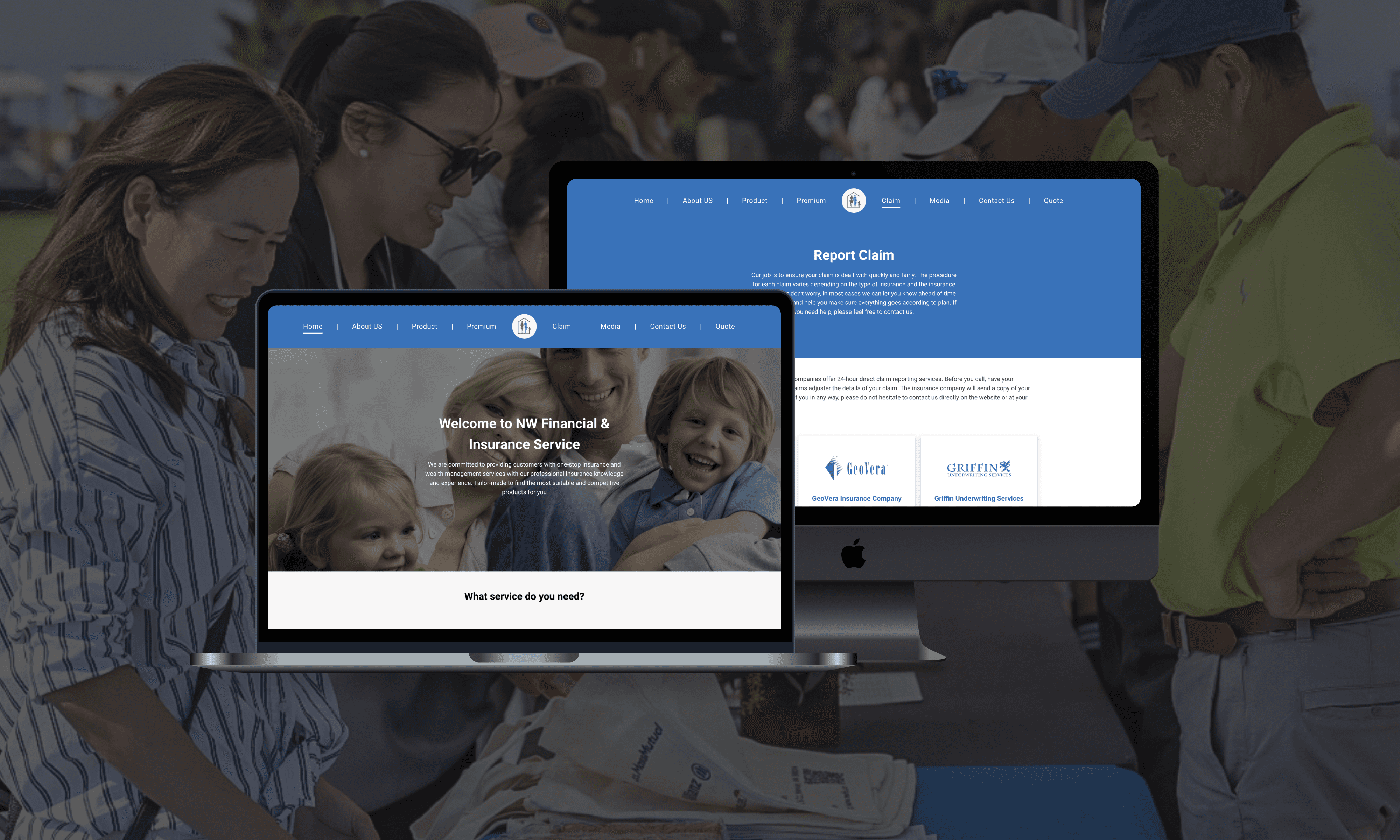
I worked part-time as a UX designer at NW Financial & Insurance Services, where the goal was to modernize customer engagement. My mission was to redesign the website, making service discovery easier for customers and expanding the company's digital presence.
MY ROLE
As the UX designer, I led competitor analysis and user interviews, created iterative mockups, established a design system to elevate the company's brand, redesigned the website architecture for easy service navigation, and built the website that went live in early 2023.
DESIGN
Features
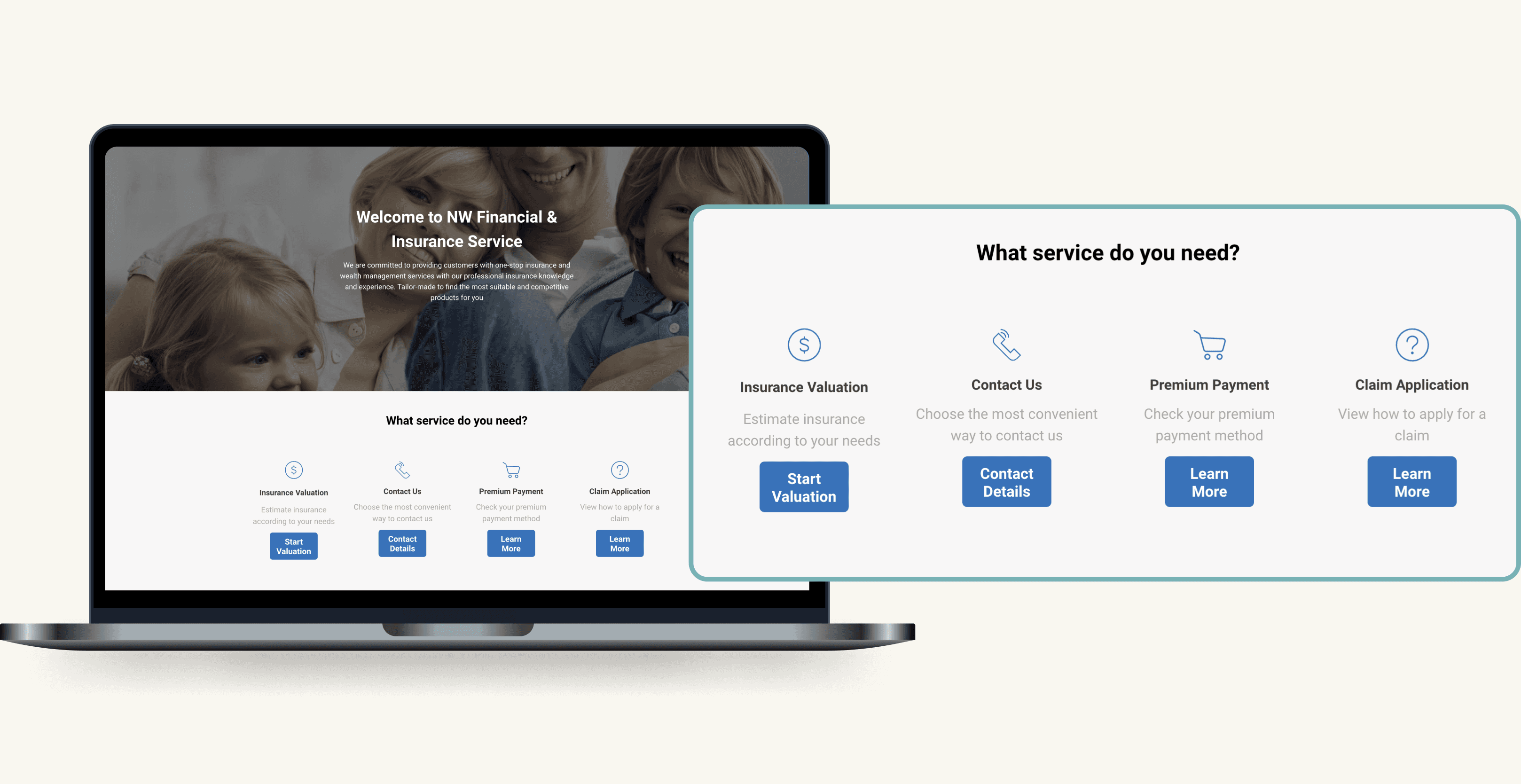
Easy navigation of services
Customers can instantly locate the services they need upon their arrival on the website.

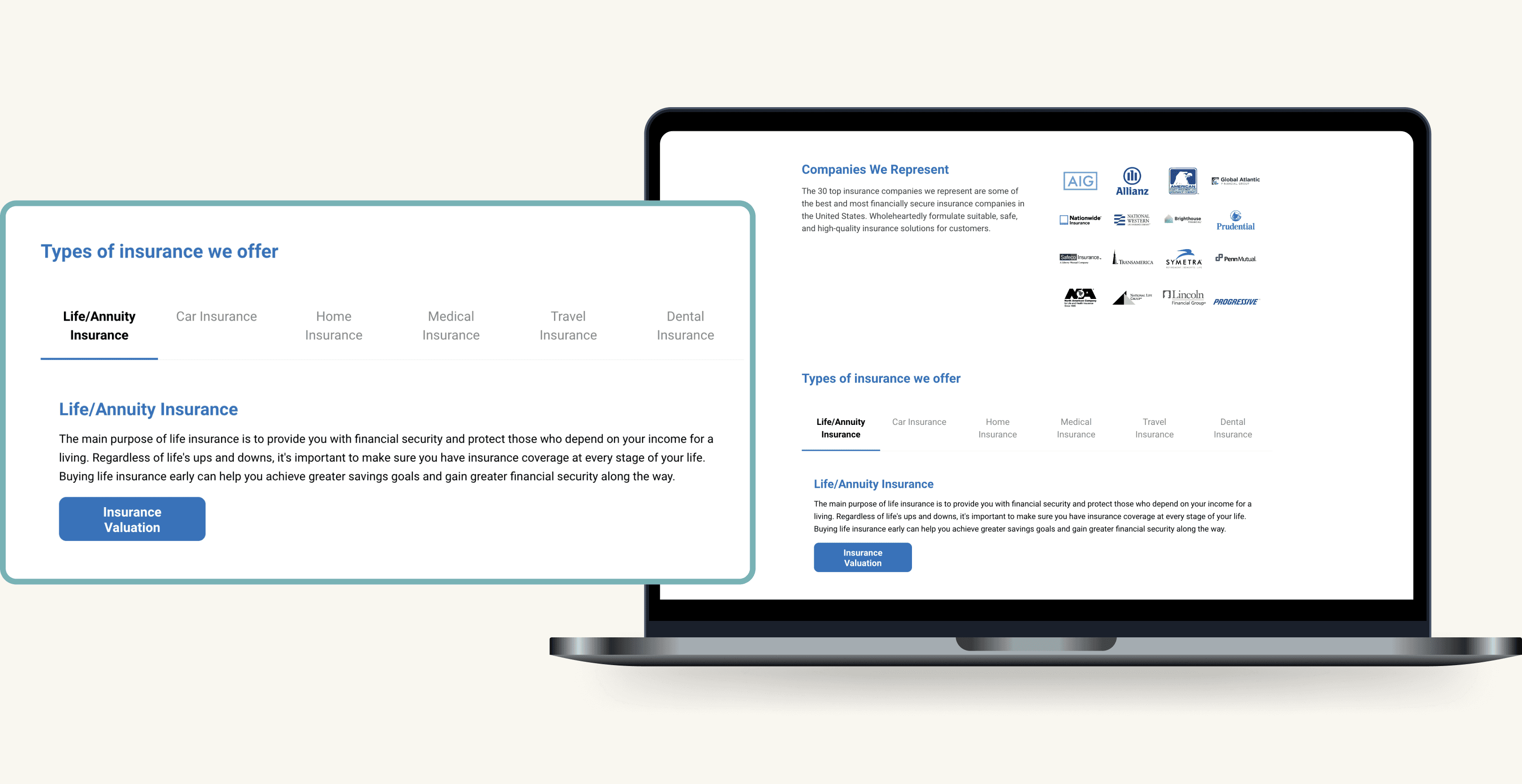
One-stop Product Discovery
Customers can easily browse through a wide variety of insurance products in one location and receive quick valuations with a single click.

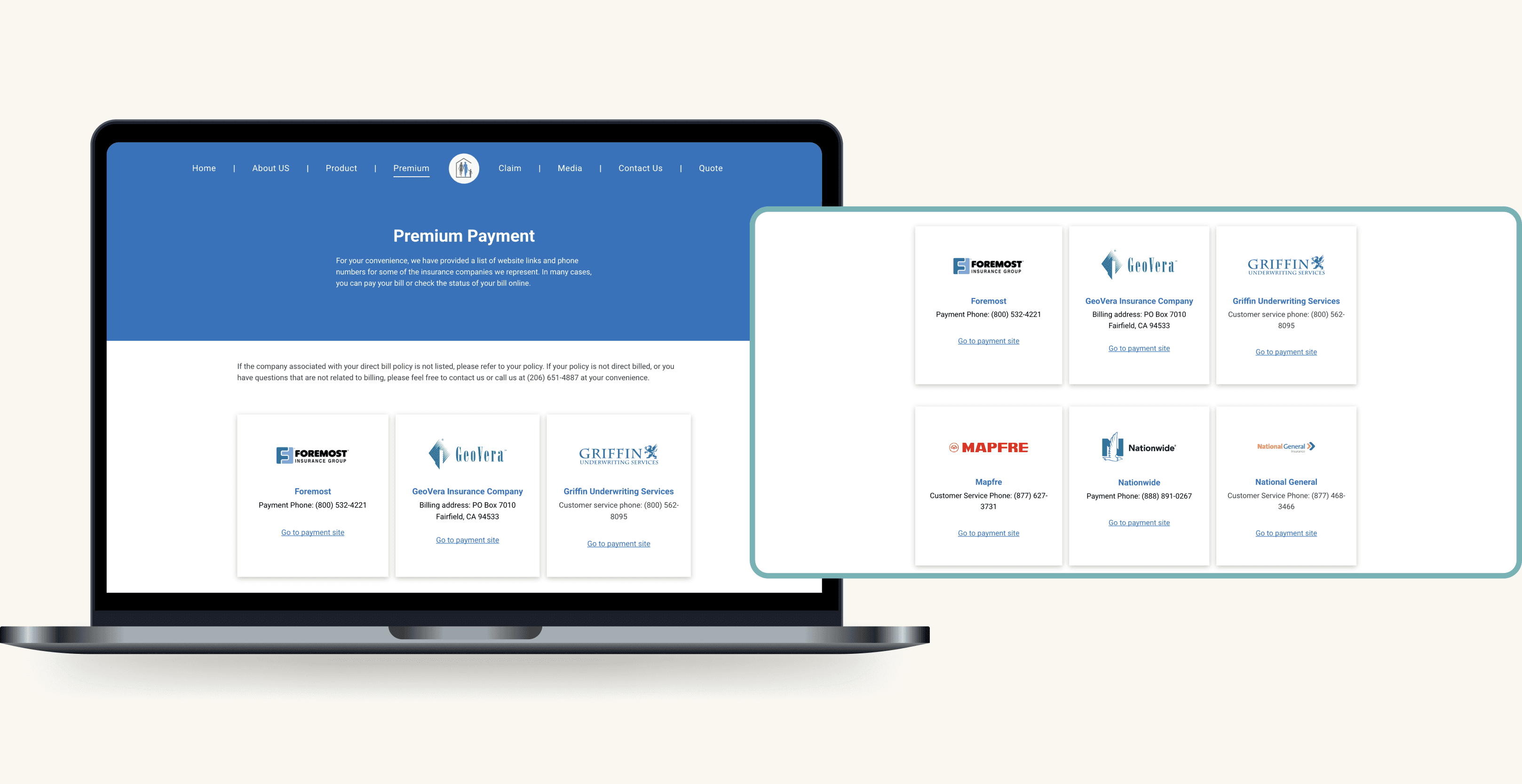
Concise insurance information summary
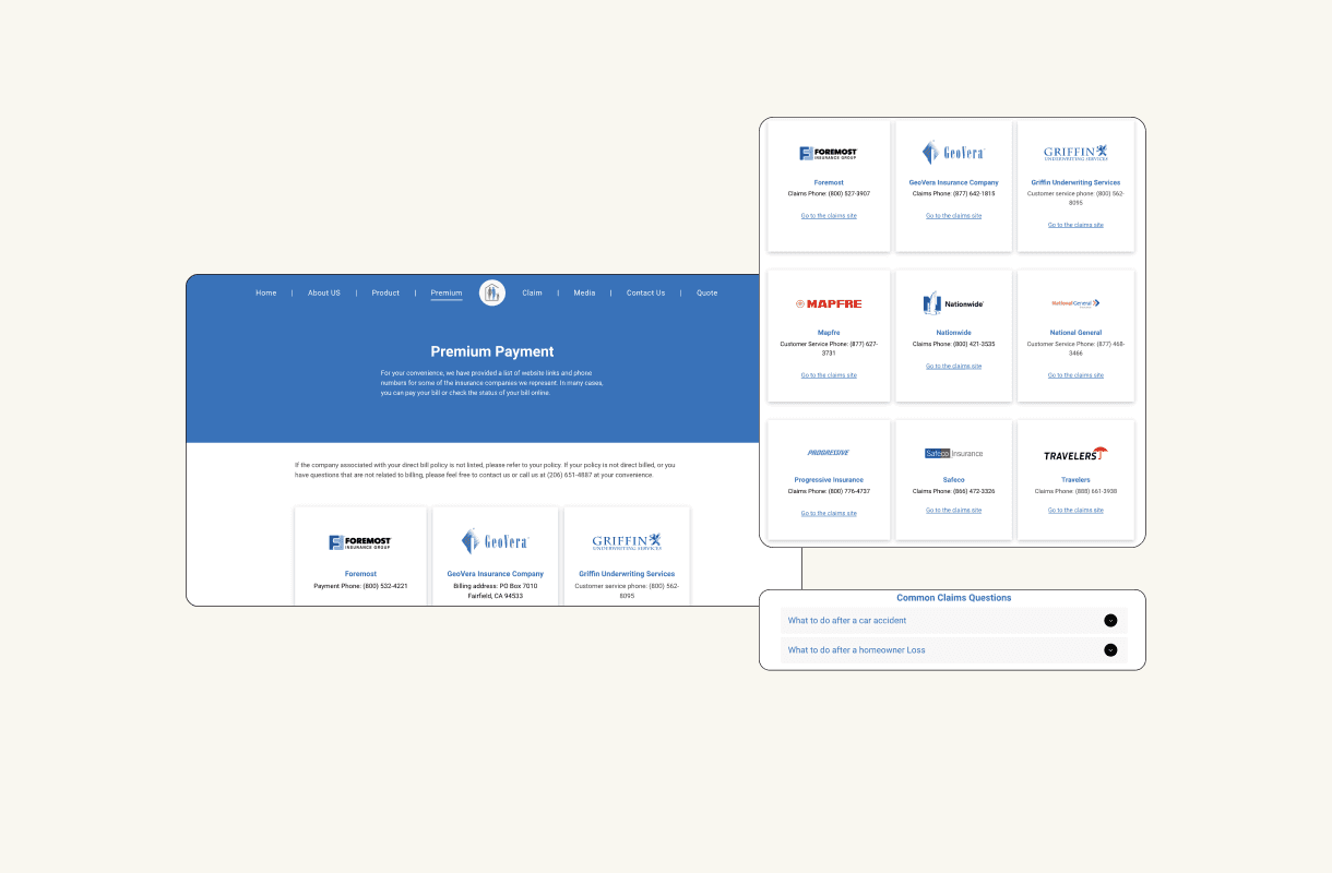
Customers can easily find information on payments or claims and be directly linked to the insurance company's site with a click to complete tasks.

Enhanced social media presence
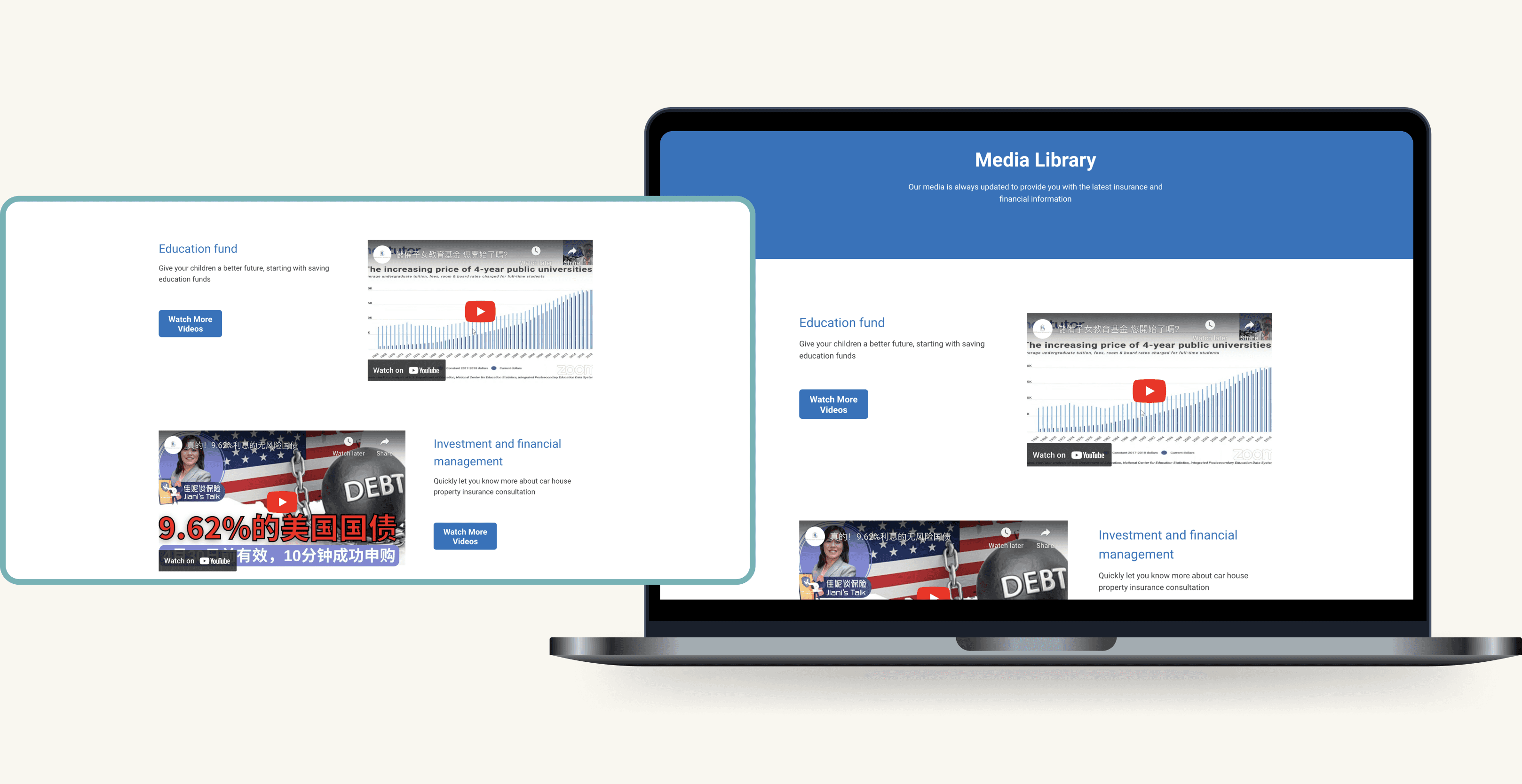
Customers can visit the "media" page for a concise overview of the company’s YouTube and social media content, offering insights into various insurance options.

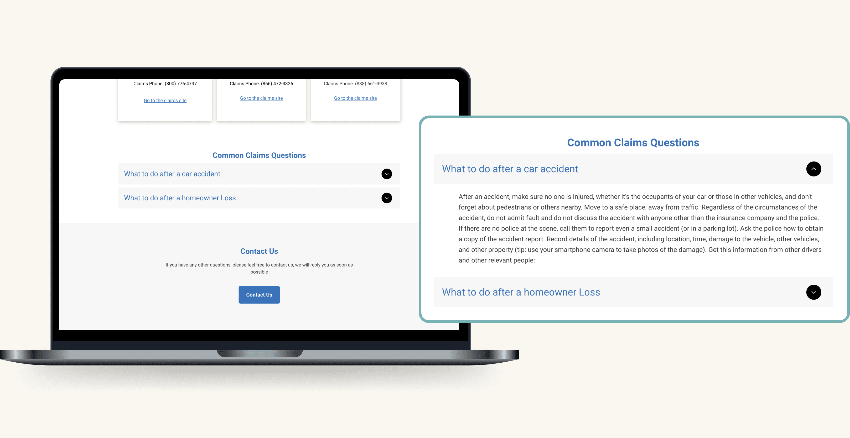
Incorporated FAQs to minimize customer call volume
Customers can easily locate common FAQs and follow the outlined steps to file a claim, streamlining their experience and reducing the volume of customer calls.

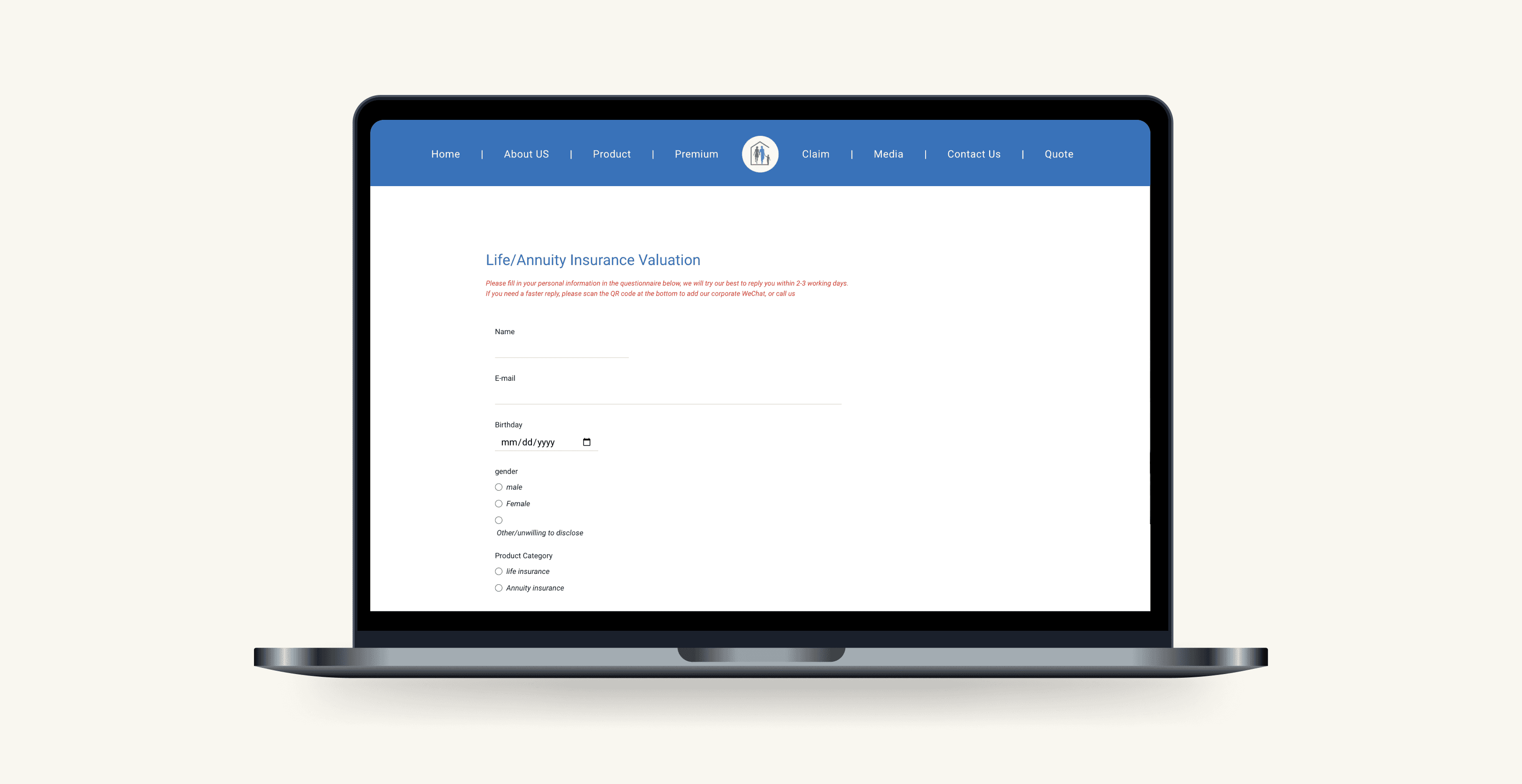
Self-service valuation tool for clients convenience
Customers can receive a valuation asynchronously, eliminating the need to call the office.

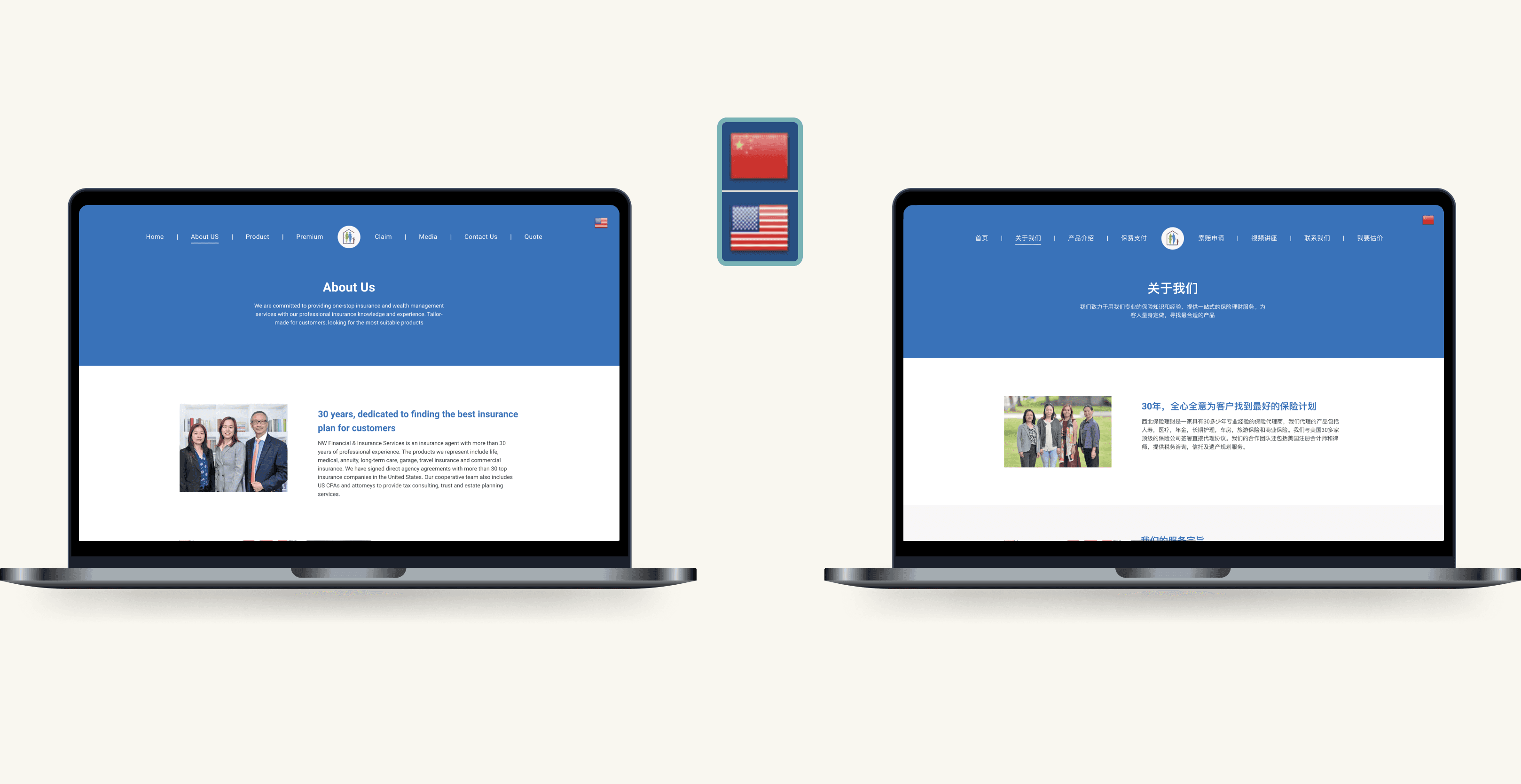
Multilingual support for the diverse client base
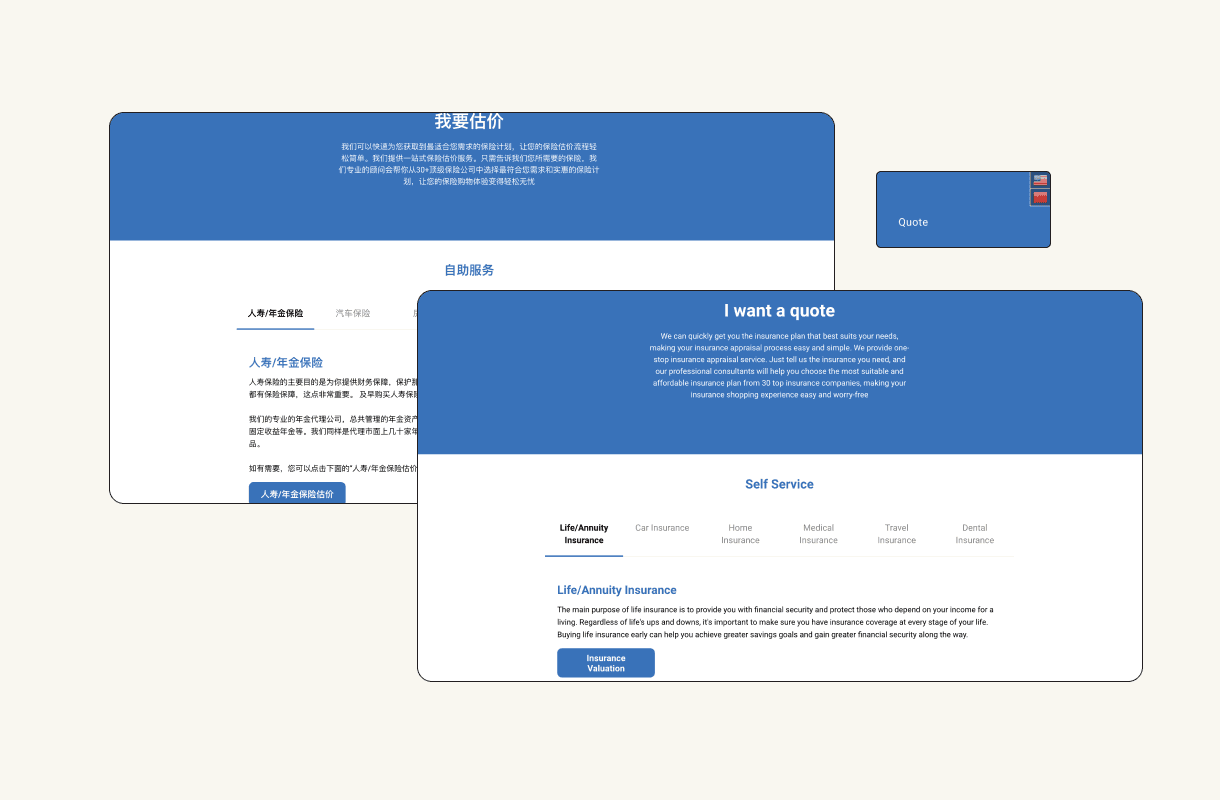
The website is designed with multilingual support to ensure customers from diverse backgrounds can easily understand the content.

Please look on a tablet or desktop for the most optimal user experience!
THE CHALLENGE
Design and ship a new system to enhance online client engagement
The lack of information and engagement on the current website often leads clients to unsatisfying phone calls. An enhanced design is needed to improve user experience and increase client engagement online.
SETTING THE SCOPE
Examining Existing Website Data to Define Project Scope
Given the constrained timeframe, I examined the existing website's user data and determined that the priority should be redesigning the desktop version website, as a significant portion of users access the site via their desktop browsers.
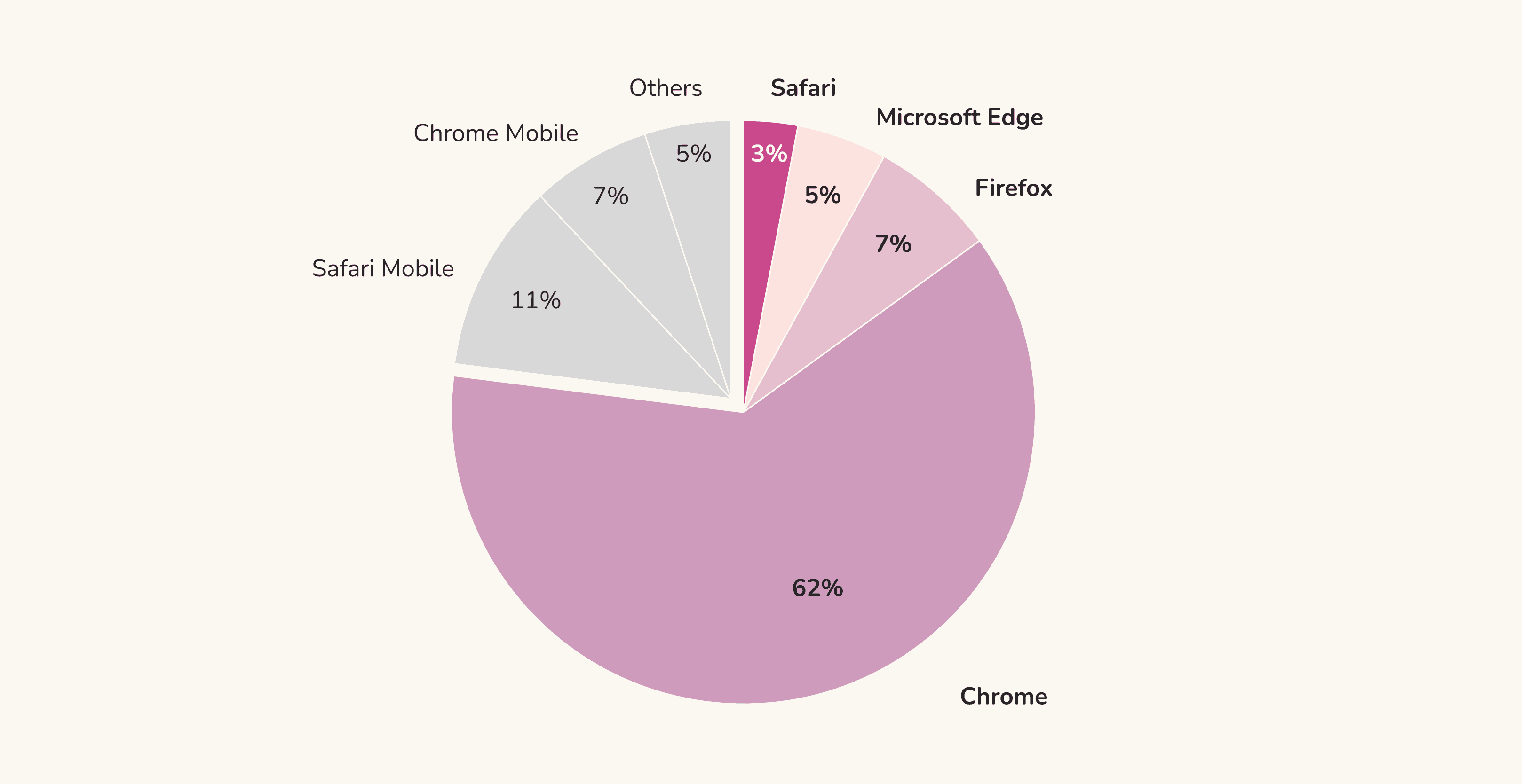

77% of the clients view the website through their desktop browsers
RESEARCH
Identifying customer needs and challenges
Initially, I assumed that the website served primarily as an informational resource for customers assessing the company's suitability for their needs.
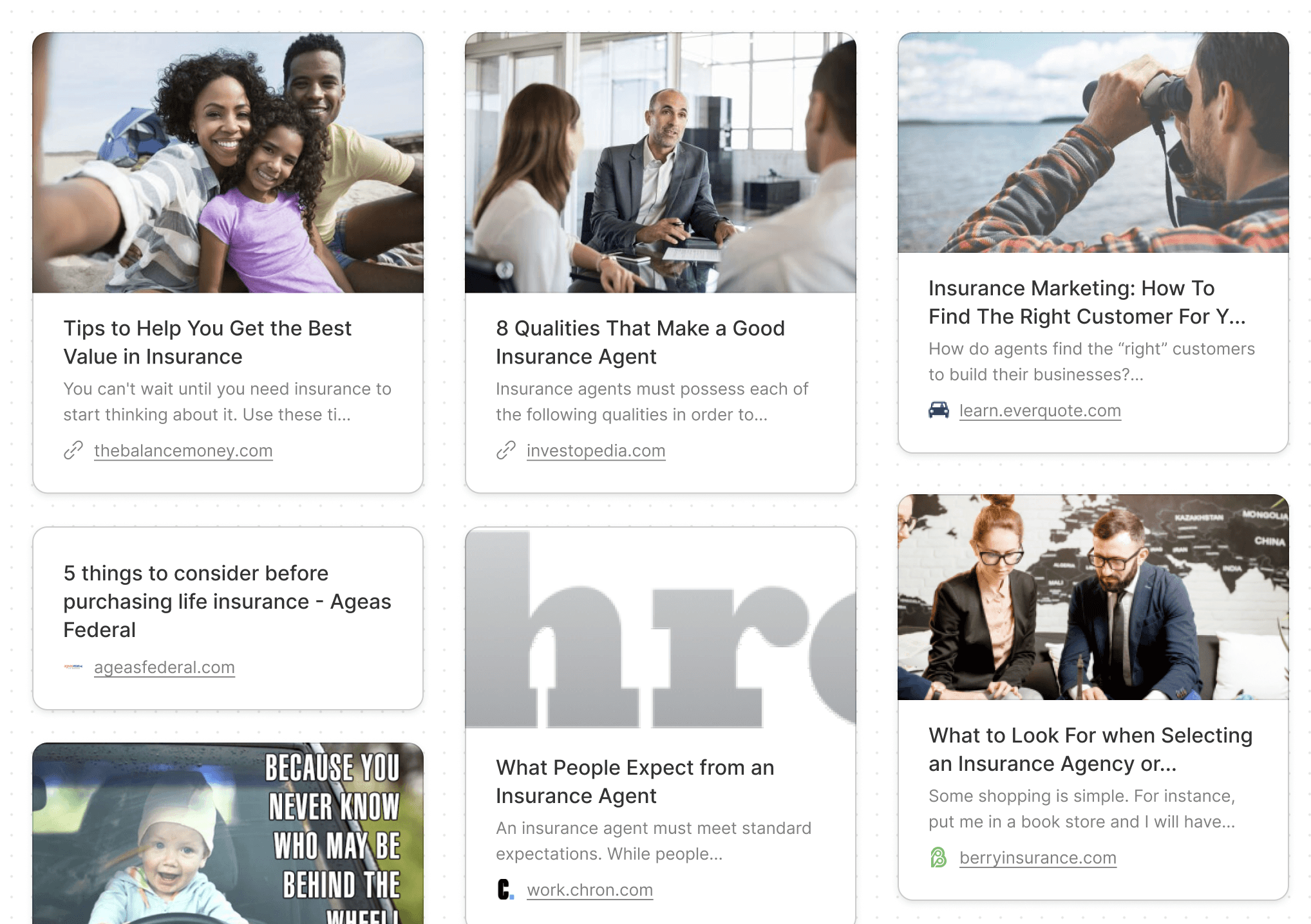


1
round of desk research



5
interviews with clients and company staff
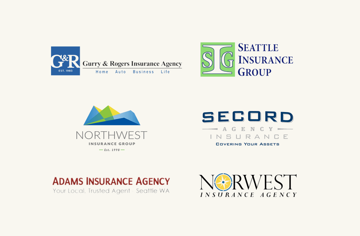


6
Competitor companies evaluation
INTERVIEW FINDINGS
Discovering what affects customers' choices in picking an insurance agency

Excess site information often overwhelms users and complicates navigation
“We don't want our website to be too complicated since that often will overwhelm our customer, and we don't want that”
- P1 Company Employee

Coverage and availability influence customer choices for insurance agencies
“[When selecting an insurance agency], I usually will check the company history, see their products, and ask for the coverage value… If the agent is responsive, that's also a good sign.”
- P2 Customer

Customers like to compare options when selecting insurance agencies
"[Before making a decision], I like to check between different agencies and compare their offerings, and go with the one that can give you claims quickly and has the best value."
- P3 Customer

Leveraging networks is a great way to enhance the company's public visibility
"I usually would pick the one (insurance agency) my friends recommended since they've already tried the service."
- P5 Customer
COMPETITIVE ANALYSIS
Evaluating competitors' pros and cons
I examined websites of 6 local Seattle insurance agencies offering similar products and found the following strengths and weaknesses.
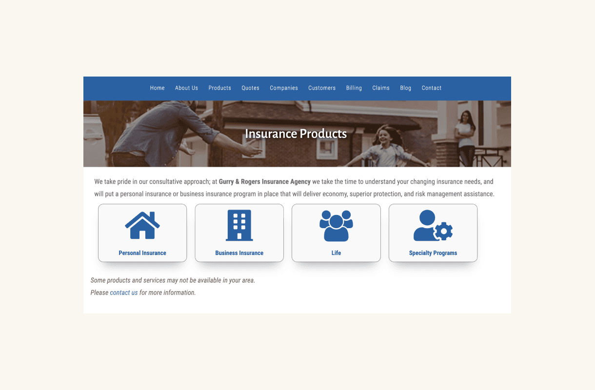

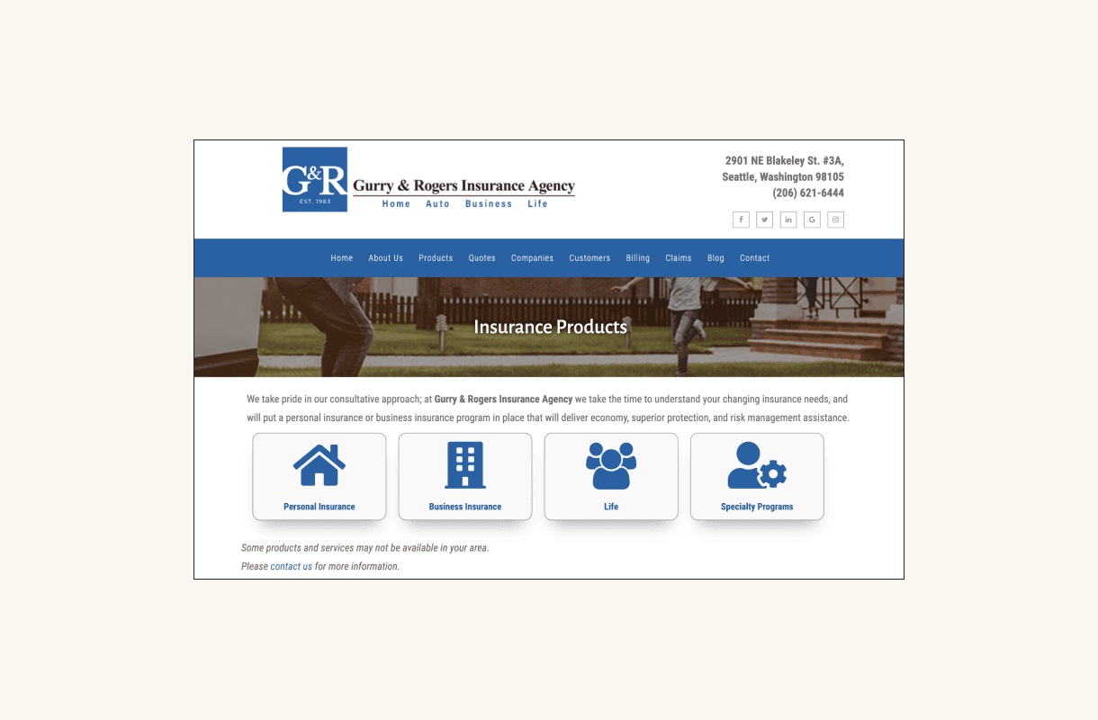
Pros - the horizontal layout simplifies navigation for a clean user experience
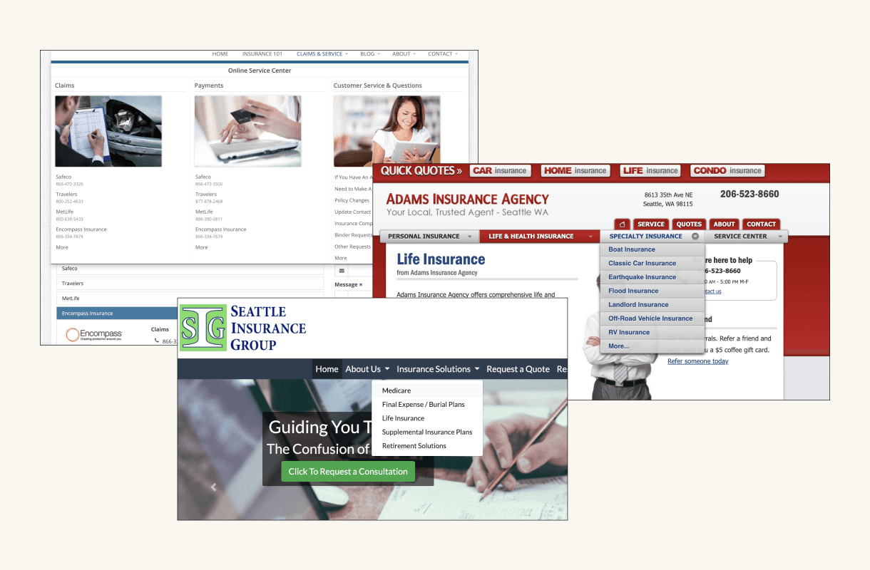


Cons - the dropdown navigation hides features and adds an extra layer of user friction
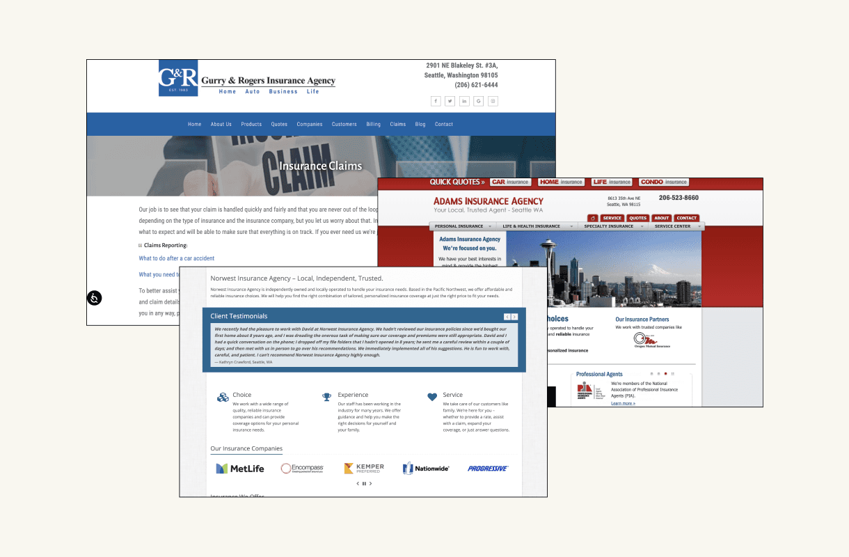


Cons - many websites are text-heavy, complicating customer content skimming and navigation
HEURISTIC EVALUATION
Identifying existing design flaws
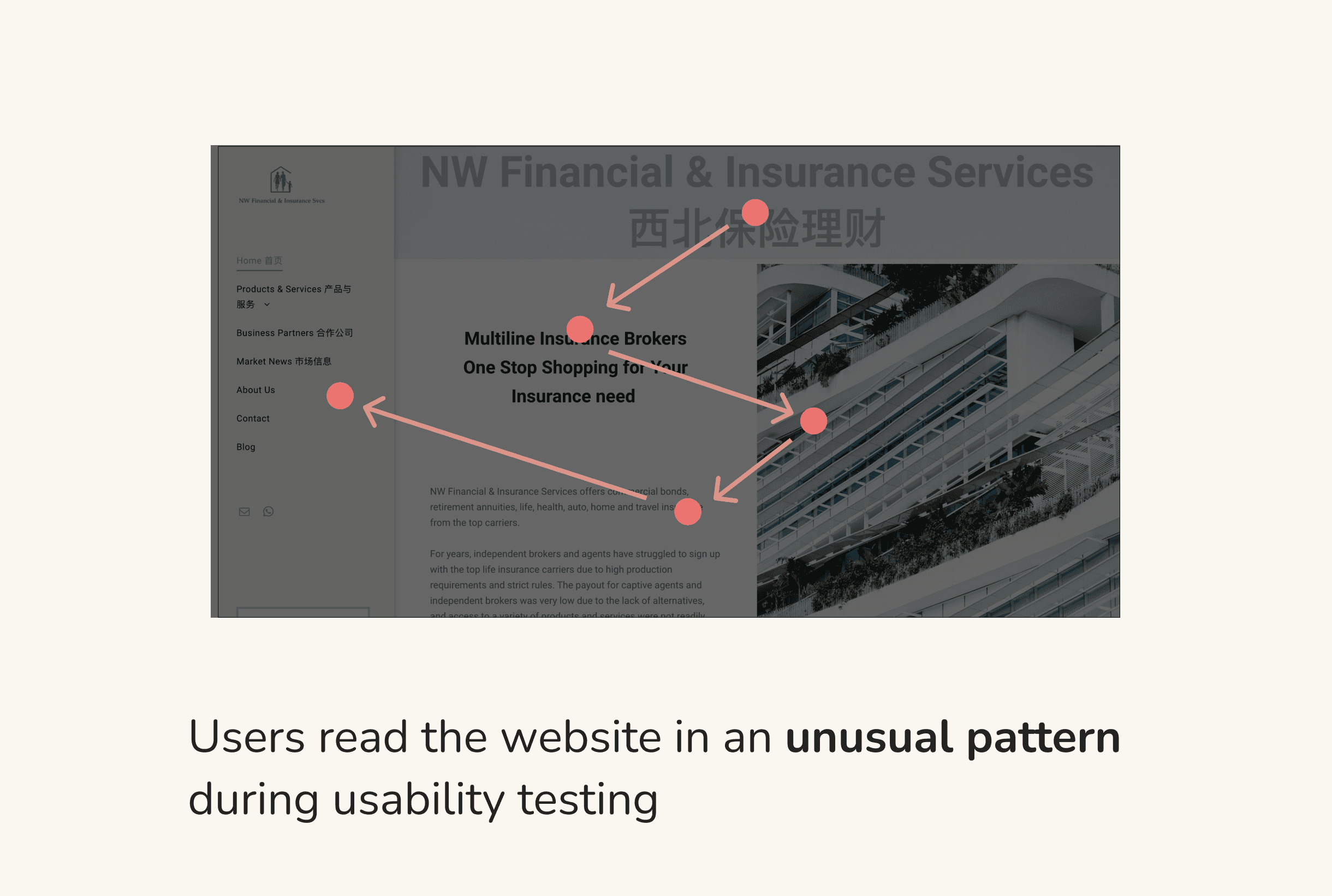
I conducted heuristic evaluation with the existing website and identified 4 categories of design flaws that need to be addressed in the redesign.

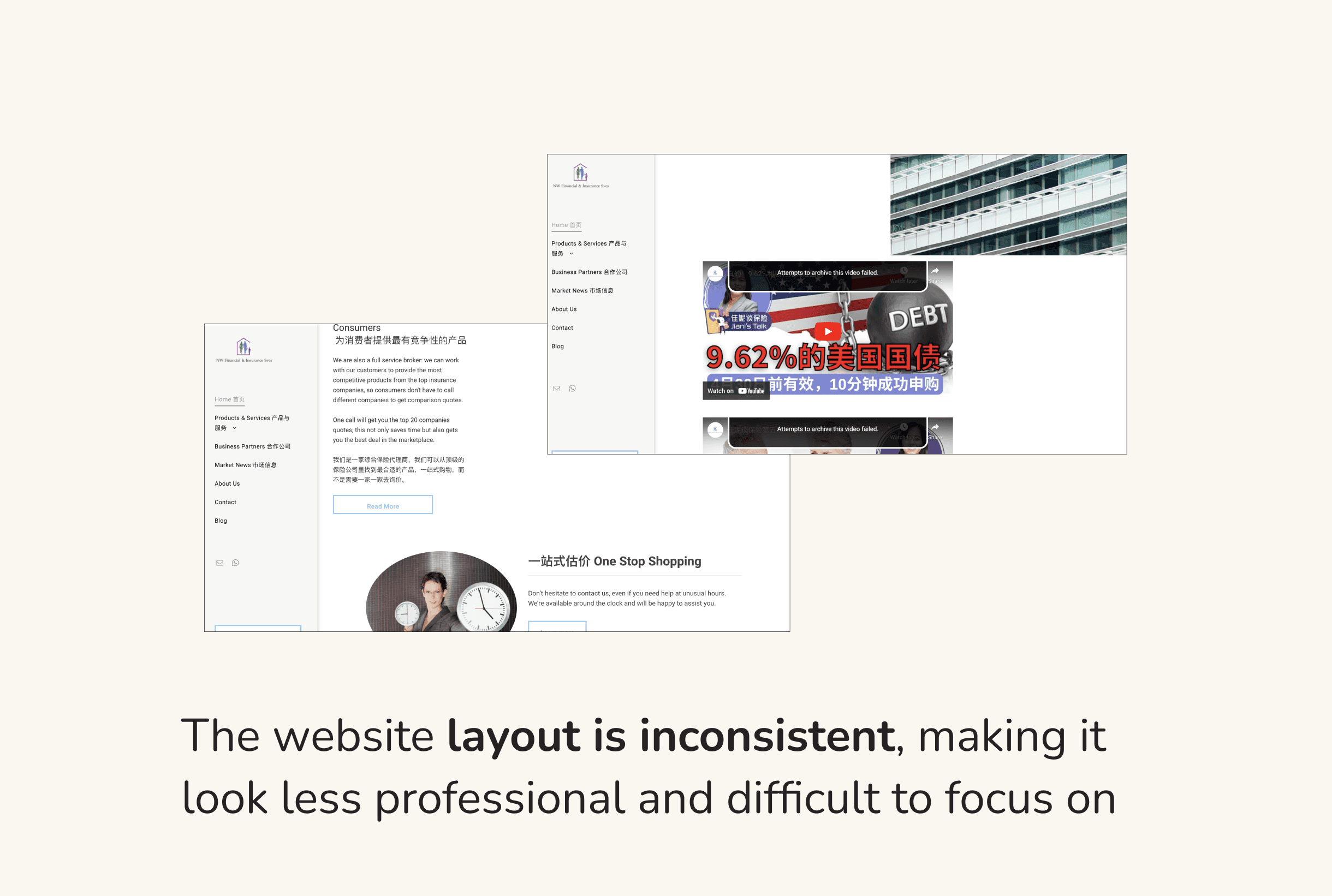

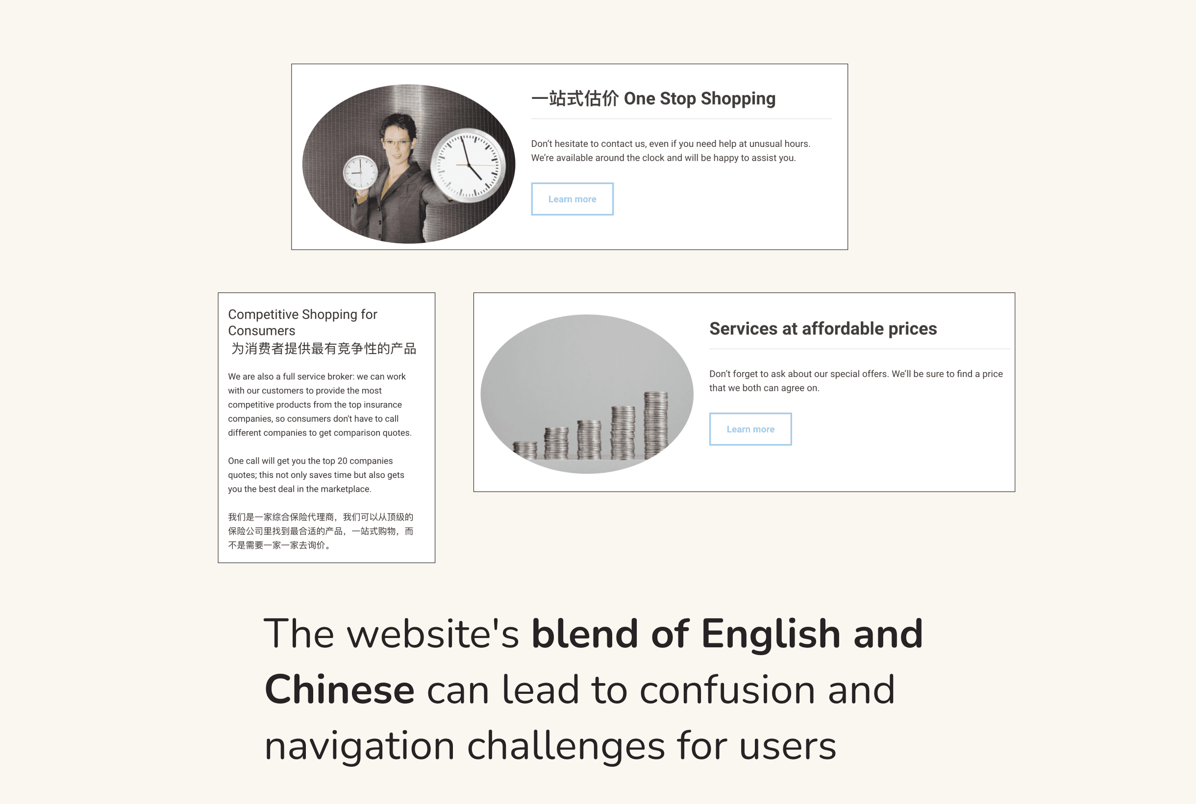

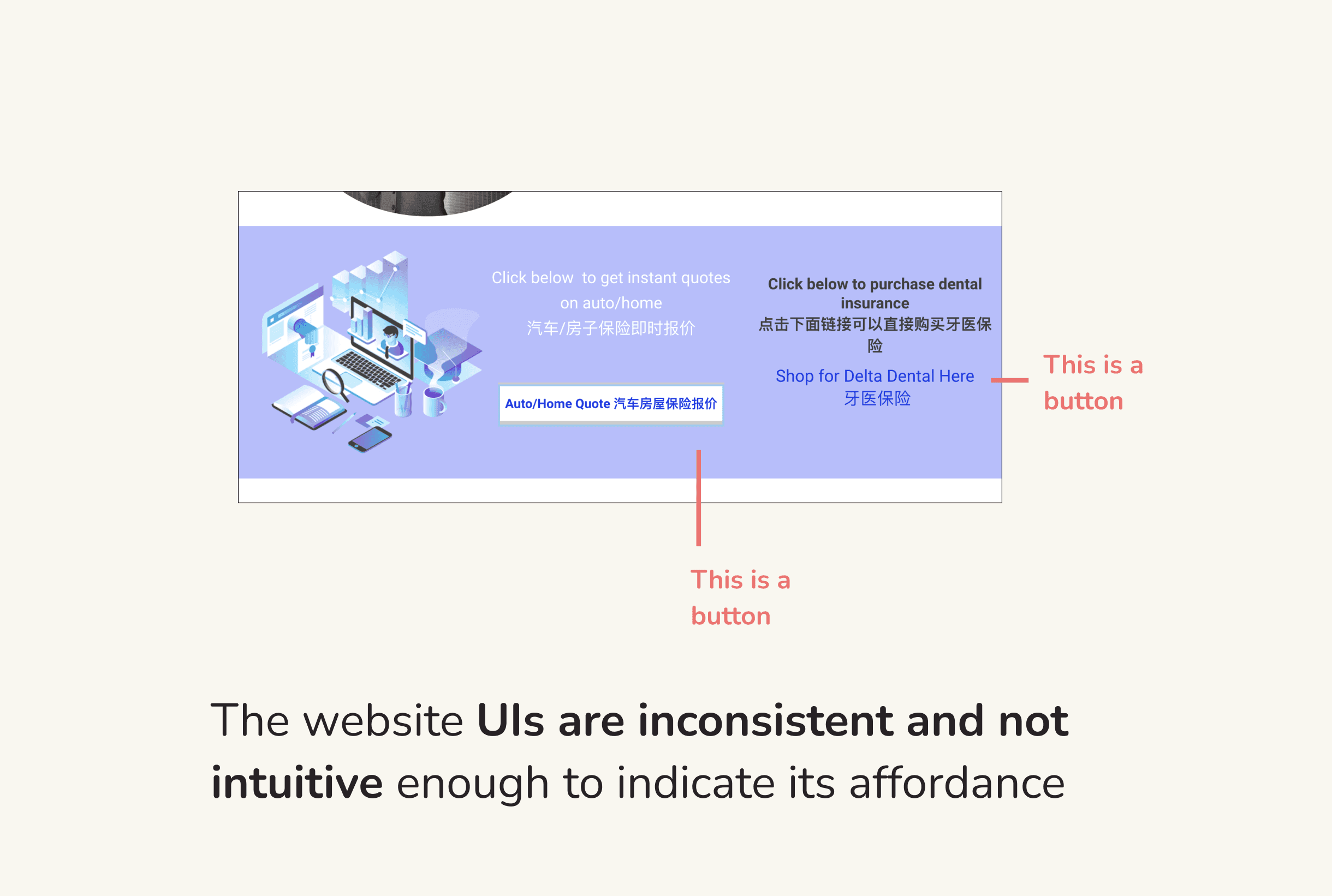

Design Challenge
How might we create a website that streamlines service discovery, fosters online engagement, and enables customers to advocate for the agency within their networks
IDEATION
Brainstorming opportunities based on the existing features
Due to time constraints, I opted for an unconventional approach. Rather than following the typical divergent and convergent design process, I chose to assess the existing website features to draw inspiration and facilitate iteration.
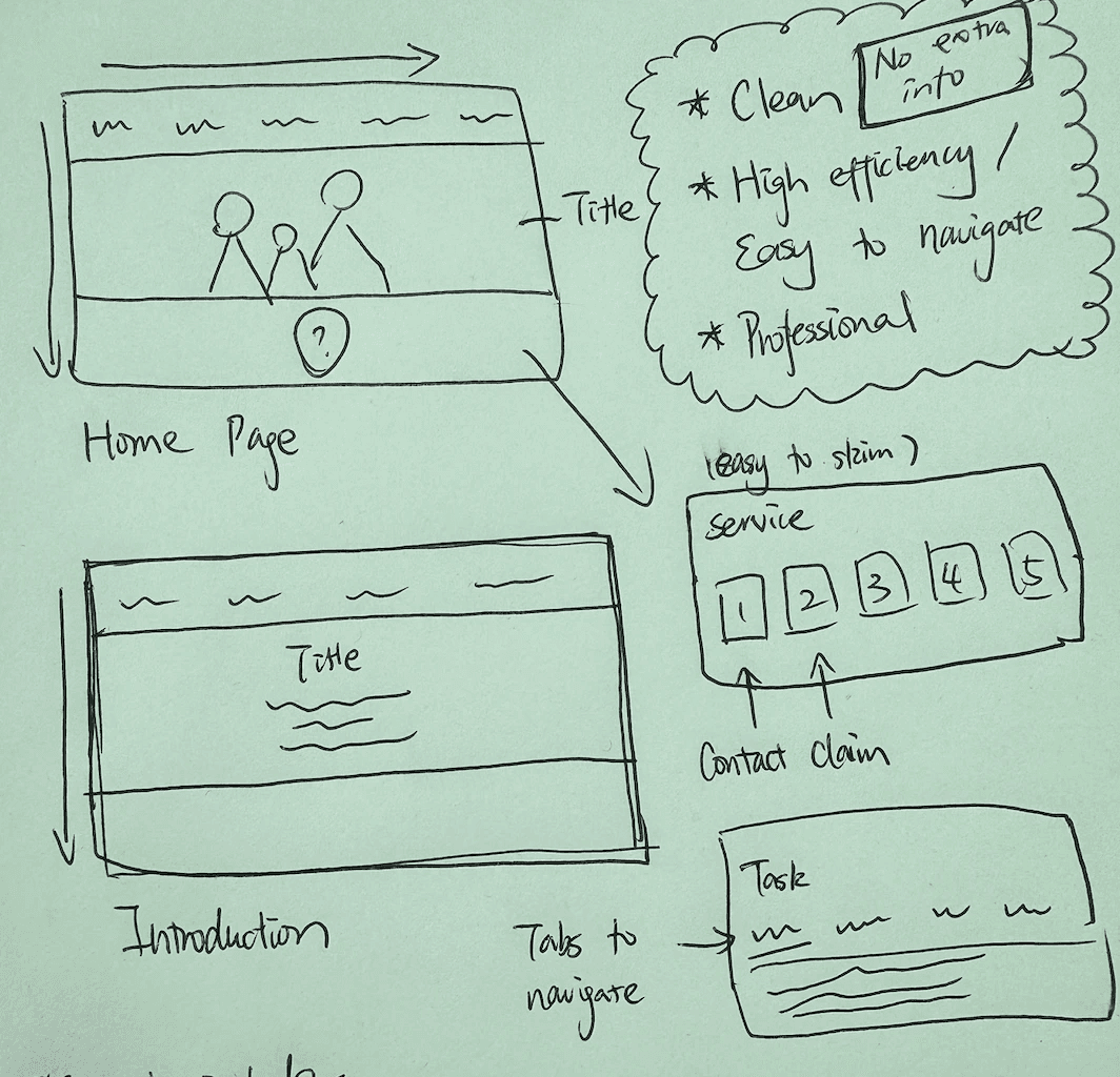

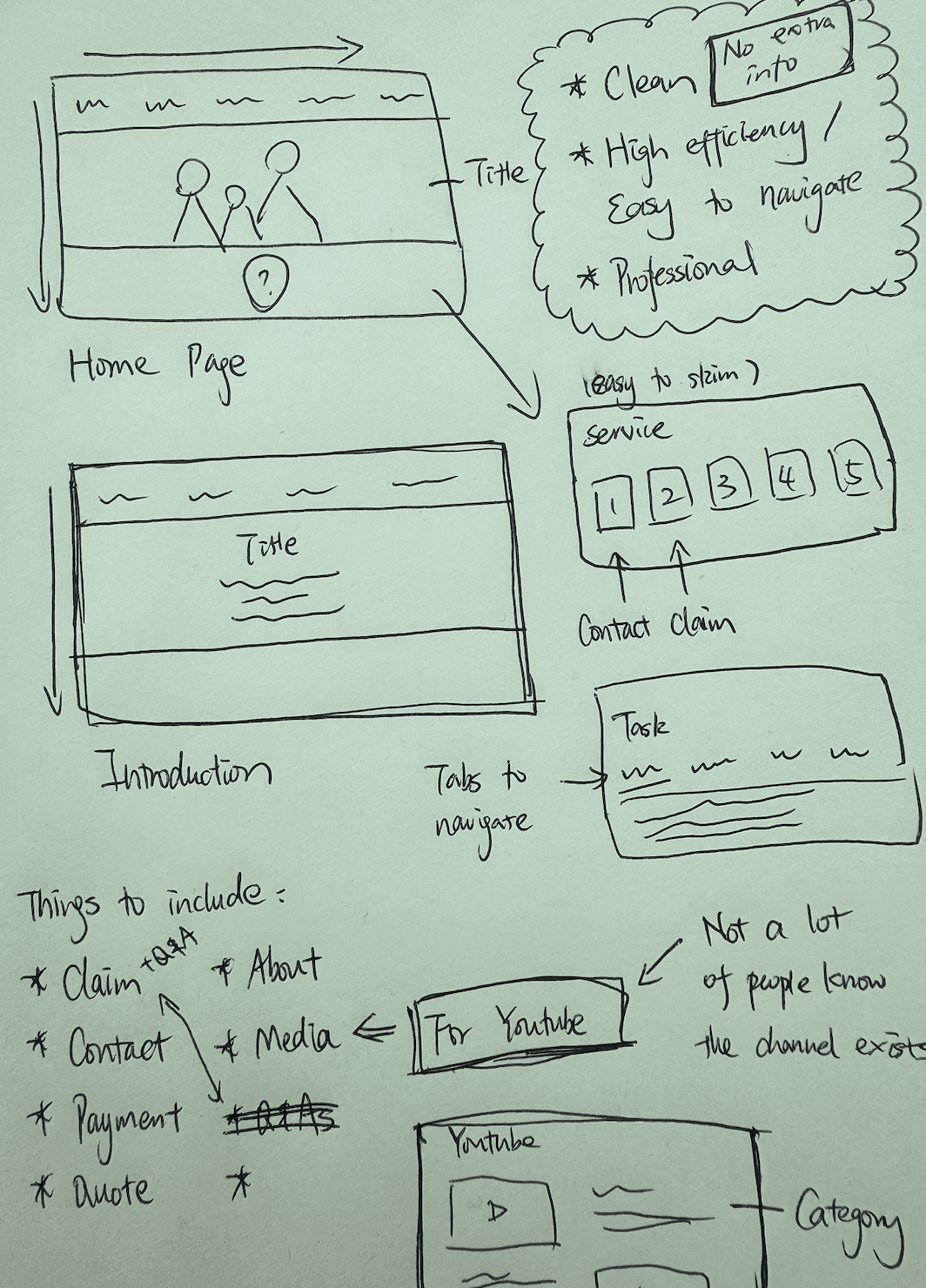
The notes I took after showing my initial sketches with the company employees
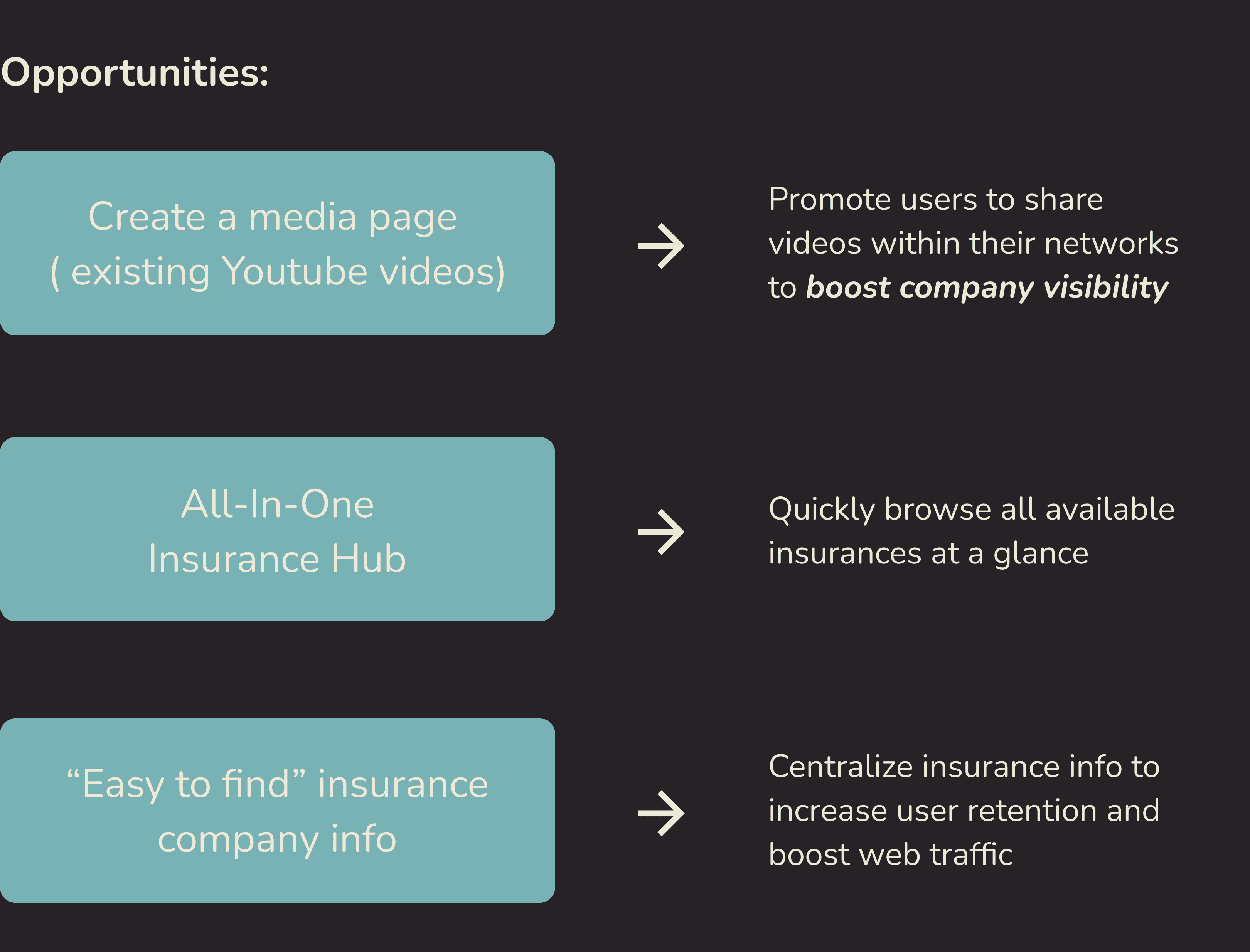


Opportunities linked with research findings and current company features.
INFORMATION ARCHITECTURE
Restructuring the website structure to achieve the desired outcome
After consulting with the company, I established the following objectives for the website:
Clean and concise
Easy to navigate
Professional
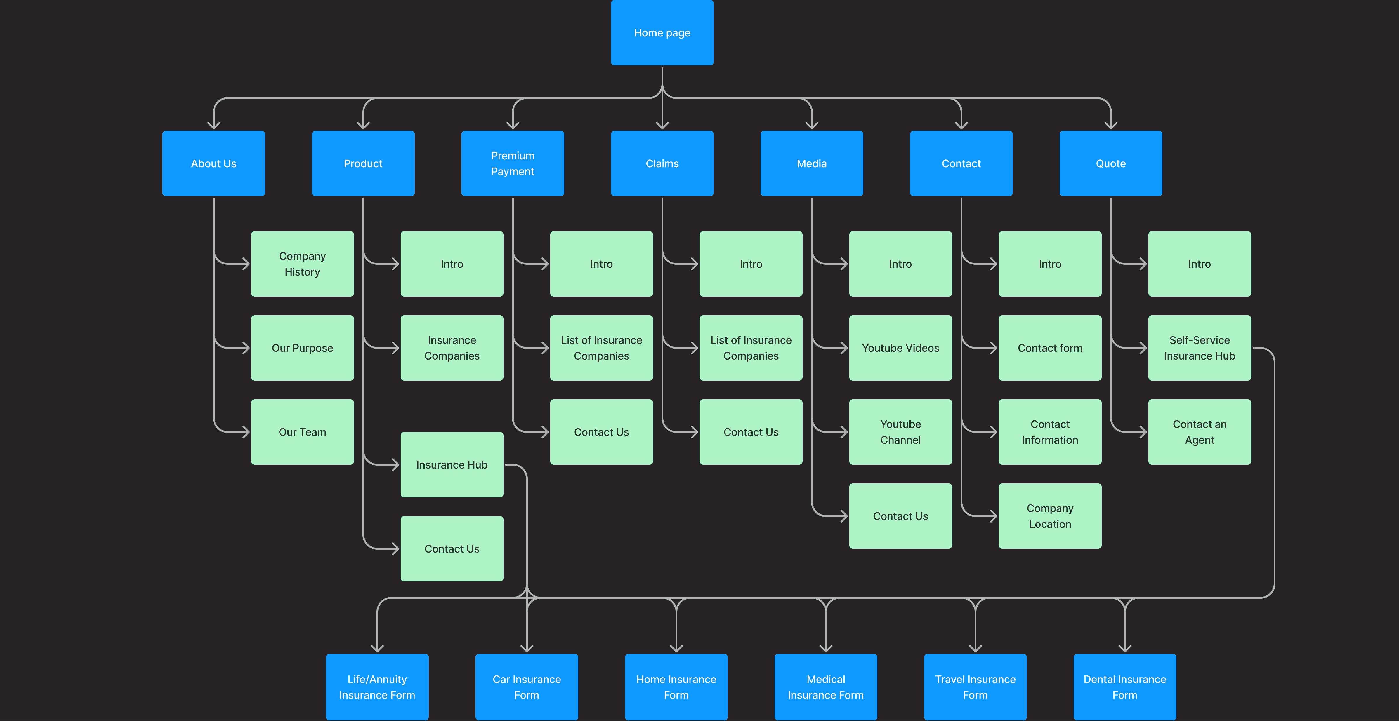

I restructured the website architecture so that users could quickly move between services and pages
FINAL DESIGN
Transforming website to meet user needs
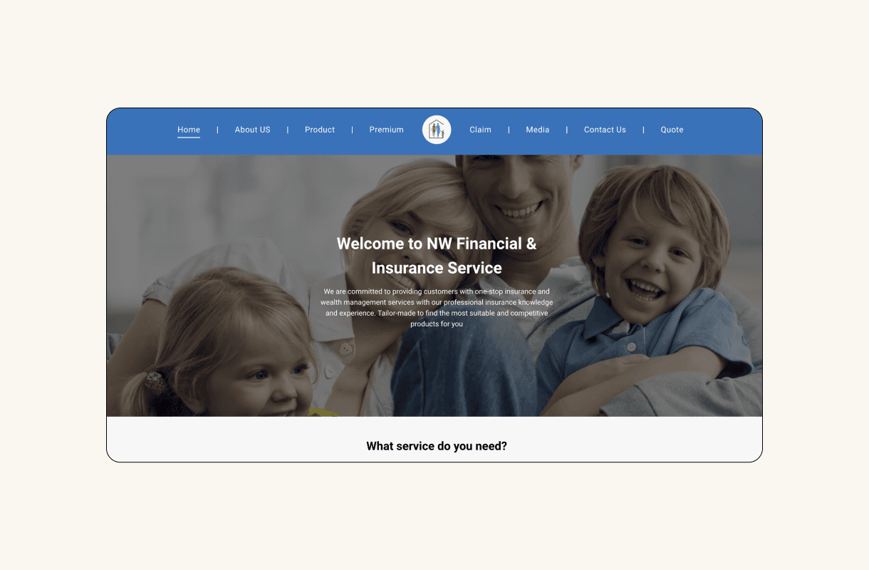
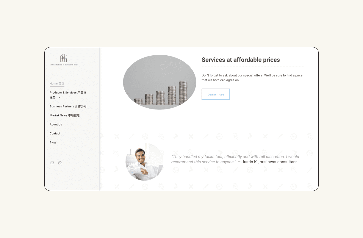
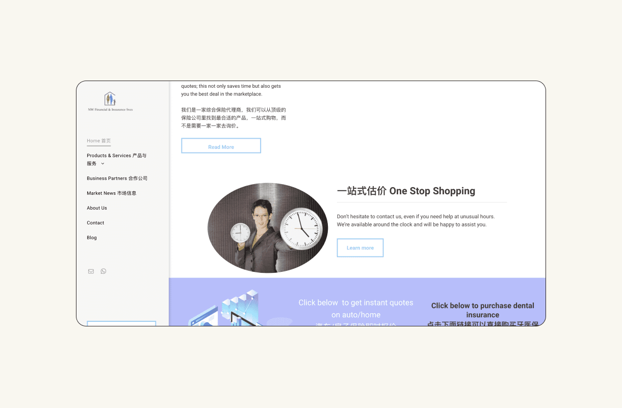
Redesigned the homepage to be cleaner and more welcoming
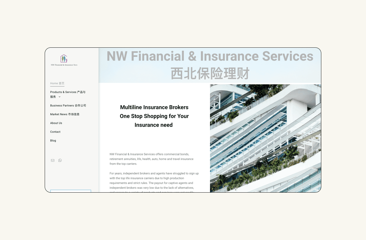



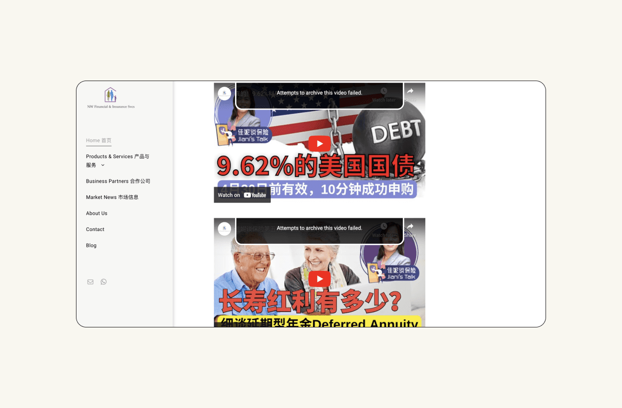
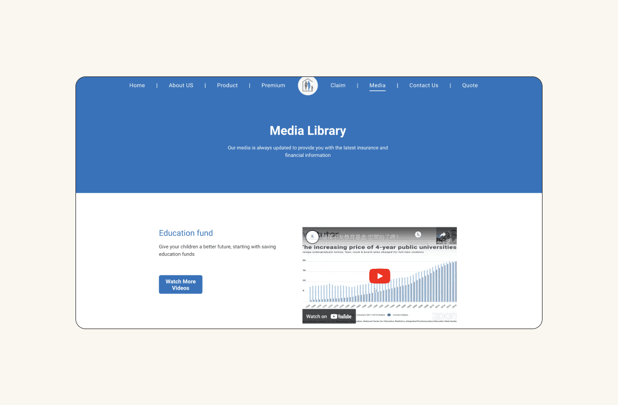
Consolidated all YouTube videos on a media page for easy viewing and sharing, boosting company exposure in customer's network



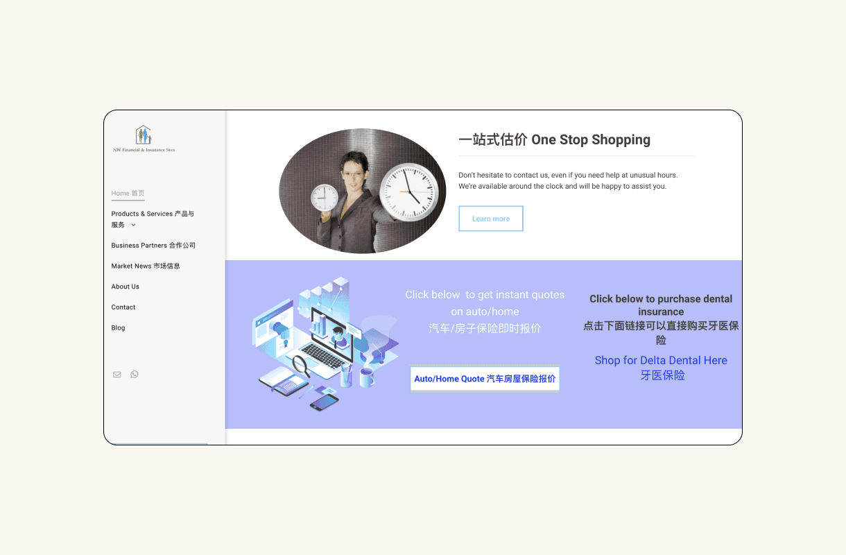
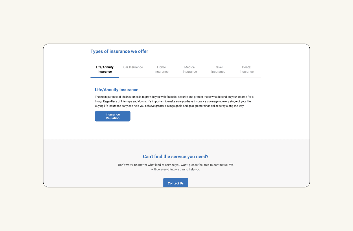
Refined the UI and re-structured the information to increase the usability of the insurance quoting interface



Redesigned the "about" page to showcase the company's history, team, and agent experience


Enhanced UI consistency and added an English-Chinese switch for multilingual customers



Grouped insurance payment and claim details on the site, increasing traffic and advertising opportunities with regular customer visits for updates

DESIGN IMPACT
Traffic boost and impression reduction
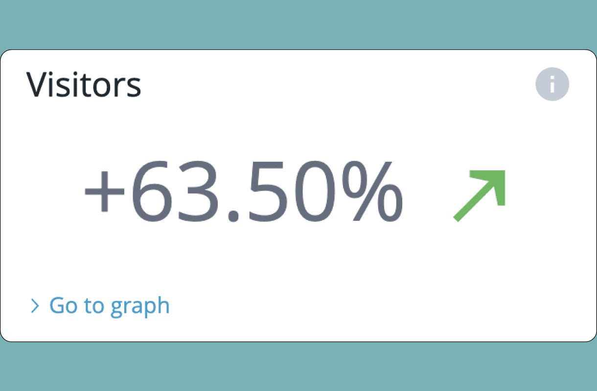
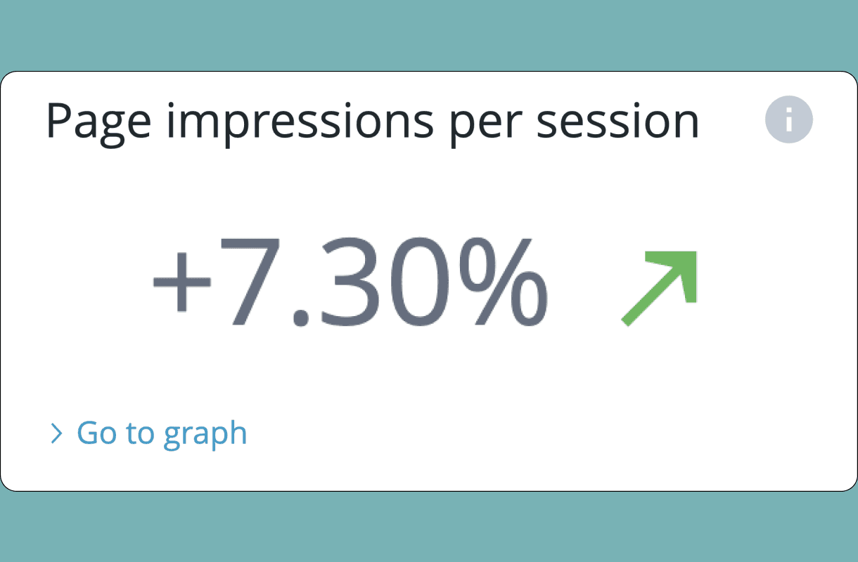
After 9 months of launching the website, the analytics revealed a 64% boost in traffic and a 7% rise in impressions.


Company employees report using the website as both a customer reference tool and an internal resource for promoting the company during online customer interactions


The graph compares visitor numbers before and after the redesign (light blue dotted line vs. dark blue solid line)
REFLECTIONS

If I had more time, I would conduct usability and evaluative testing to validate my assumptions
With additional time, I would carry out post-design interviews and usability tests with users to evaluate my assumptions, and I would set up the criteria to test if my design achieves the desired outcomes.

Enhance the website's responsiveness to ensure compatibility with mobile devices
Due to time constraints, I had to make a decision to only focus on redesigning the desktop version of the company website. With additional time, I would improve the site's responsiveness for optimal viewing and sharing on personal devices.

Consider alternatives to make more informed decisions
With limited time and resources, I decided to only revise designs based on the existing website. Moving forward, even with constraints, I intend to examine various options, assessing their pros and cons to facilitate well-informed decision-making

Be more confident navigating through ambiguity
Being the only designer and developer on the team, I sometimes doubted my decisions. In the future, I aim to base my confidence on the alignment of decisions with my findings and rationales, acknowledging risks to advance the project

